FEM Coliving
Client: FEM Coliving — 2021
Serveis: Logo | Concepte | Identitat | Direcció d'art | Disseny gràfic | Xarxes socials | Tipografia ad hoc
Serveis: Logo | Concepte | Identitat | Direcció d'art | Disseny gràfic | Xarxes socials | Tipografia ad hoc
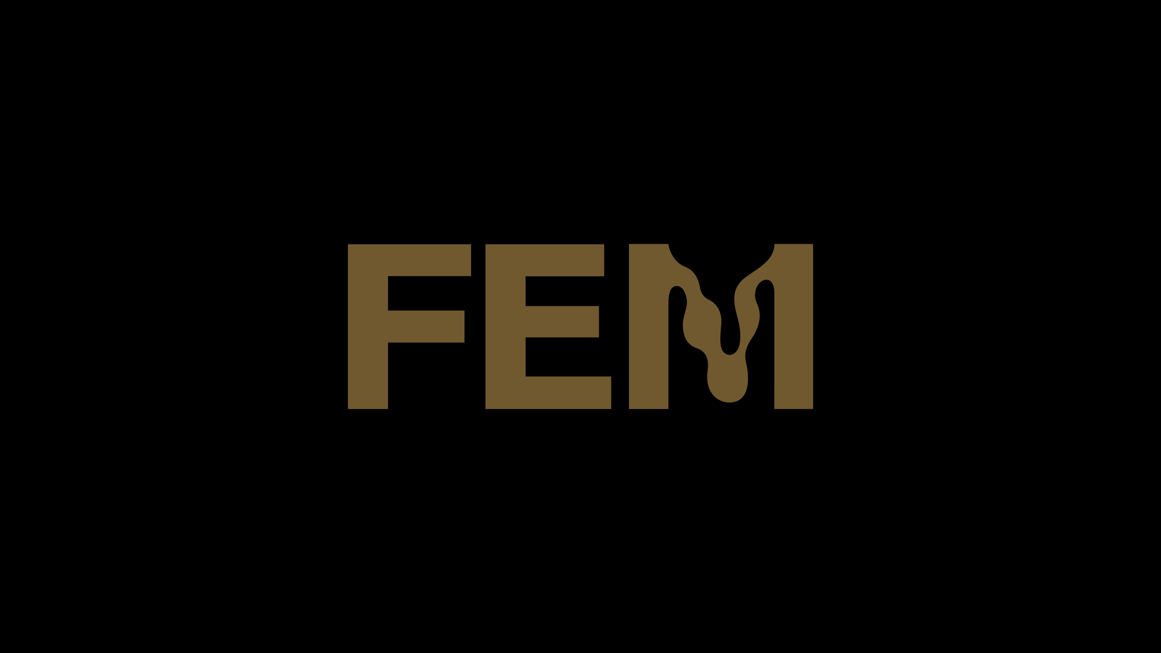
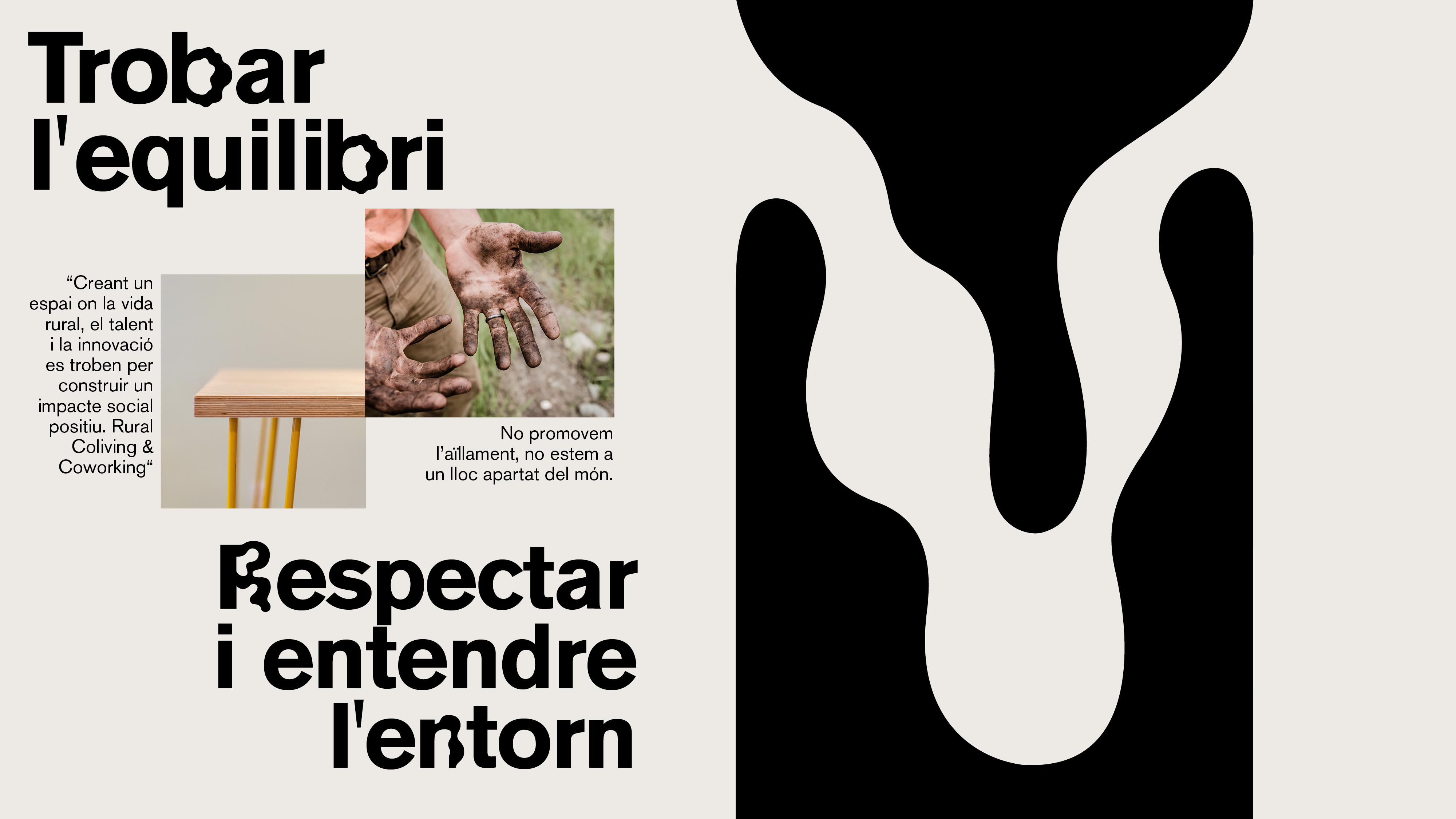
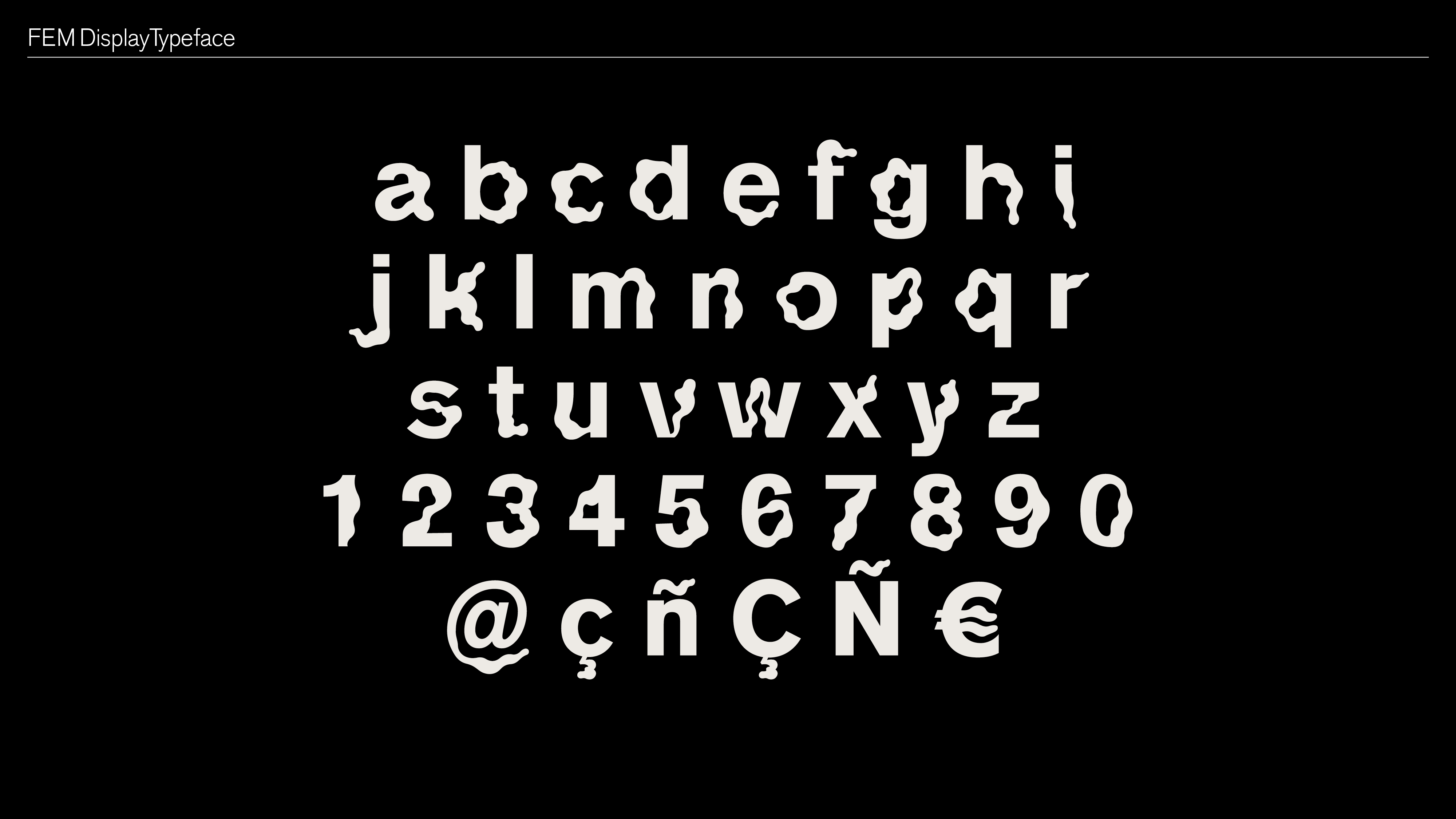
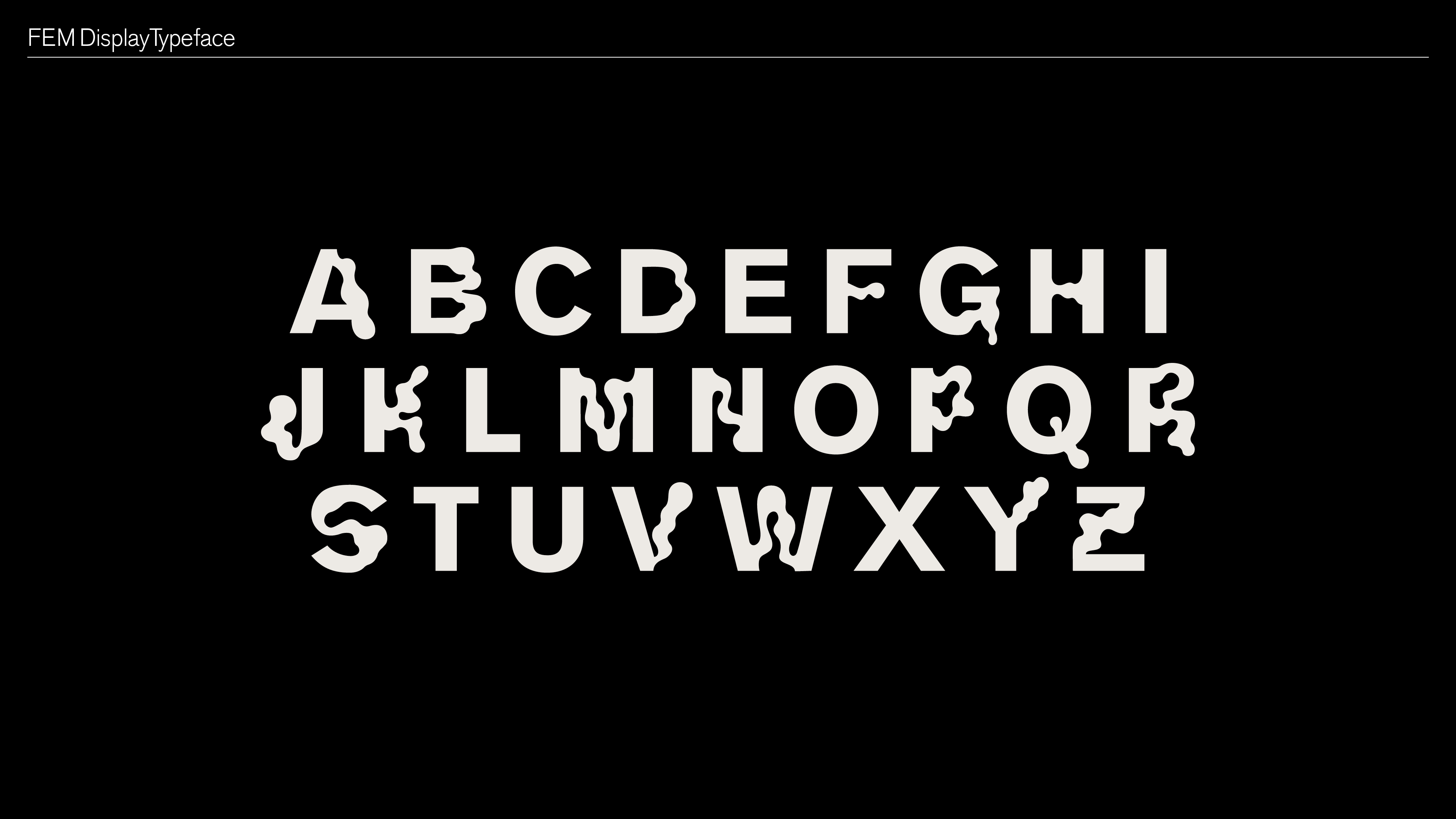
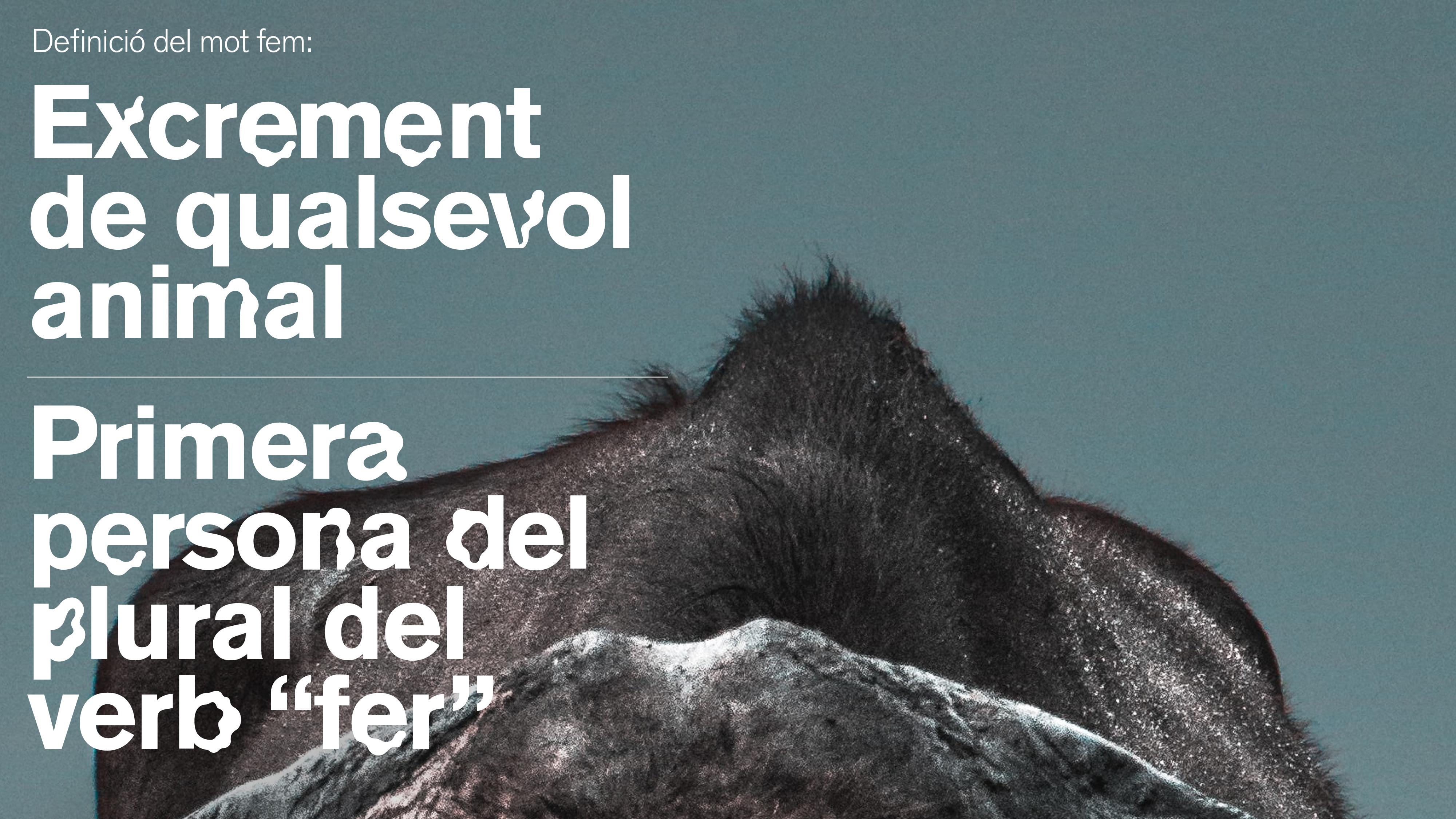
La paraula Fem en català té dos significats: 1. Excrement animal / 2. Primera persona del plural del verb “fer”.
Amb aquest punt de partida i amb l'objectiu de parlar de l'entorn rural sense edulcorants, hem creat una marca sòlida per a aquest espai de treball/coliving situat als Pirineus.
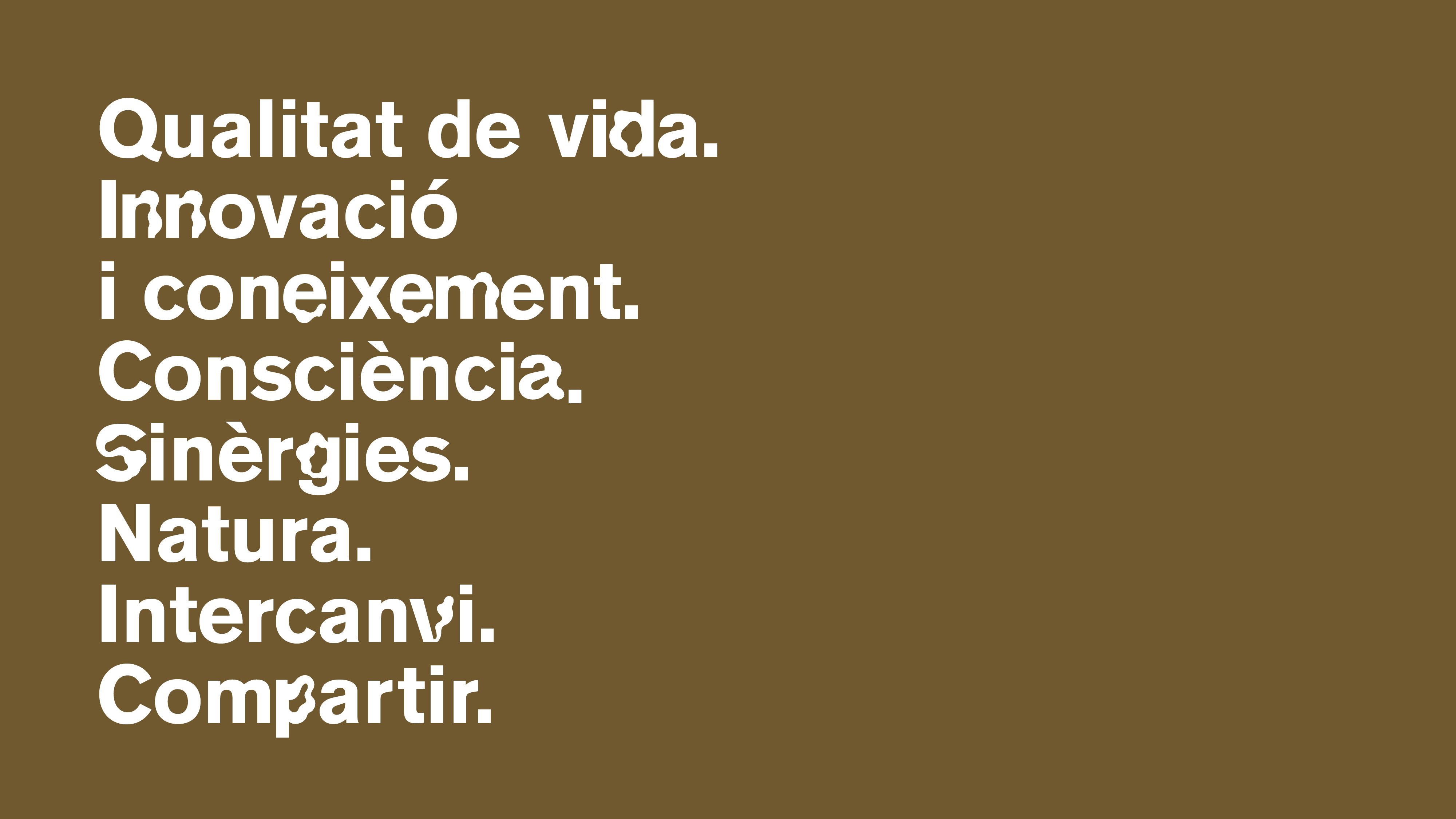
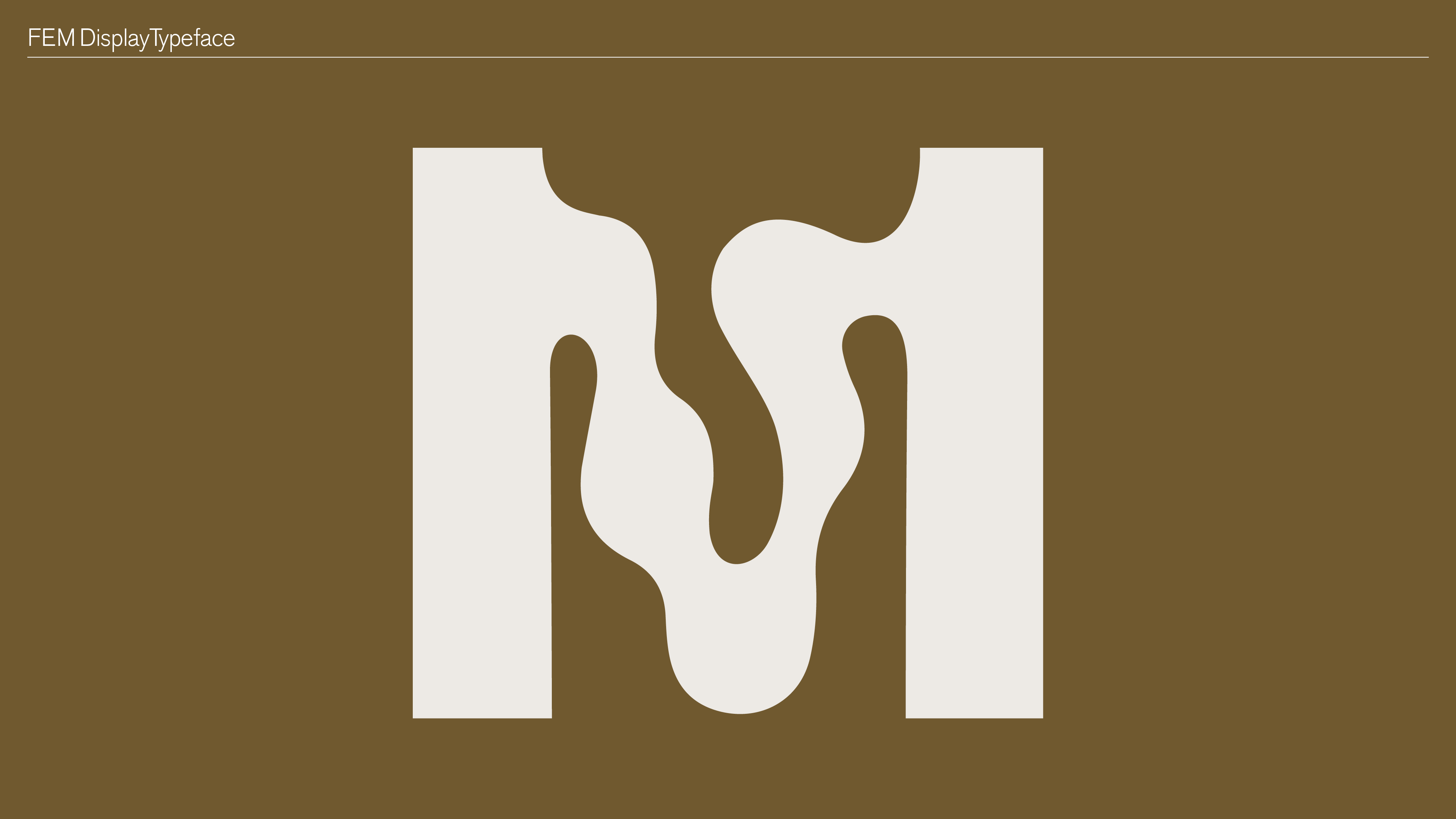
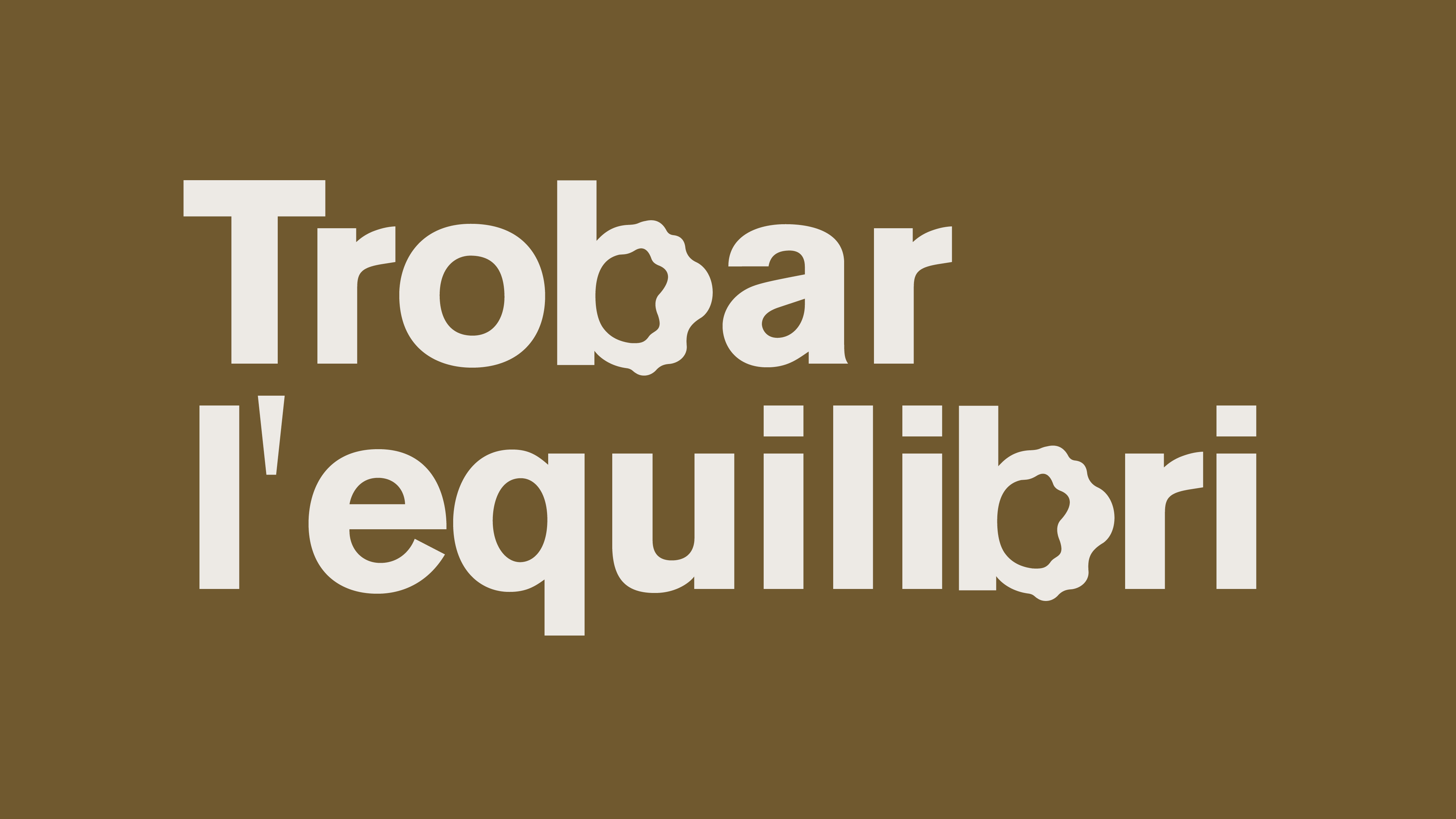
La tipografia està basada en formes orgàniques, en la seva majoria relacionades amb el fang o els excrements, i el disseny respira el contrast que representa FEM: d'una banda, una imatge depurada i ordenada, que parla de la innovació i el treball intel·lectual; per un altre, els camps, la natura i la cruesa del món rural.
Amb aquest punt de partida i amb l'objectiu de parlar de l'entorn rural sense edulcorants, hem creat una marca sòlida per a aquest espai de treball/coliving situat als Pirineus.
La tipografia està basada en formes orgàniques, en la seva majoria relacionades amb el fang o els excrements, i el disseny respira el contrast que representa FEM: d'una banda, una imatge depurada i ordenada, que parla de la innovació i el treball intel·lectual; per un altre, els camps, la natura i la cruesa del món rural.