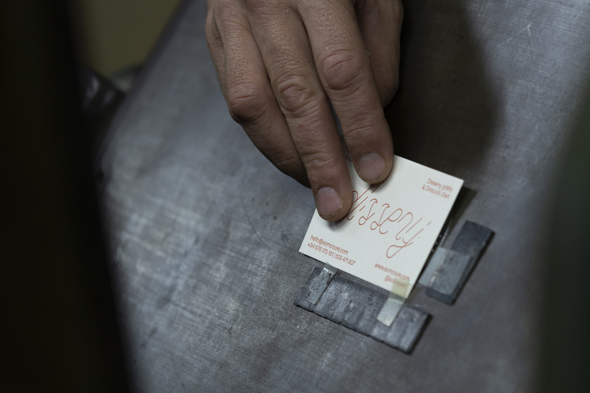
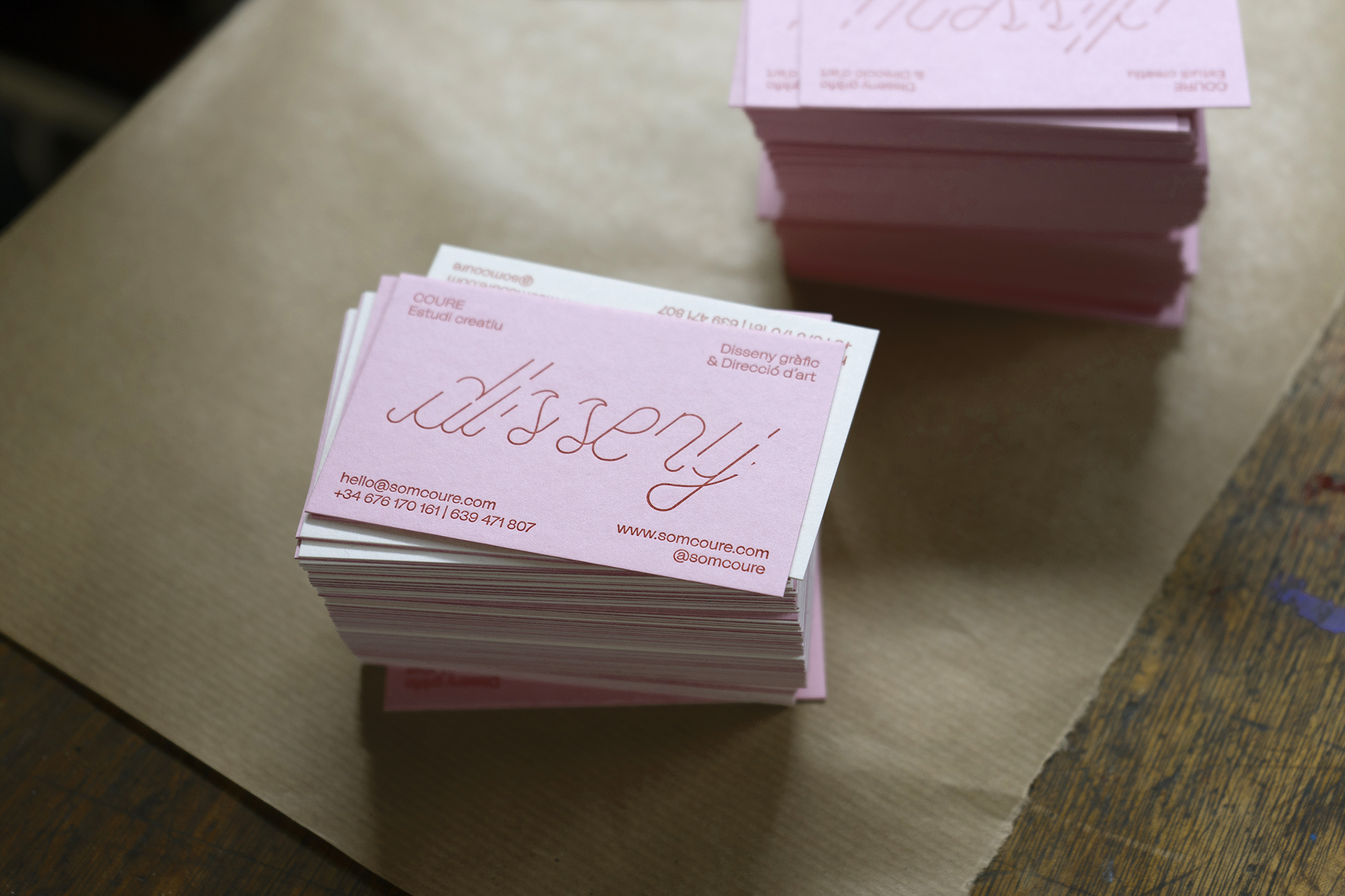
Targetes COURE
COURE — 2020
Serveis: Identitat corporativa | Disseny gràfic | Logo
Fotos: Max Maltas
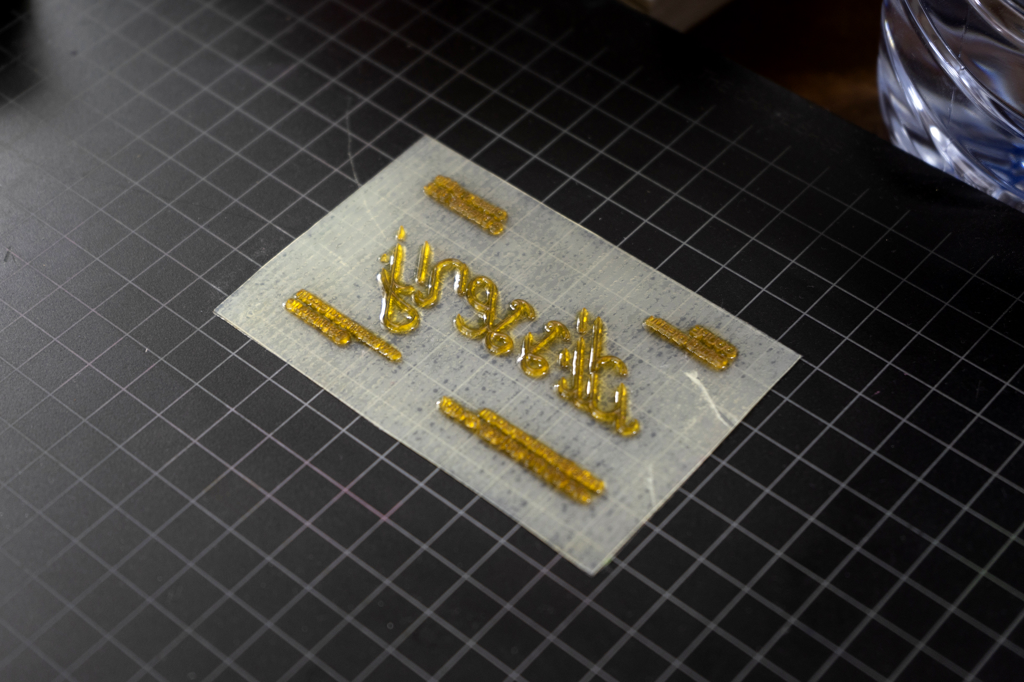
Impressió: Letterpress i cop sec a L’Anacrònica
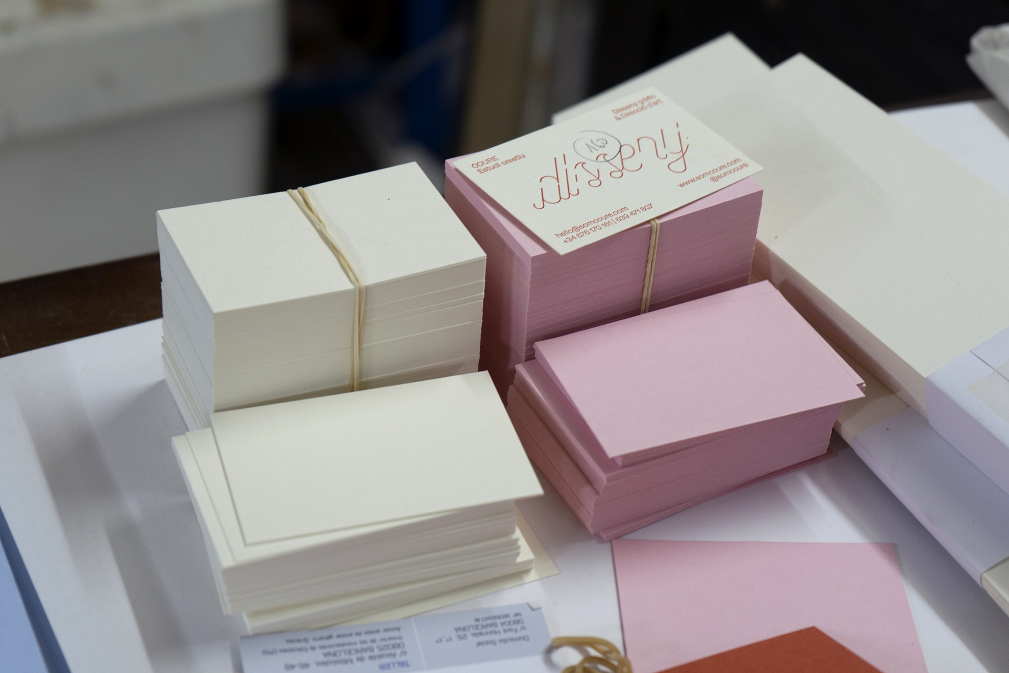
Paper: Colorplan Candy Pink & Natural White, 350 grsm.
Serveis: Identitat corporativa | Disseny gràfic | Logo
Fotos: Max Maltas
Impressió: Letterpress i cop sec a L’Anacrònica
Paper: Colorplan Candy Pink & Natural White, 350 grsm.
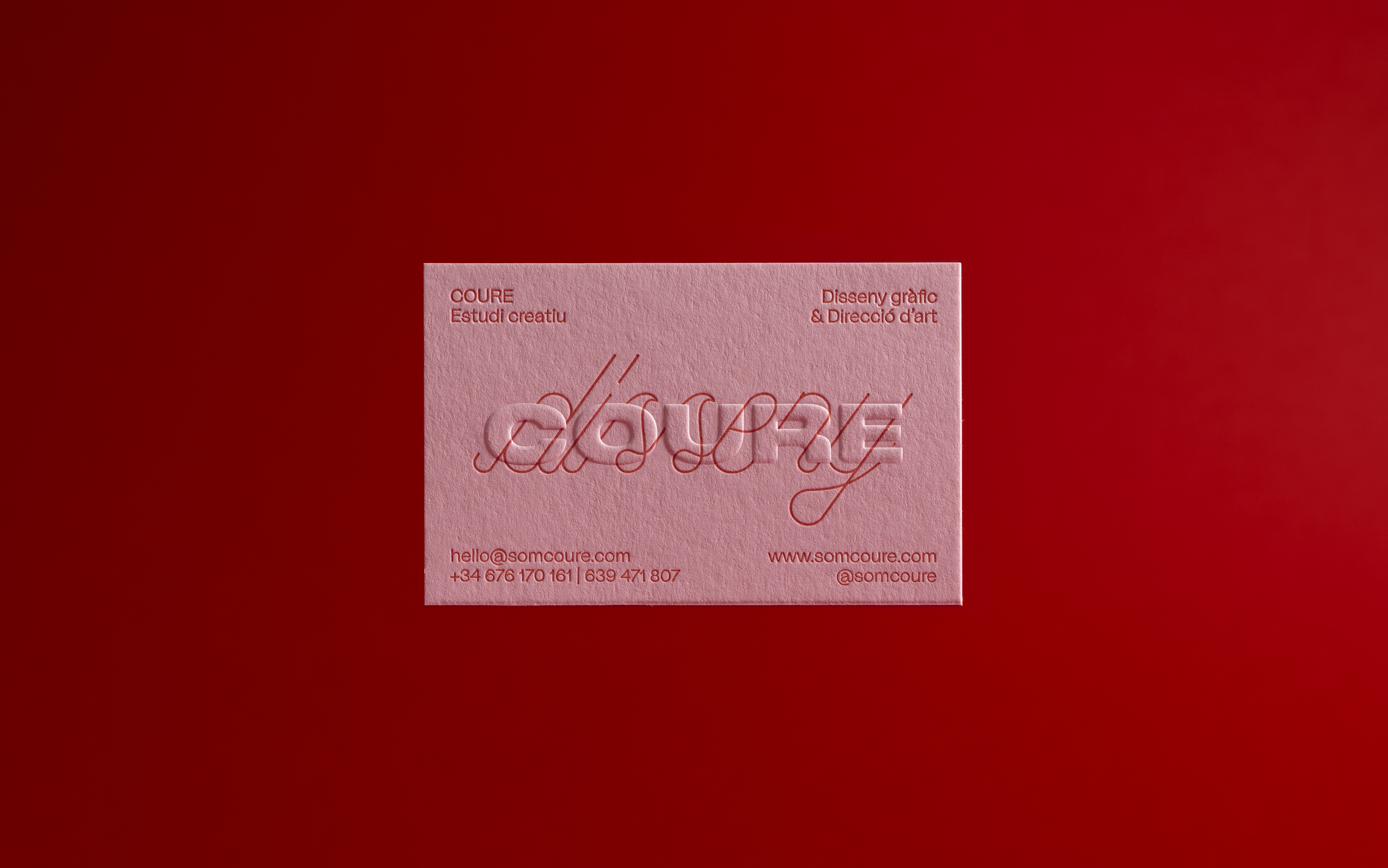
Disseny de les targetes de lestudi, la nostra presentació en paper cap al món.
El logotip, gruixut i pesant, conviu amb una tipografia custom de línia que s’entrellaça, creant dos nivells de lectura. Juntament amb la tria meticulosa de materials i tècniques, aquestes targetes transmeten l'essència de COURE.
El logotip, gruixut i pesant, conviu amb una tipografia custom de línia que s’entrellaça, creant dos nivells de lectura. Juntament amb la tria meticulosa de materials i tècniques, aquestes targetes transmeten l'essència de COURE.


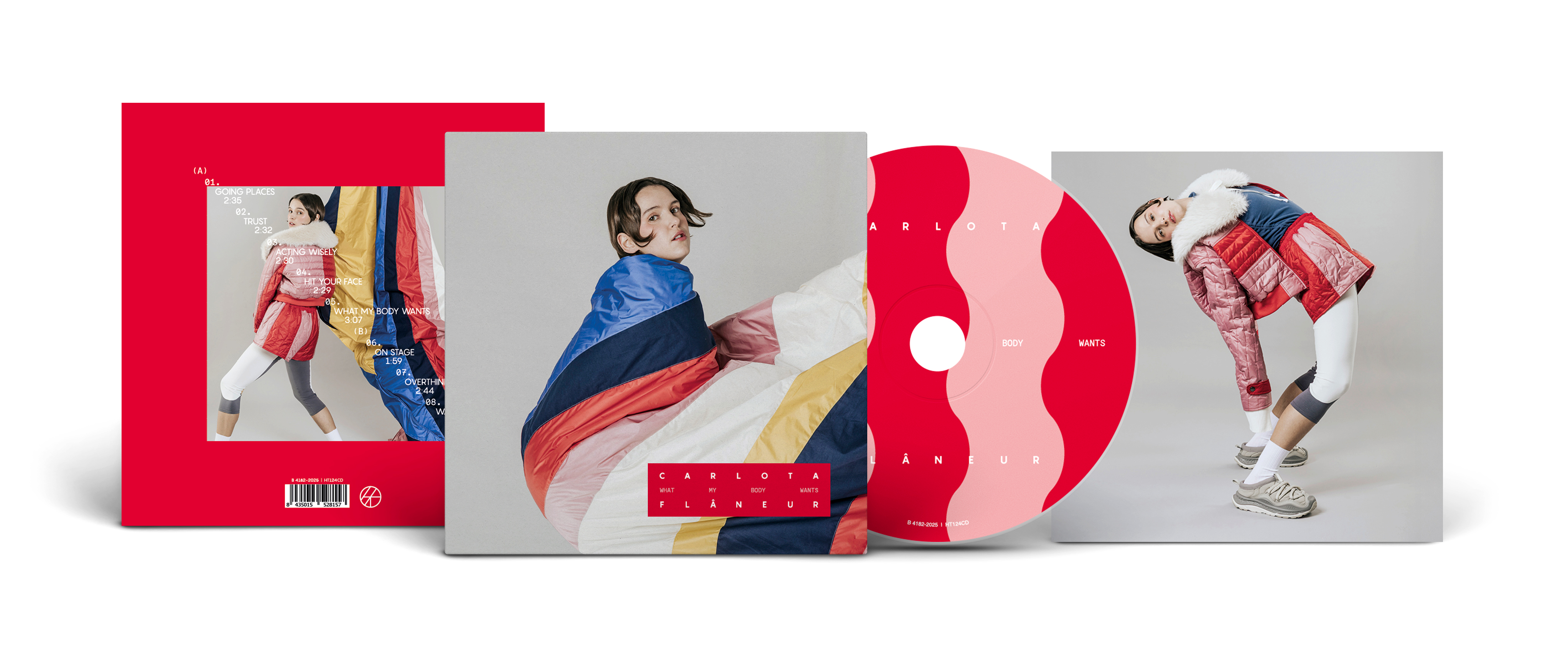
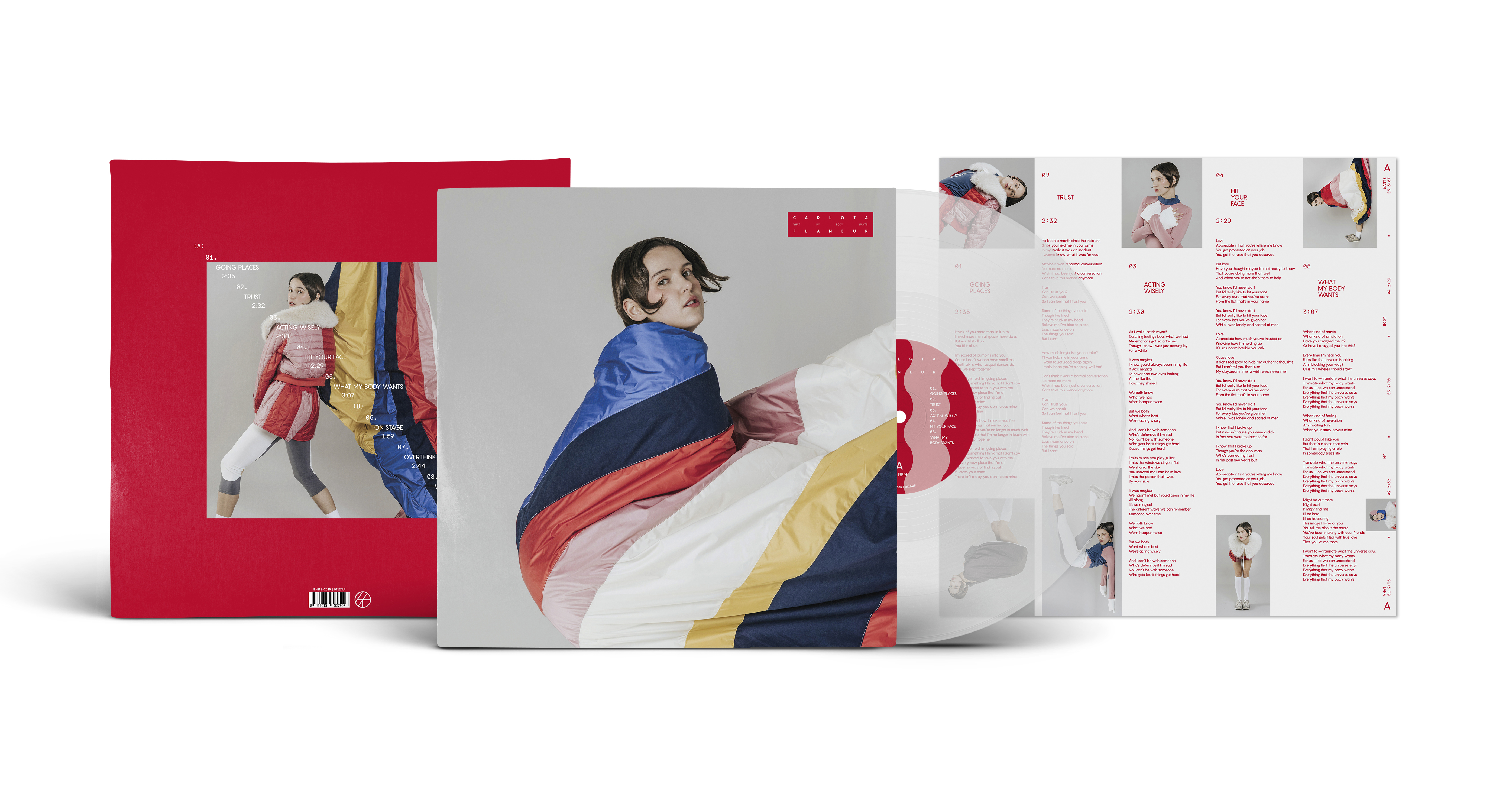
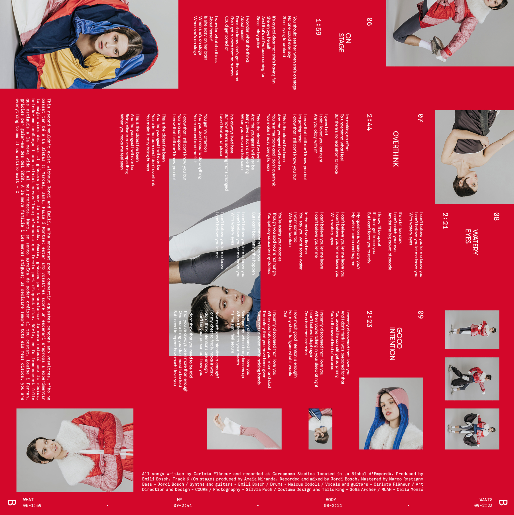
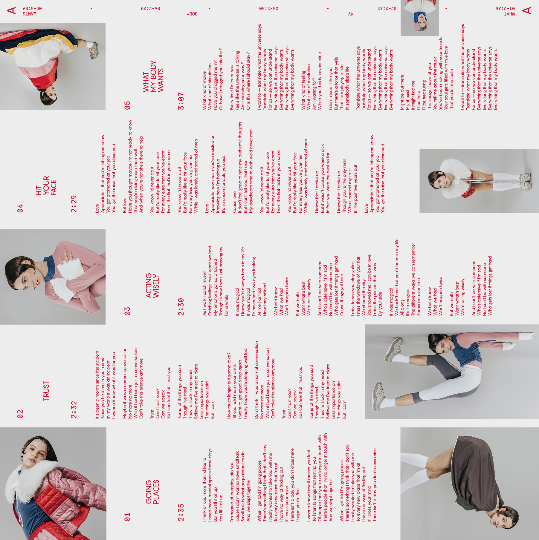
CARLOTA FLÂNEUR
Client: Carlota Flâneur — 2025
Segell: Hidden Track Records
Fotògrafa: Silvia Poch
Maquillatge: Helena Satorra
Estilista: Sofía Archer
Serveis: Direcció artística | Disseny gràfic | Vinil & CD & Cassette | Singles
Segell: Hidden Track Records
Fotògrafa: Silvia Poch
Maquillatge: Helena Satorra
Estilista: Sofía Archer
Serveis: Direcció artística | Disseny gràfic | Vinil & CD & Cassette | Singles
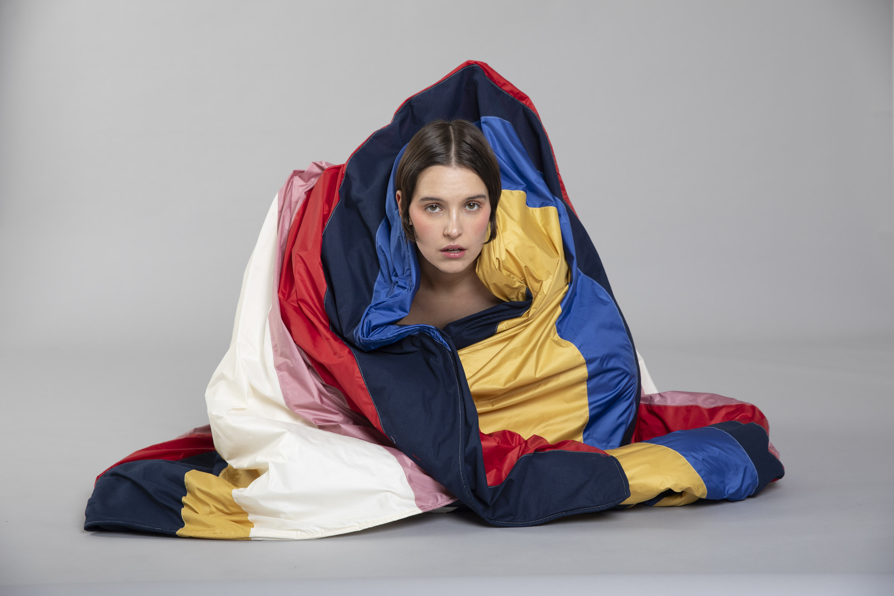
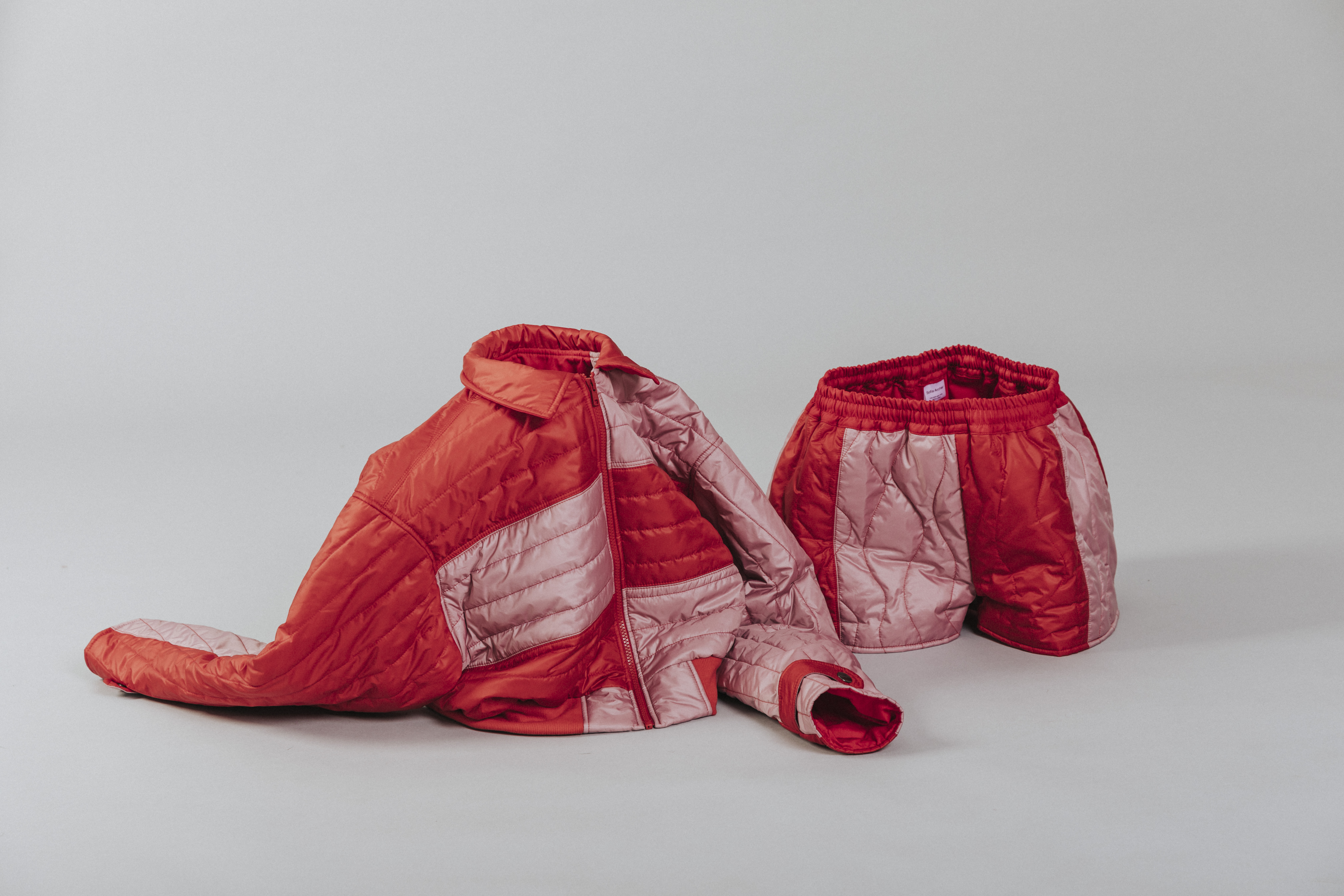
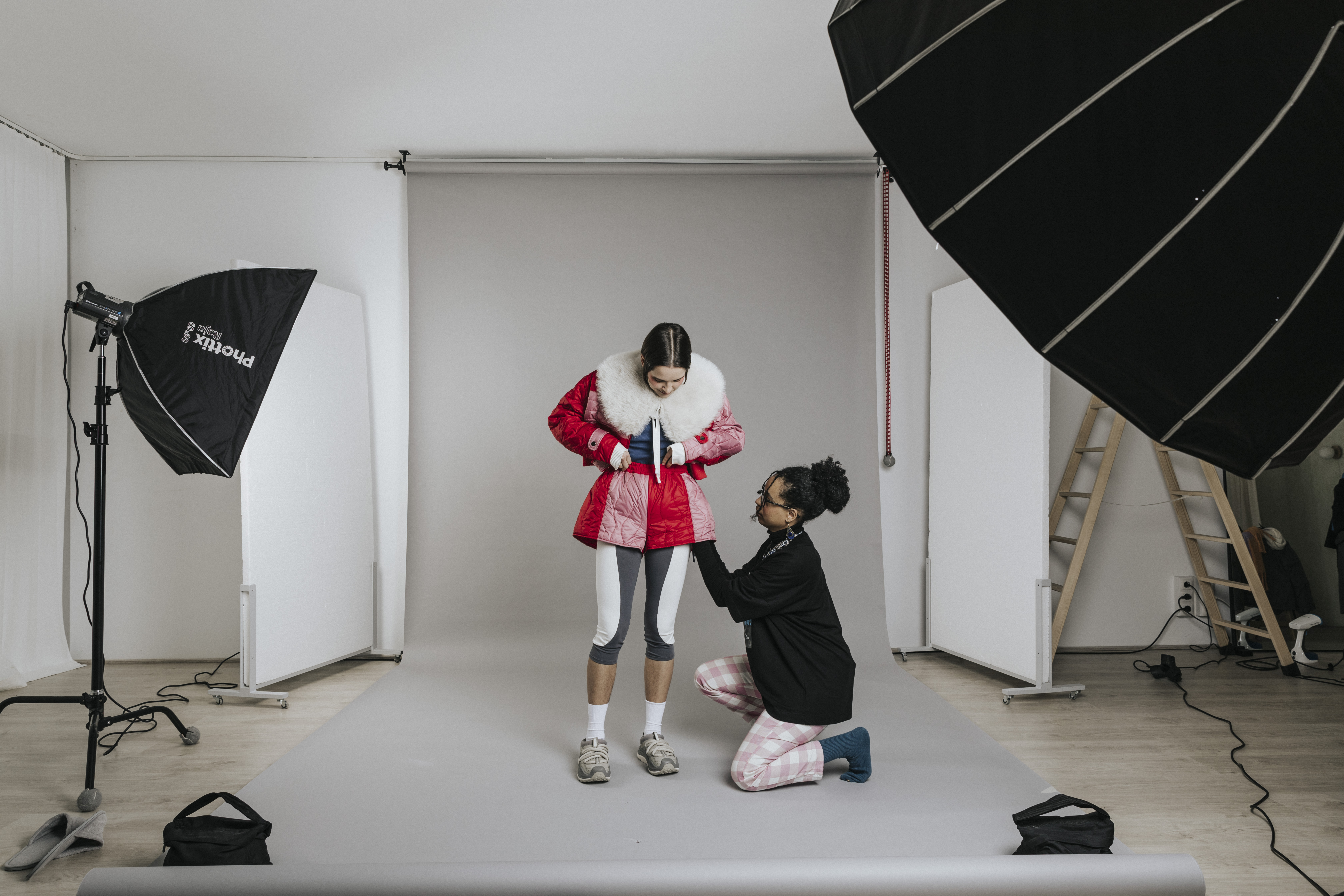
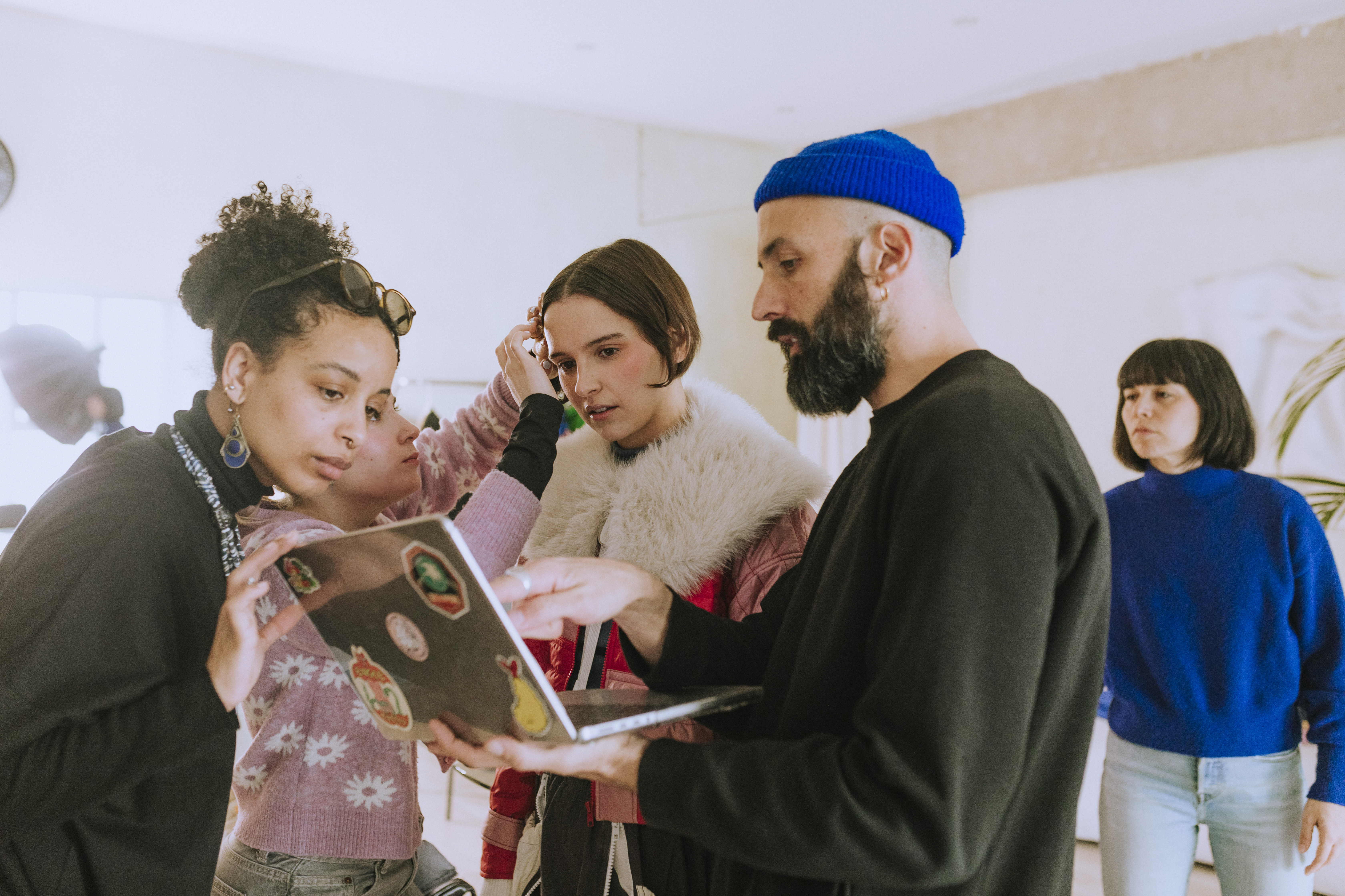
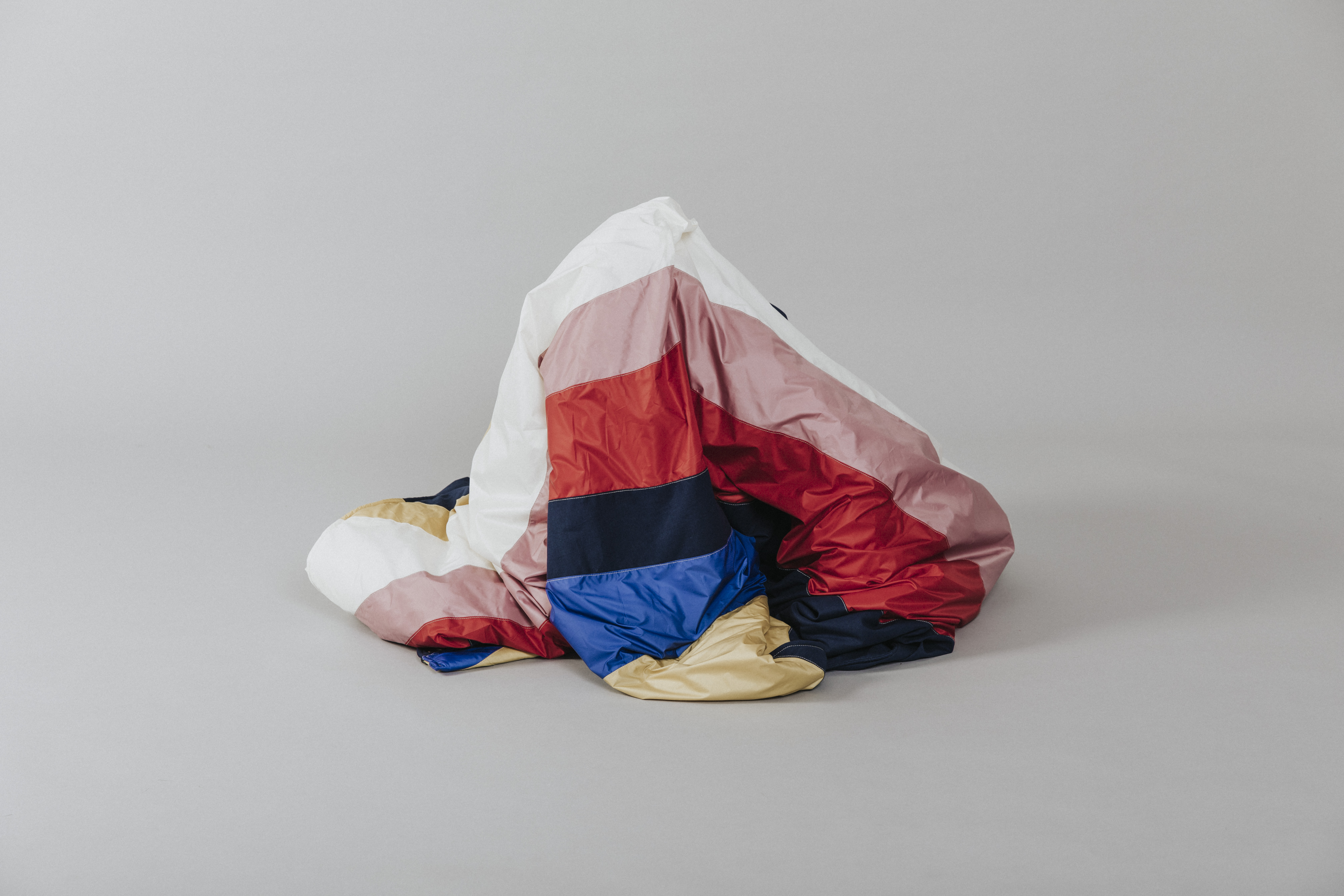
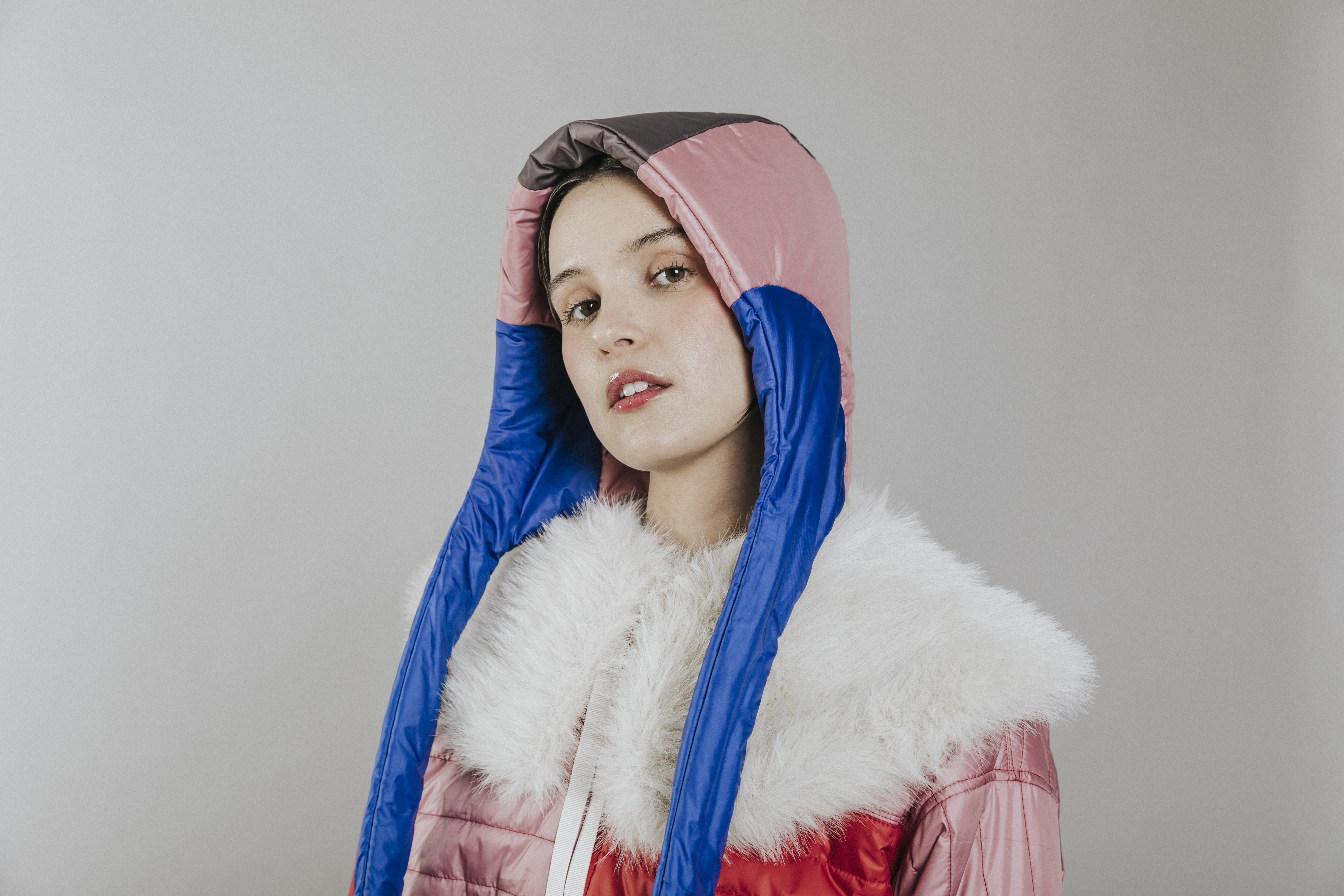
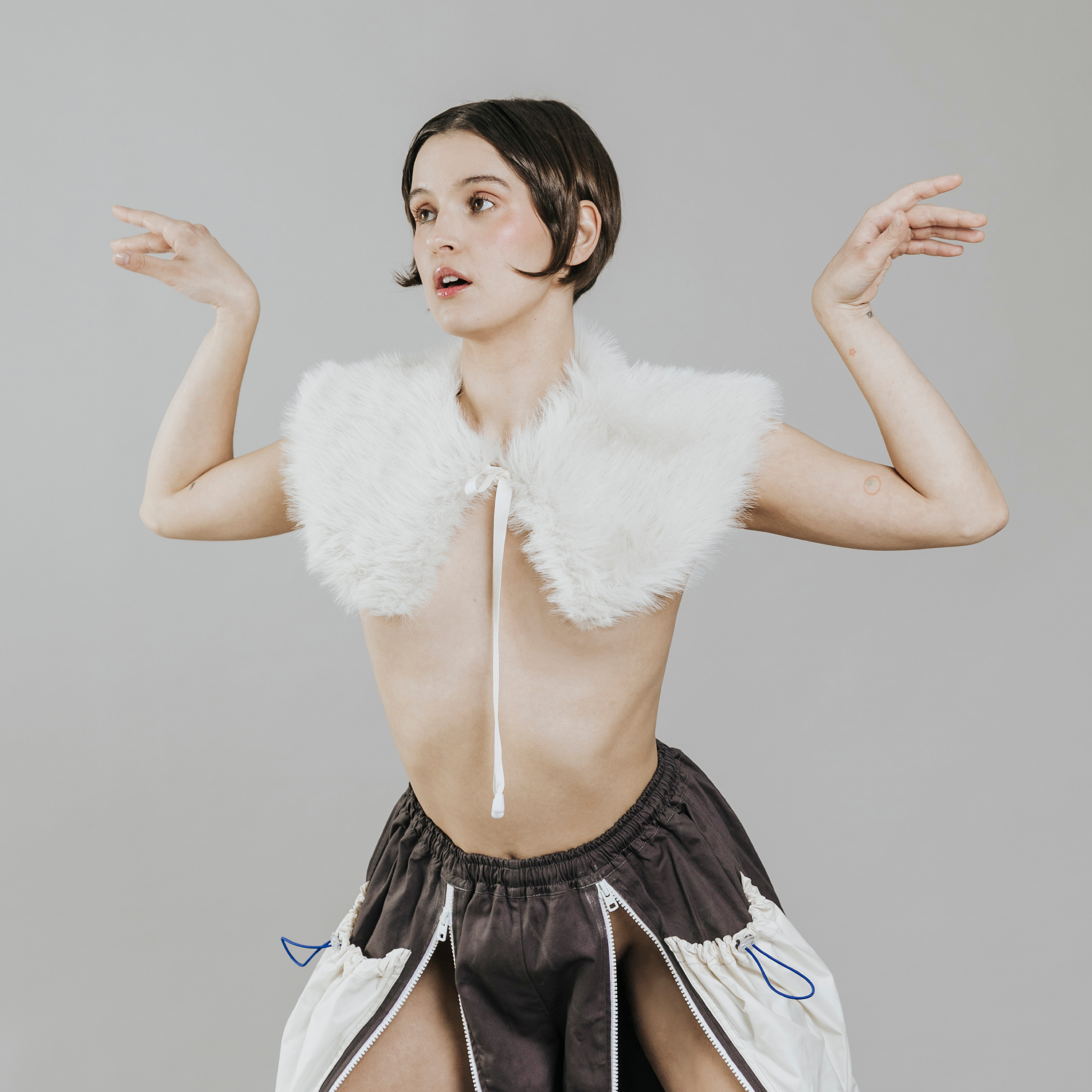
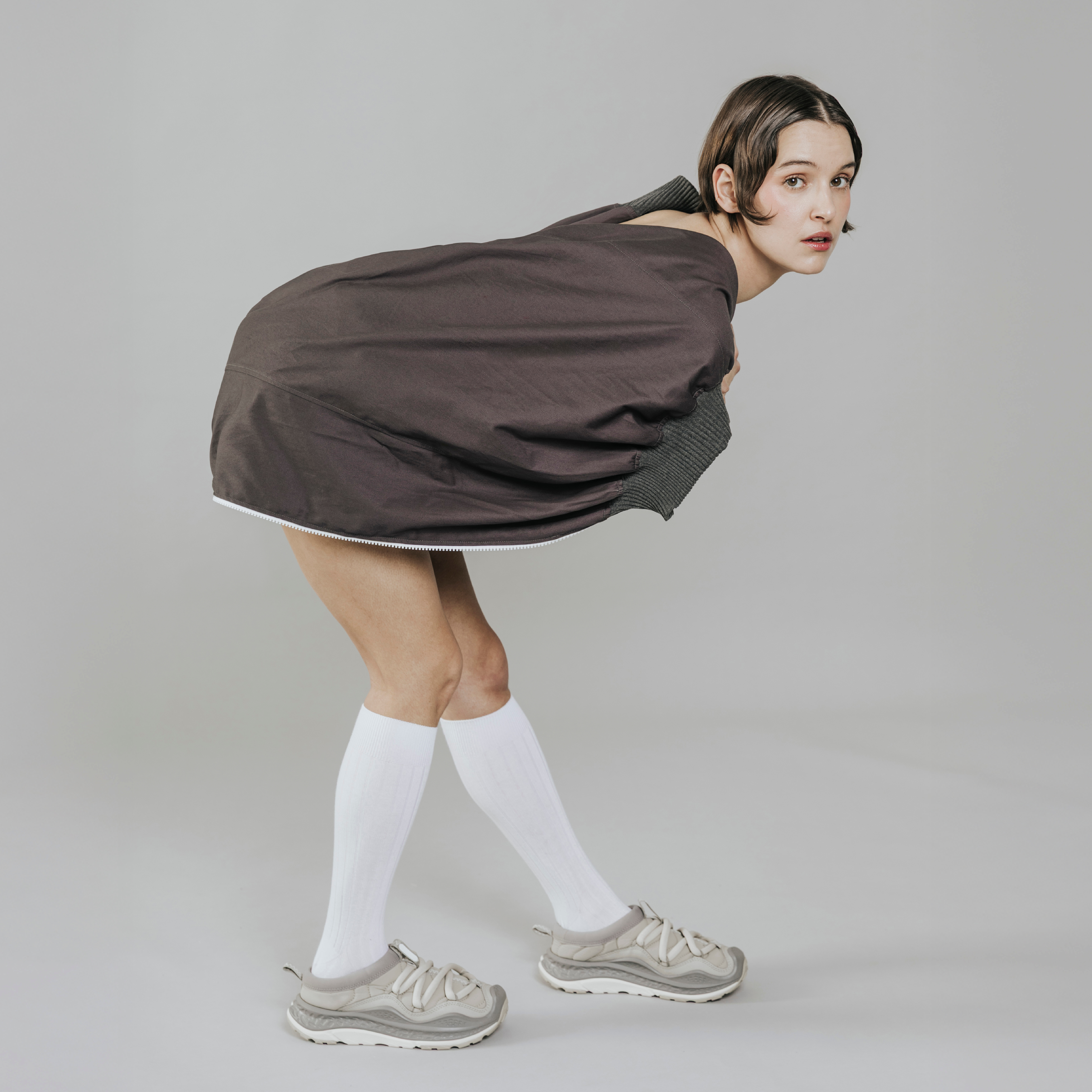
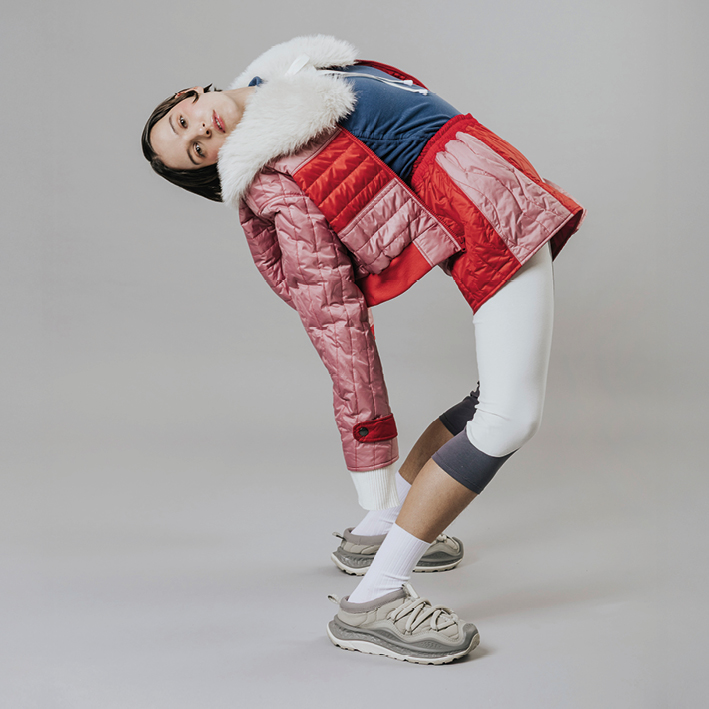
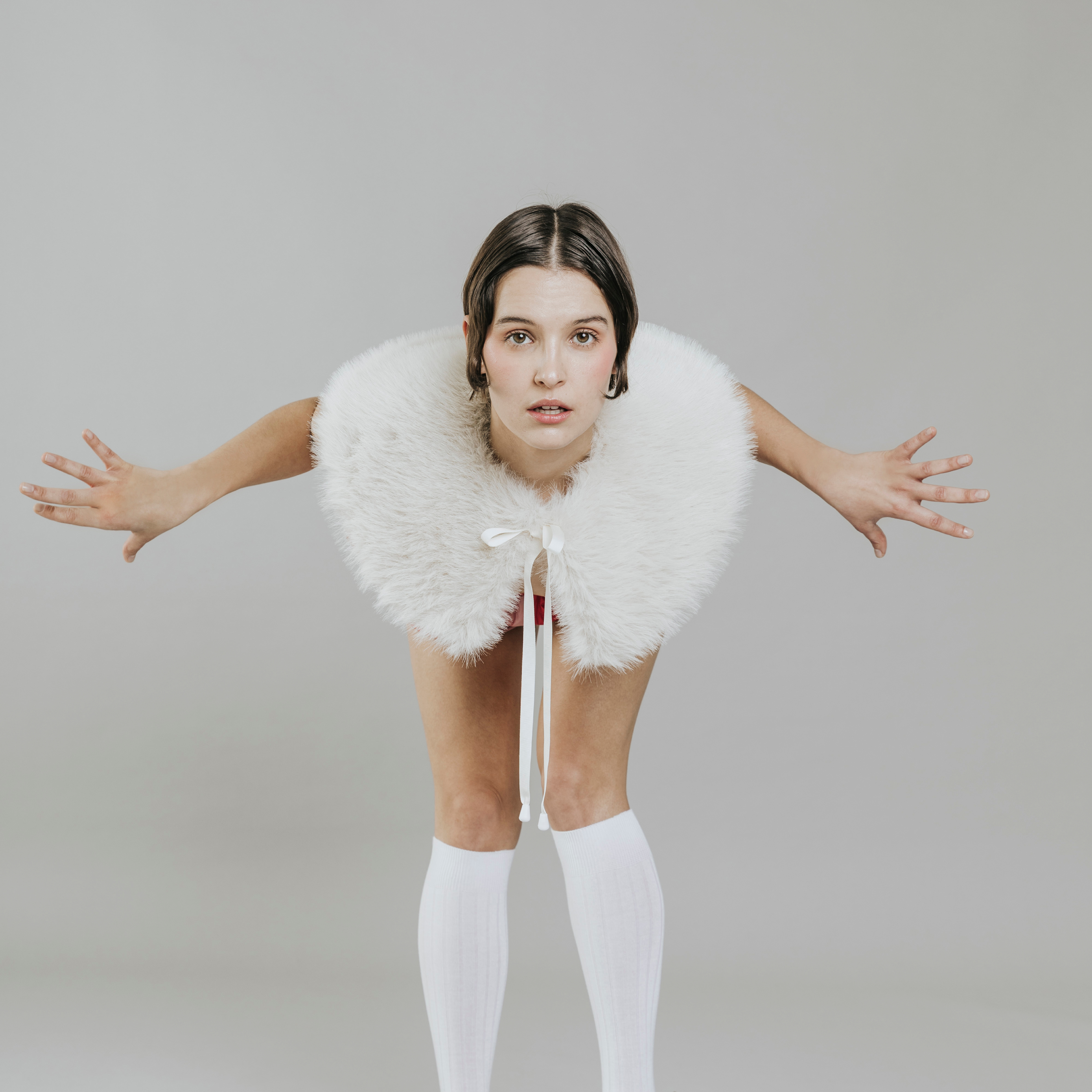
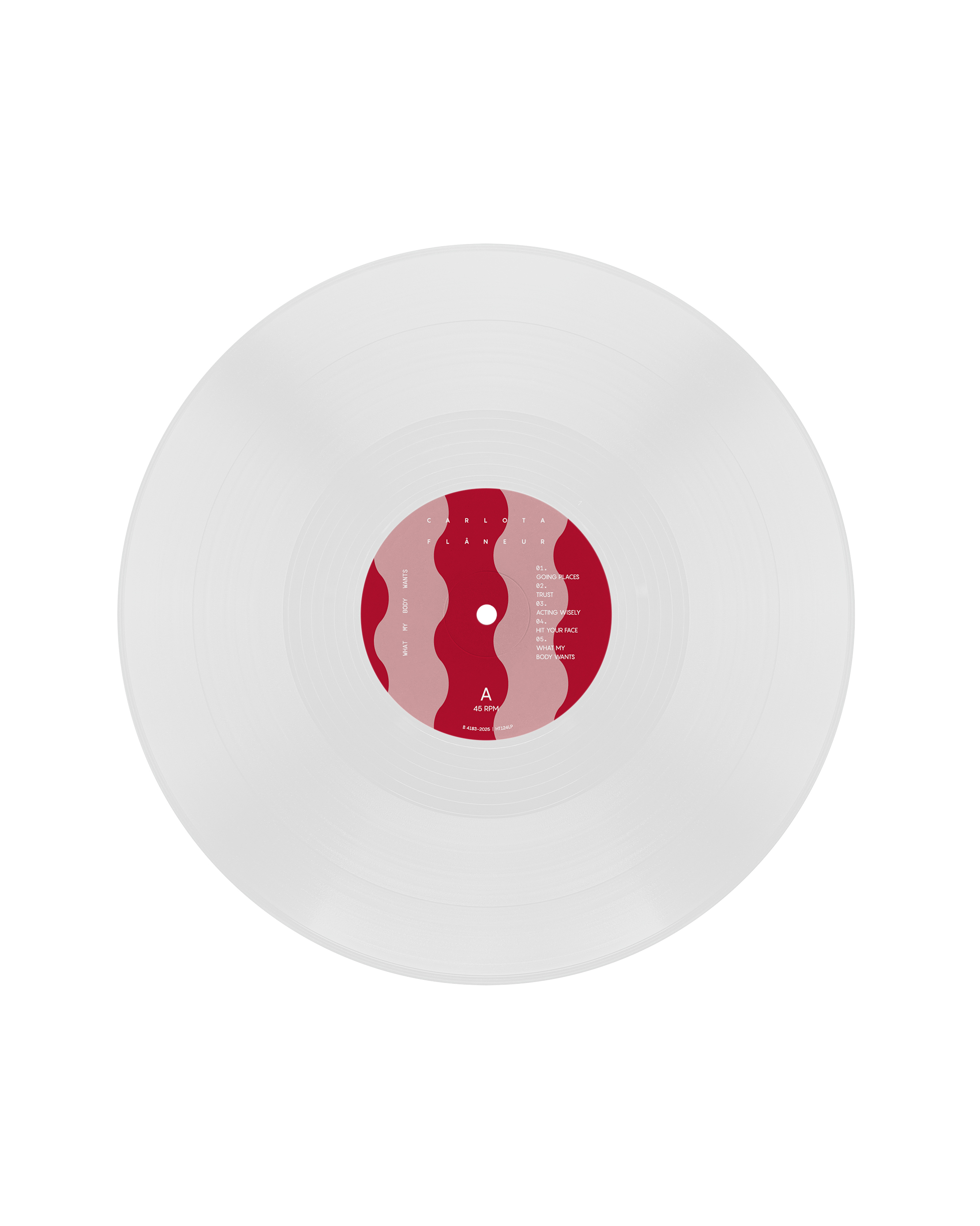
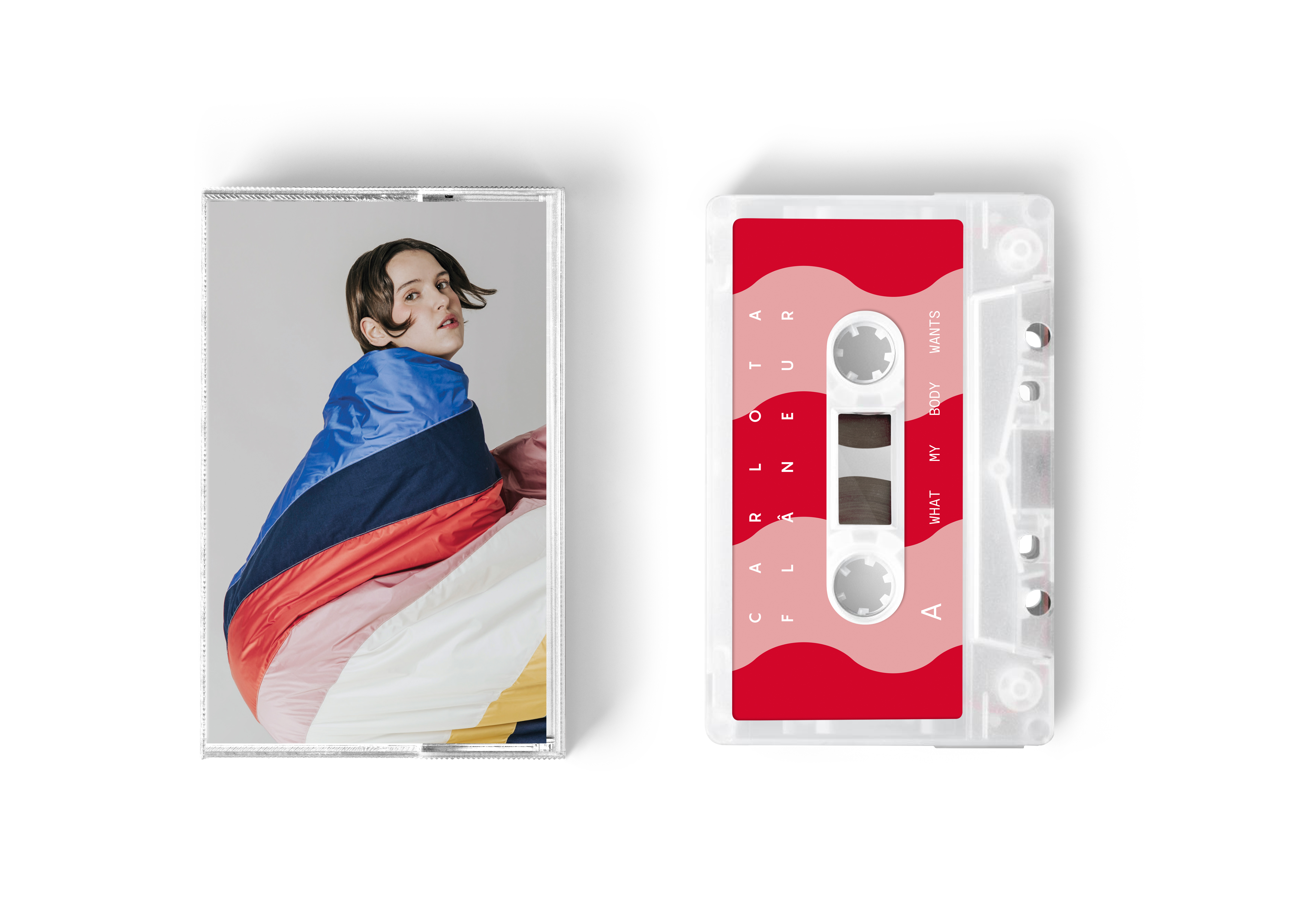
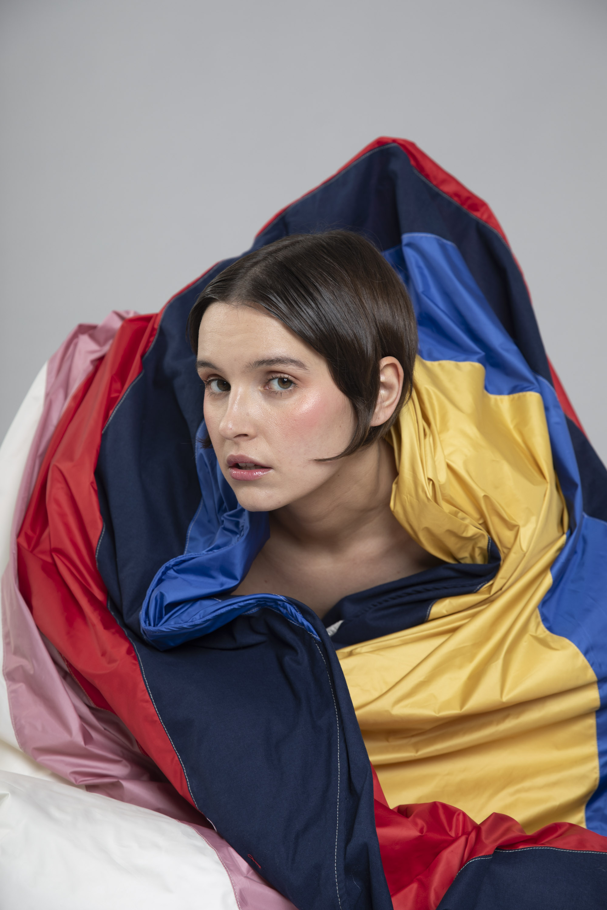
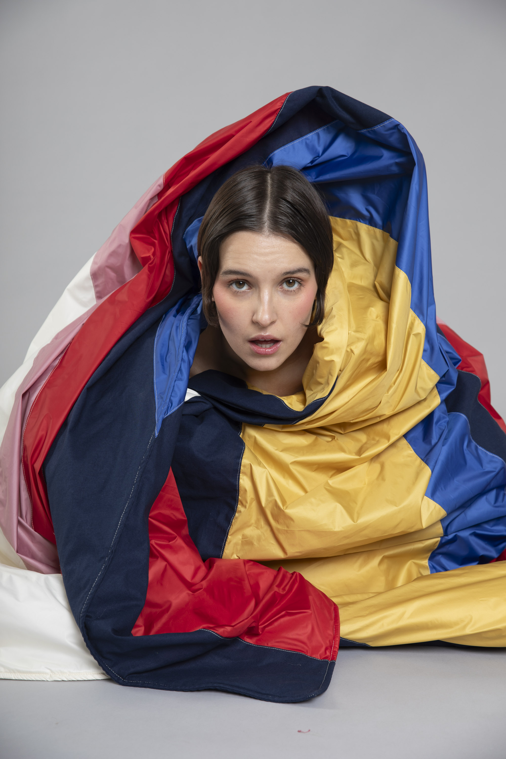
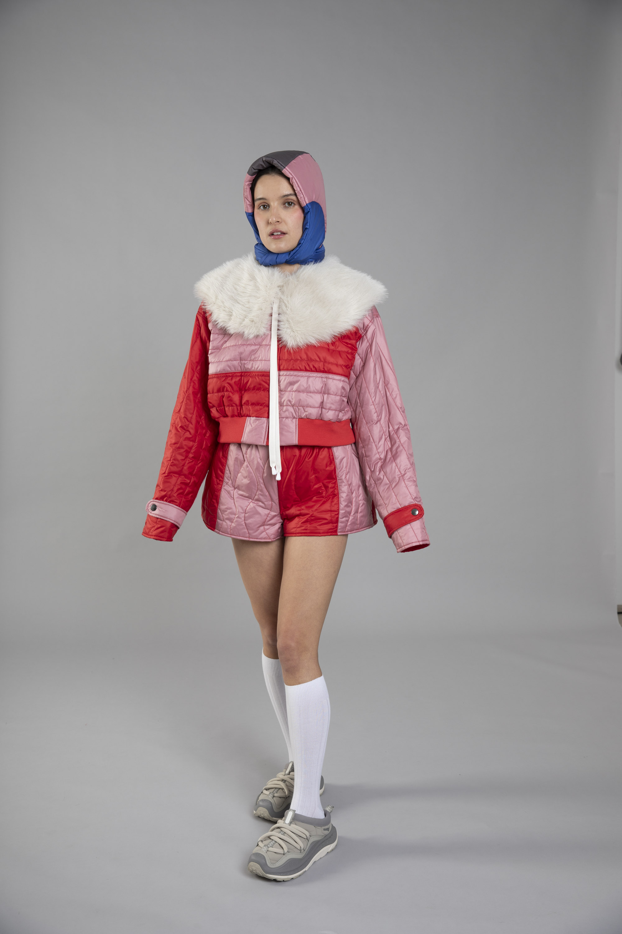
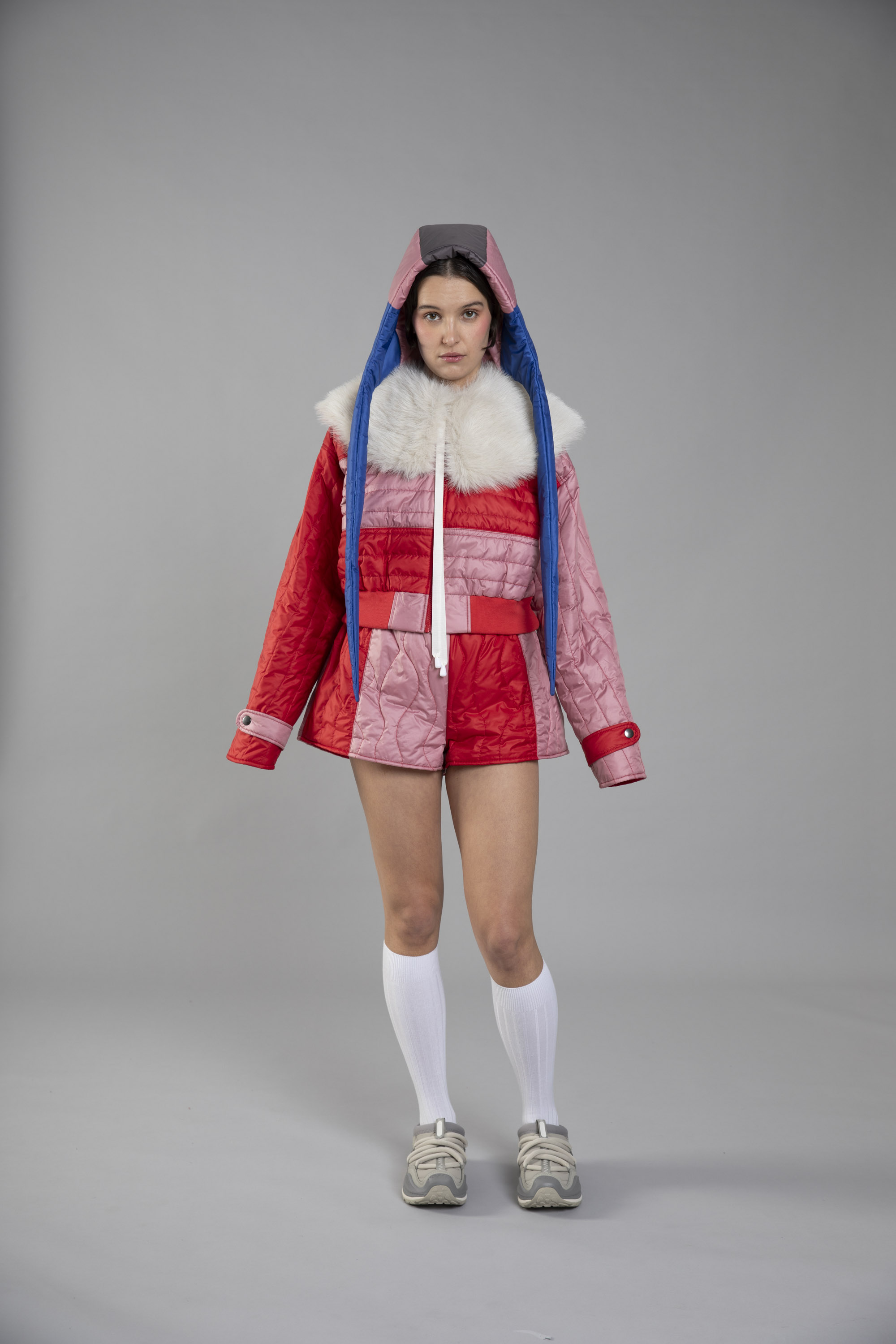
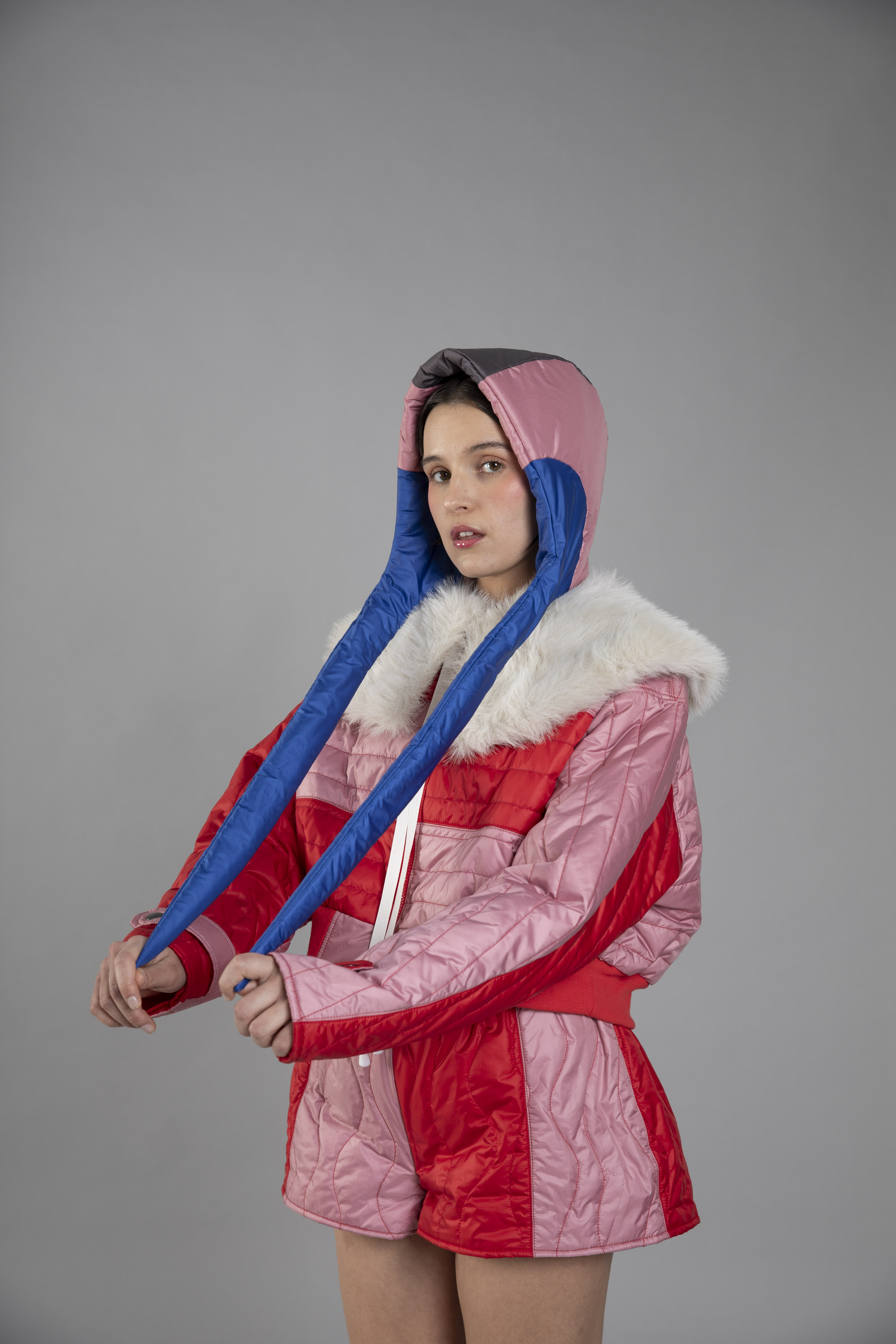
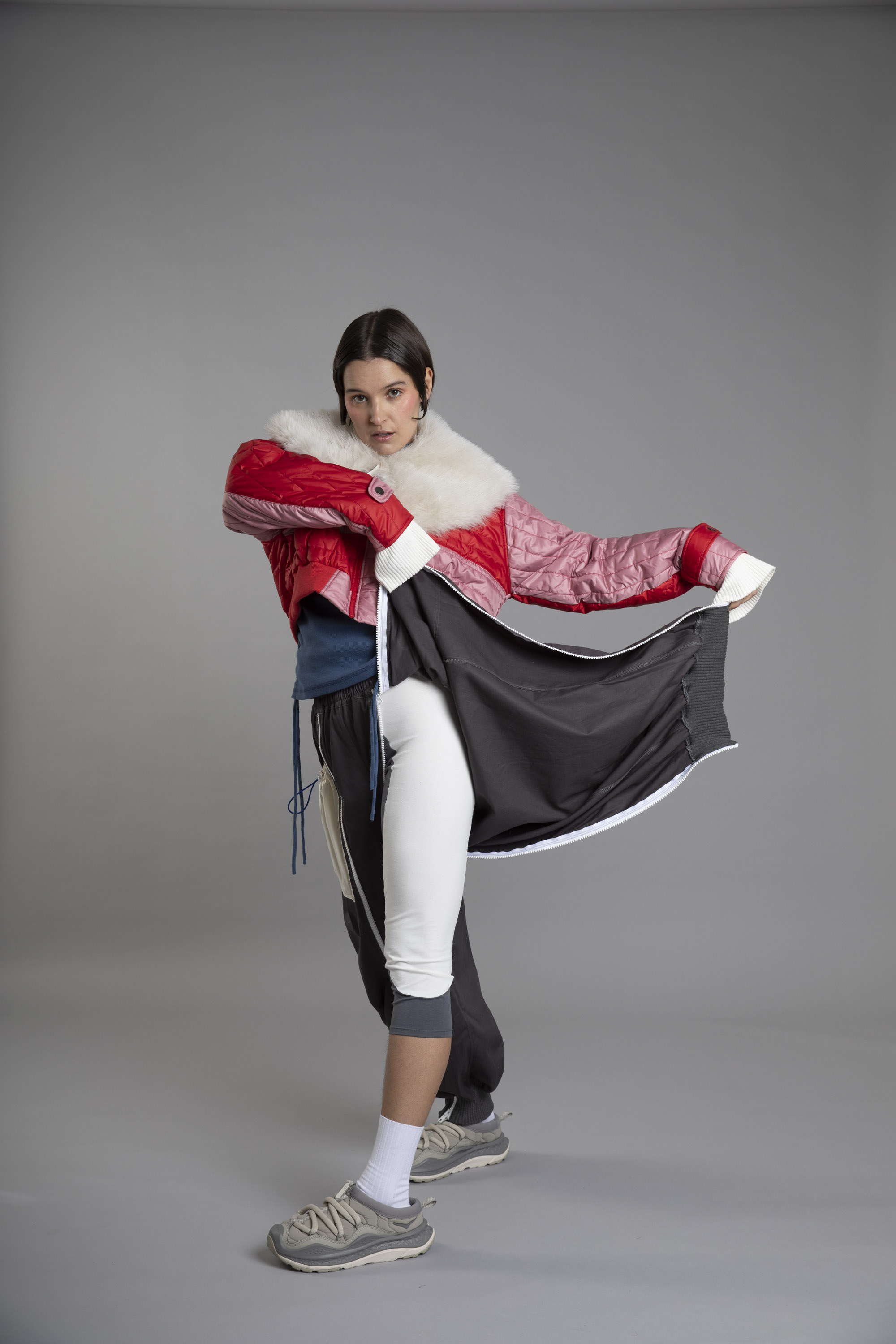
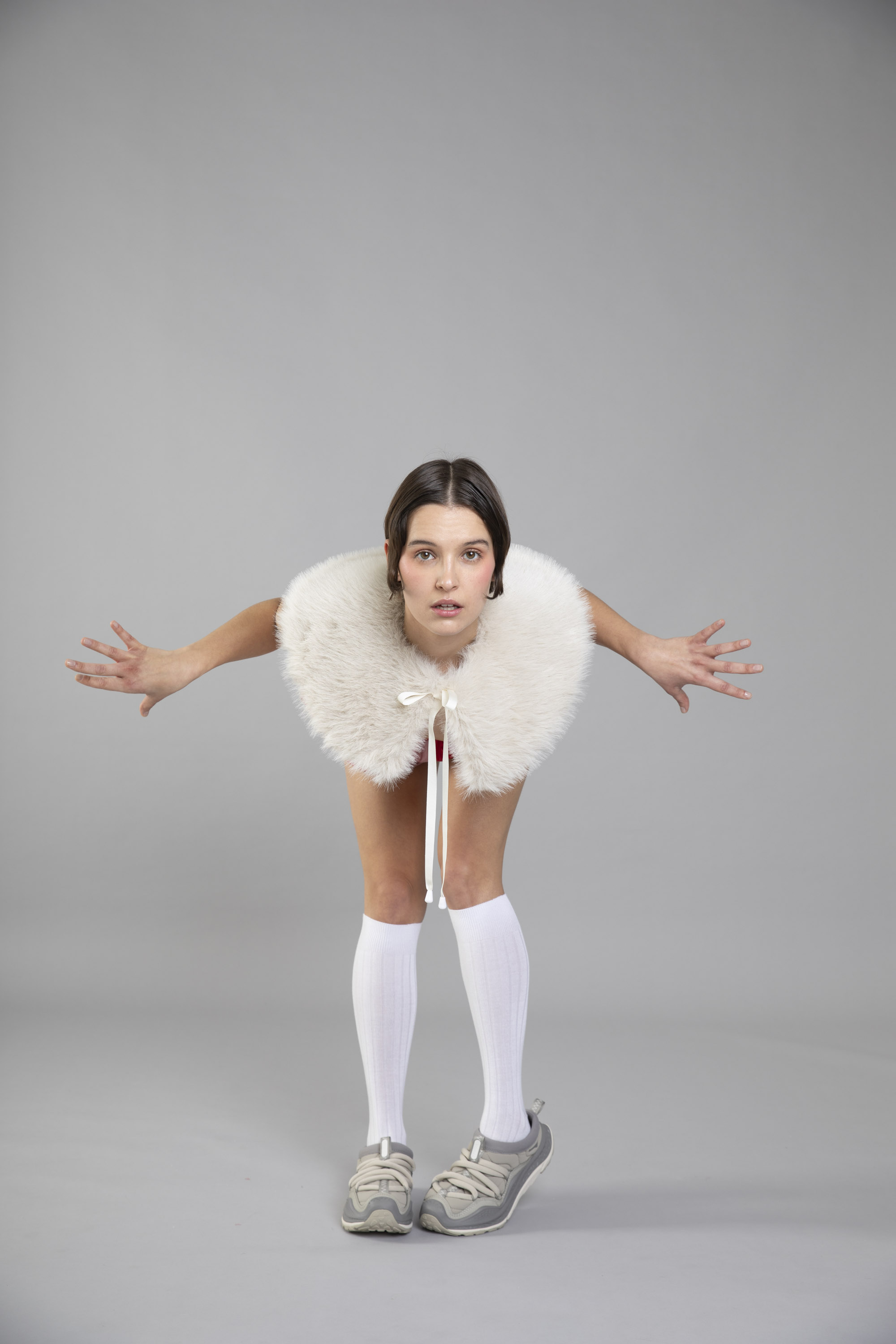
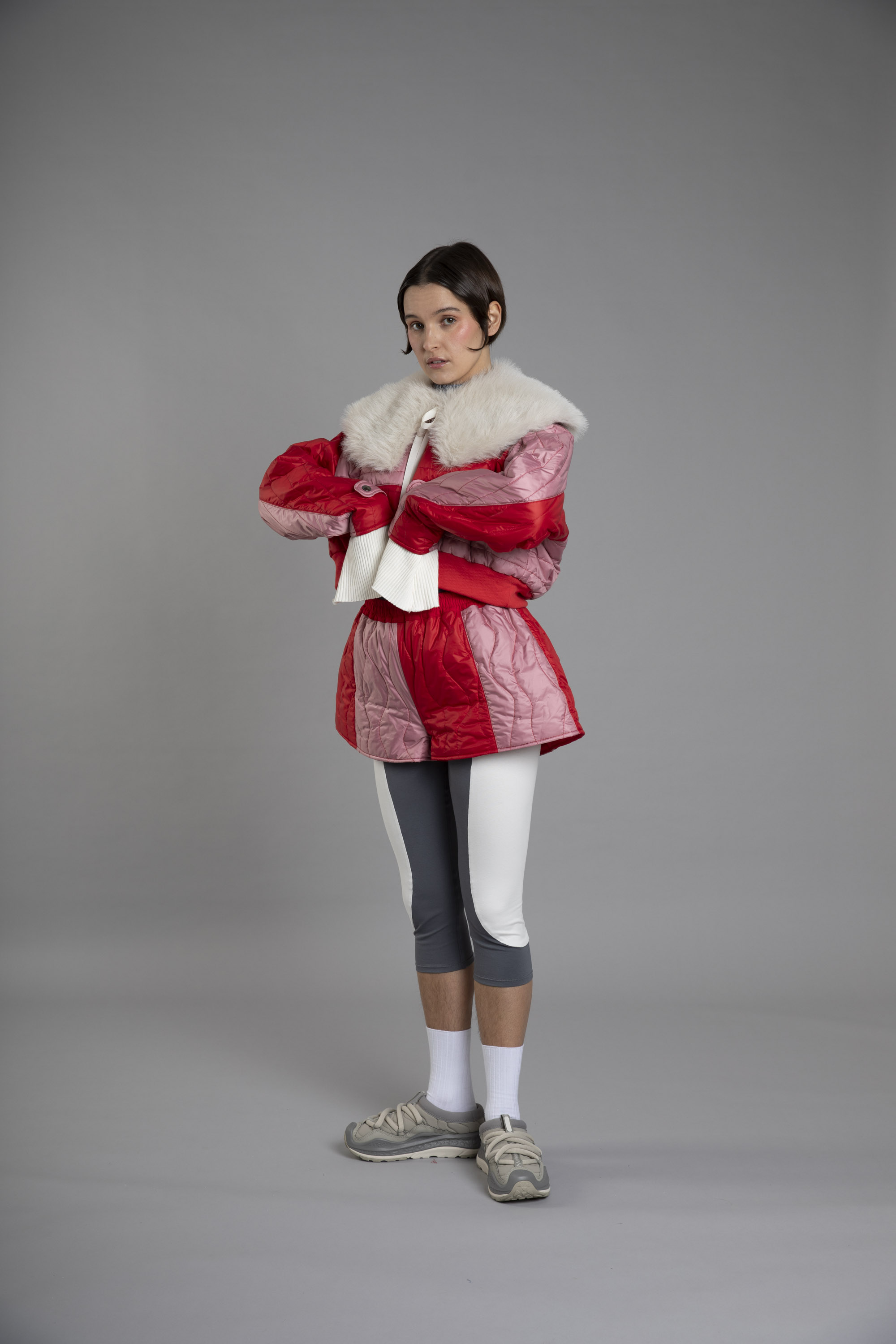
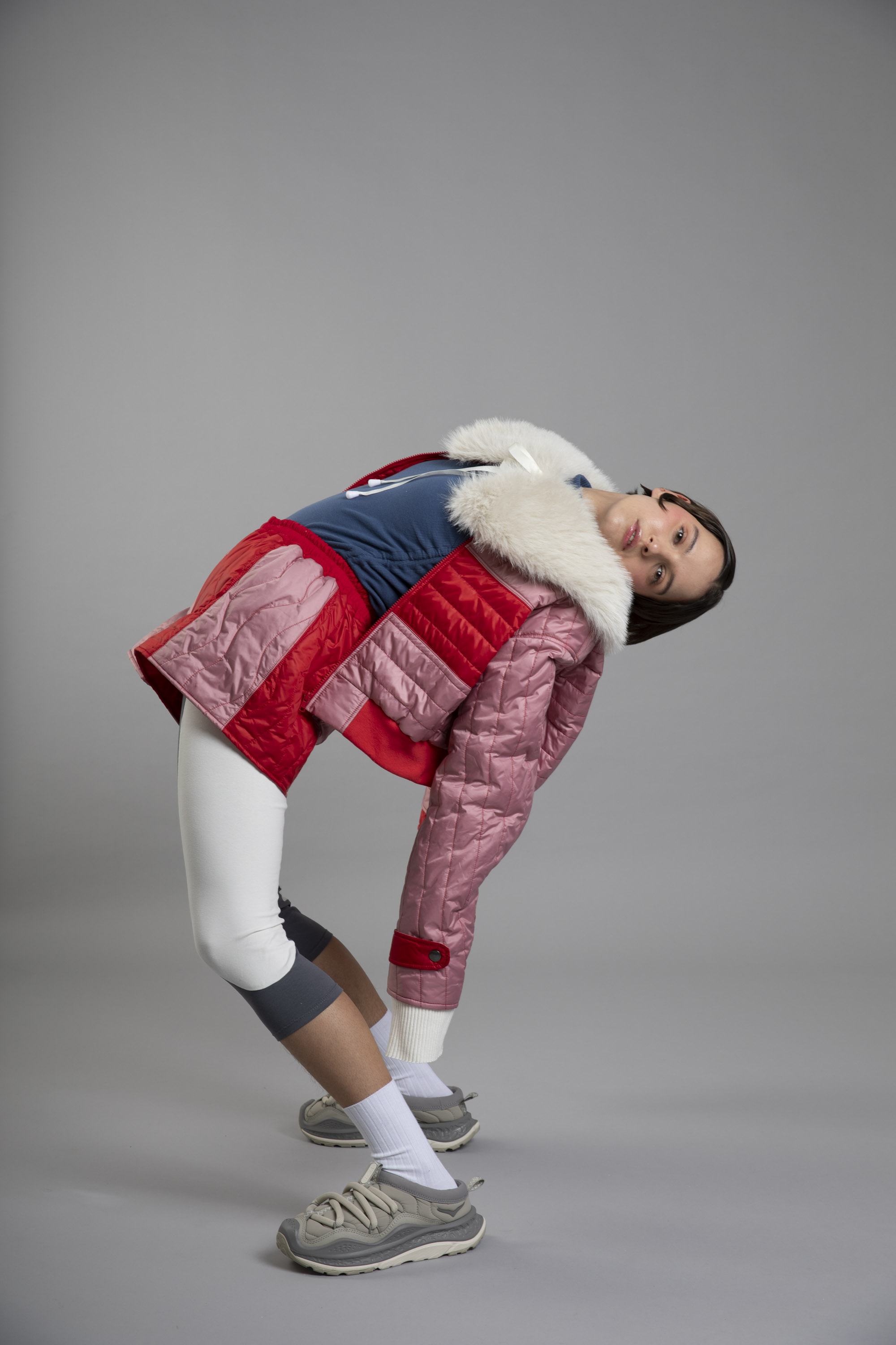
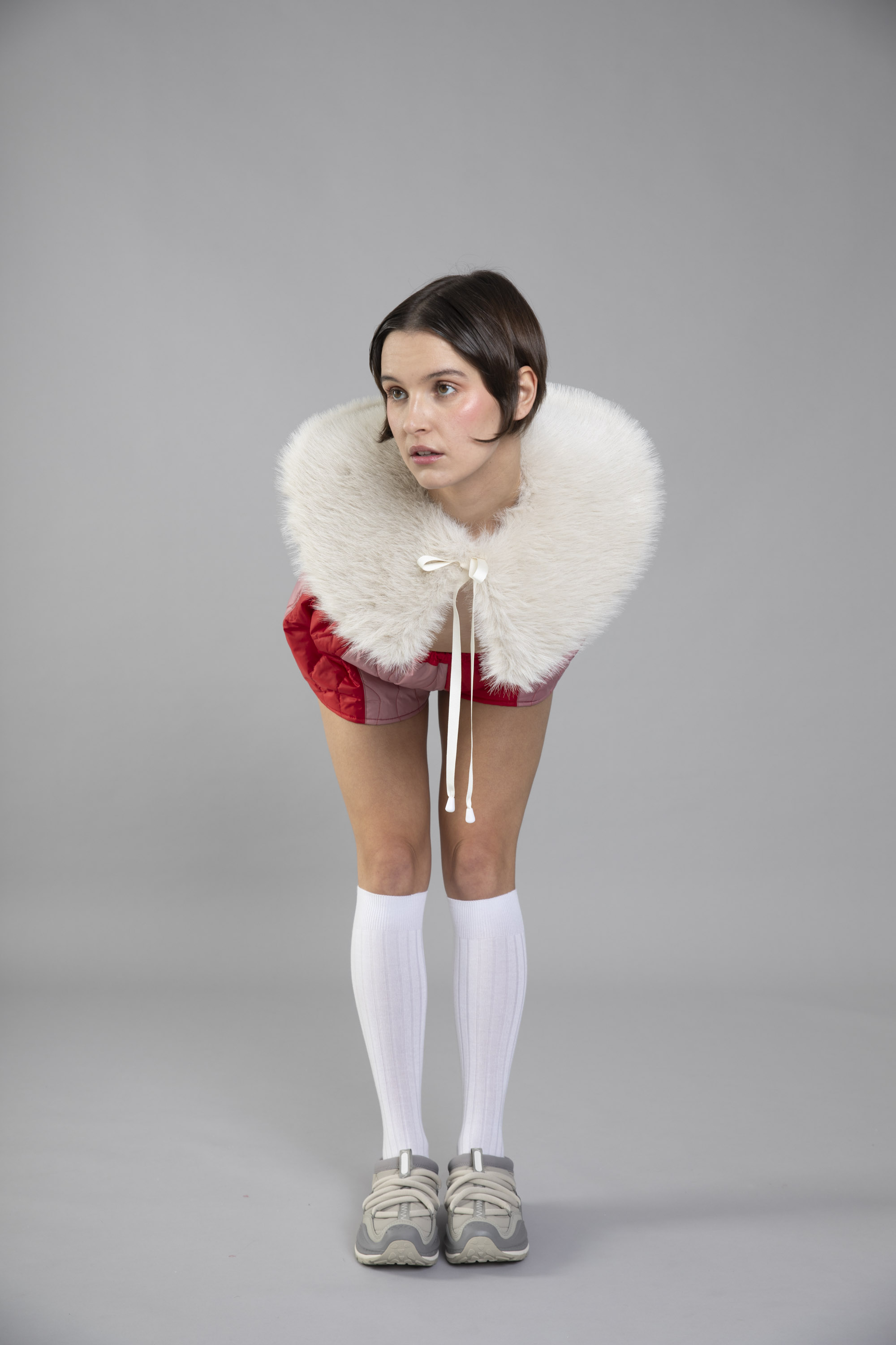
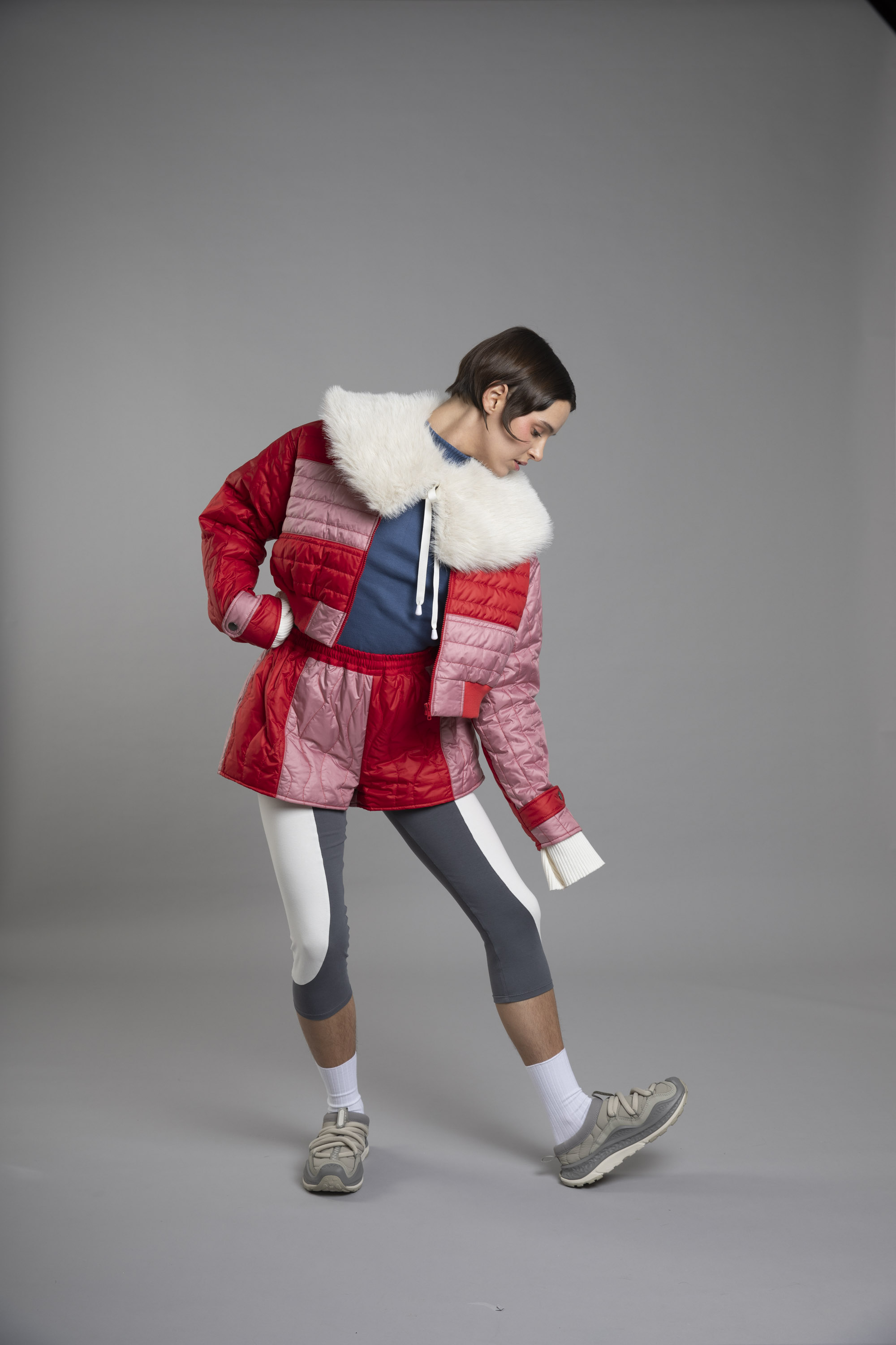
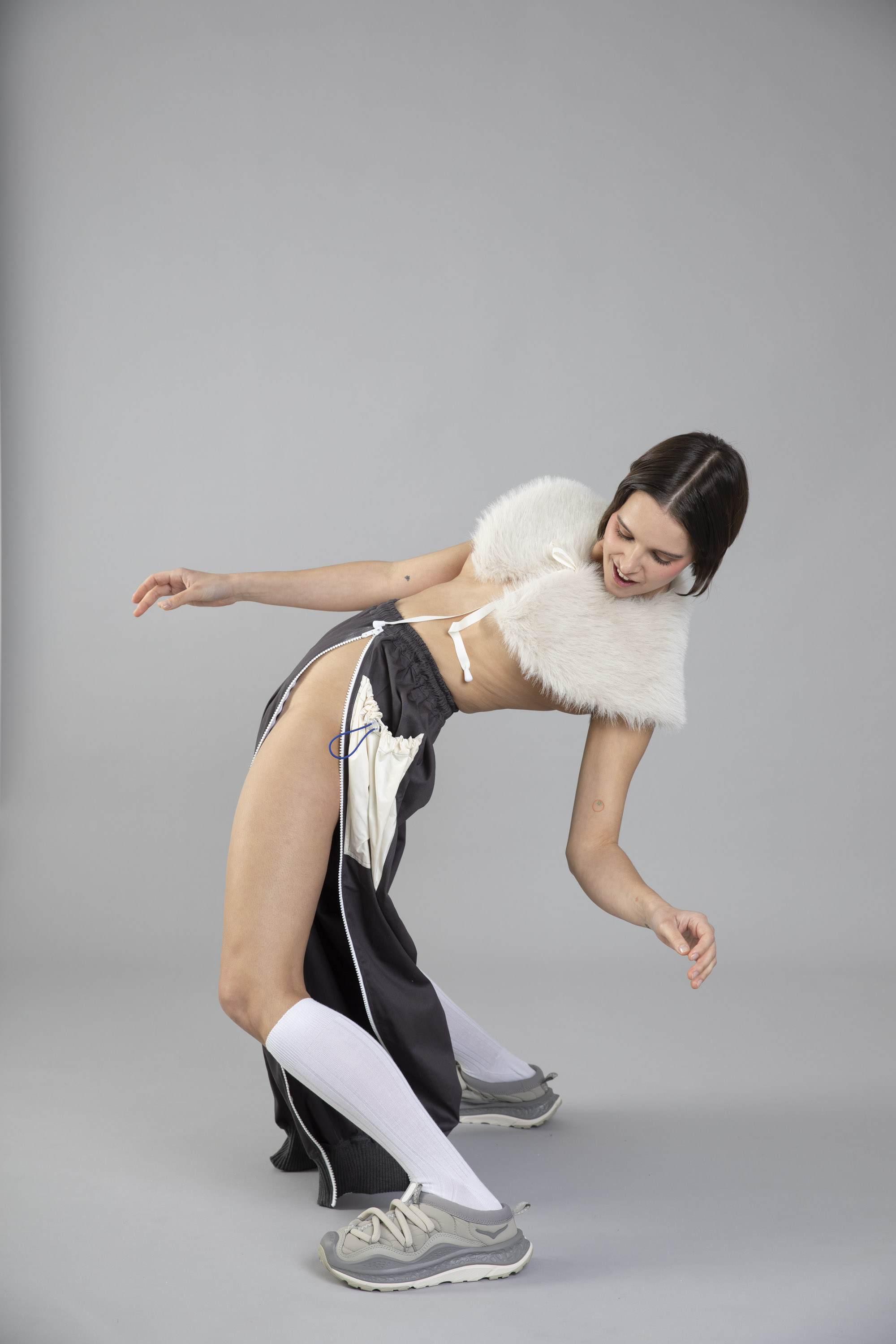
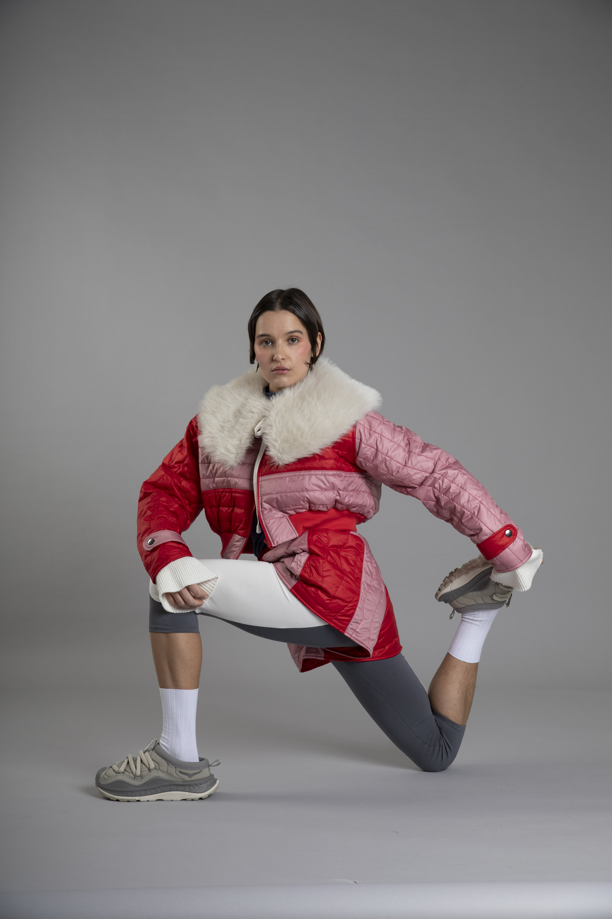
Concepte i disseny gràfic del segon àlbum de Carlota Flâneur “What my body wants”.
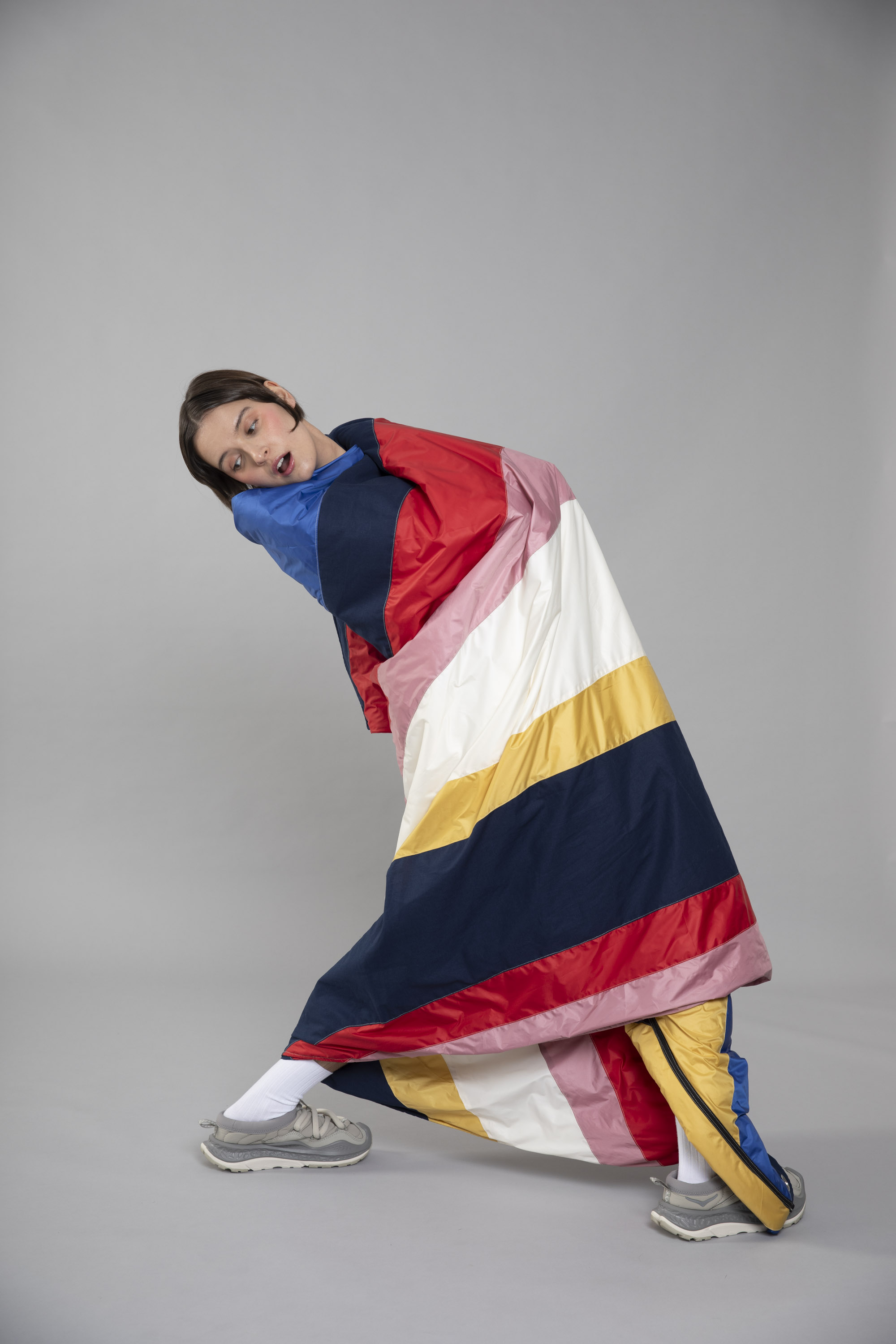
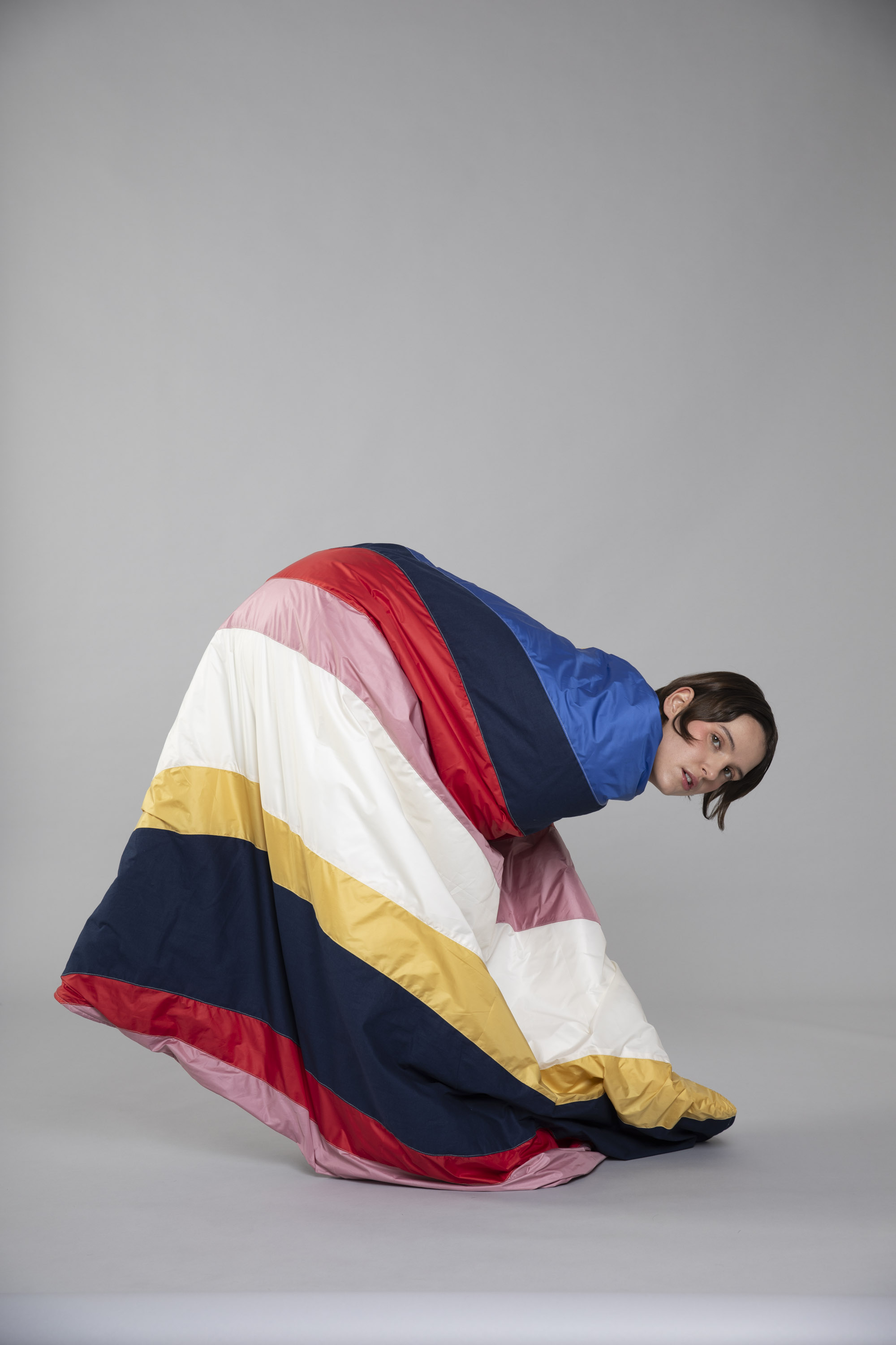
Creació d'un vestuari evolutiu i mutable basat en referències de Porco Rosso, Otaku i equips d'esqui dels 70's, amb certa estètica retrofuturista, on la cantant se sent còmoda i lliure, i on totes aquestes Carlotes que porta a dins tenen cabuda.
Creació d'un vestuari evolutiu i mutable basat en referències de Porco Rosso, Otaku i equips d'esqui dels 70's, amb certa estètica retrofuturista, on la cantant se sent còmoda i lliure, i on totes aquestes Carlotes que porta a dins tenen cabuda.
Singles: Party & Lungs
![]()
![]()
![]()
![]()
CD i llibret
Vinil


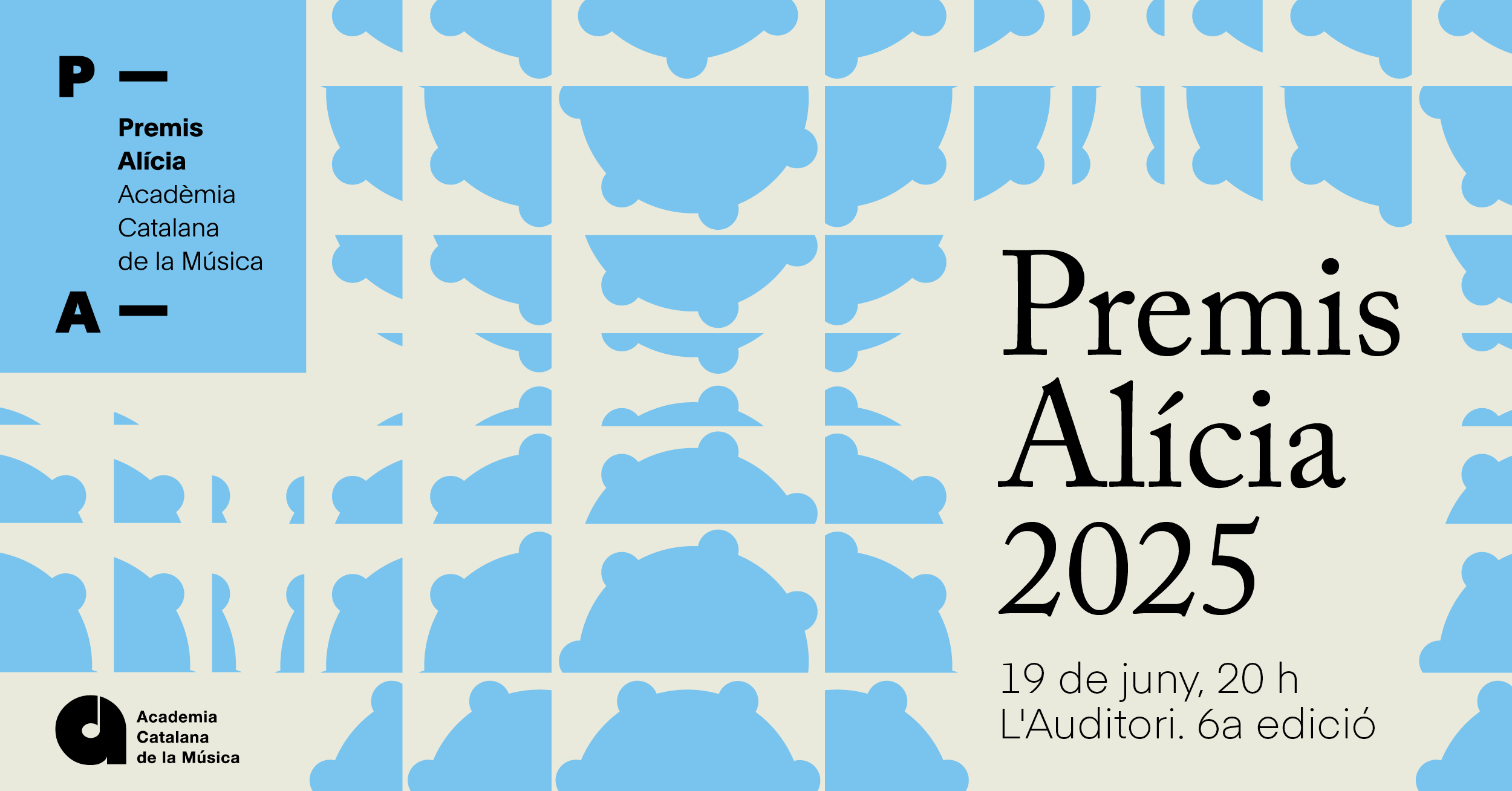
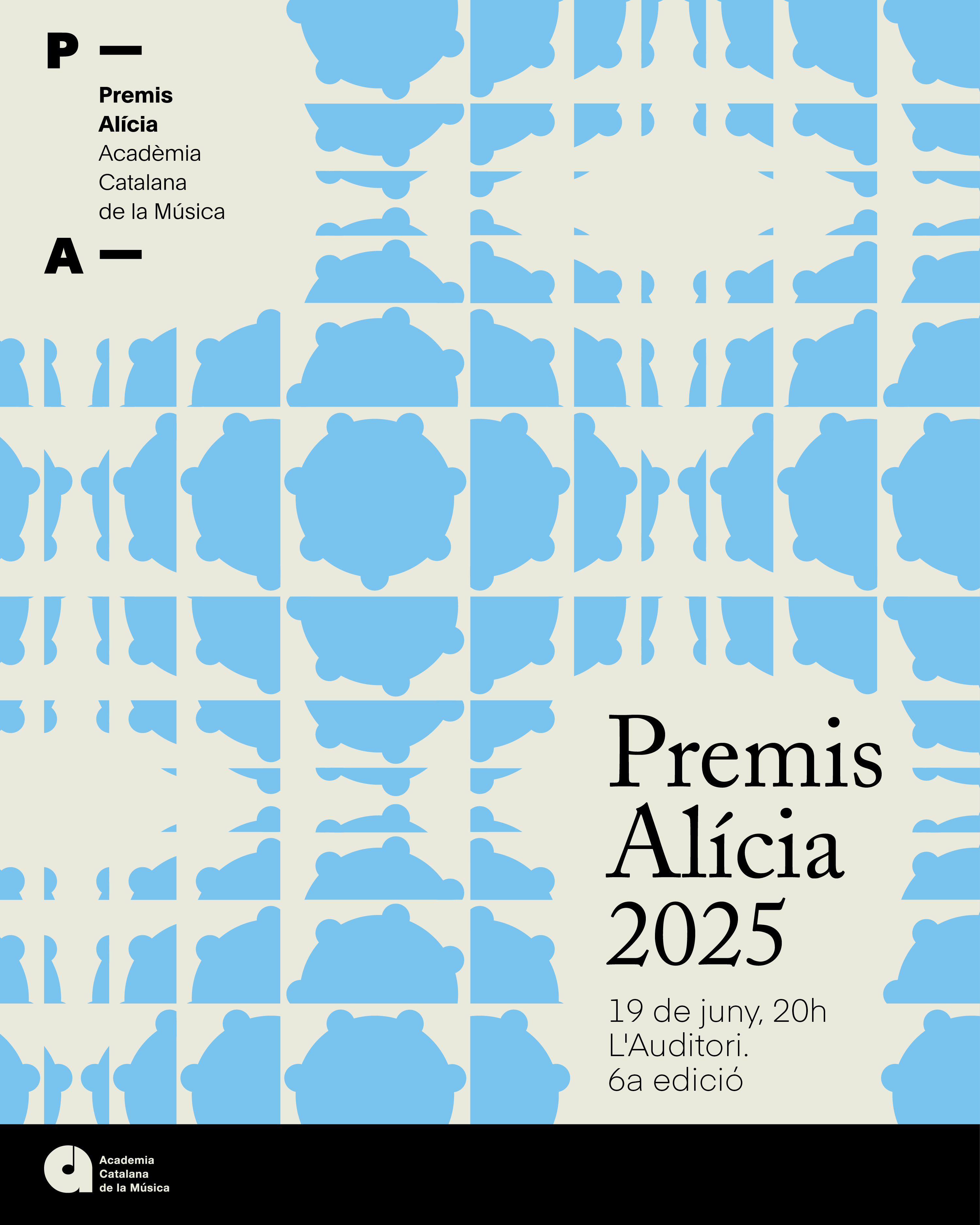
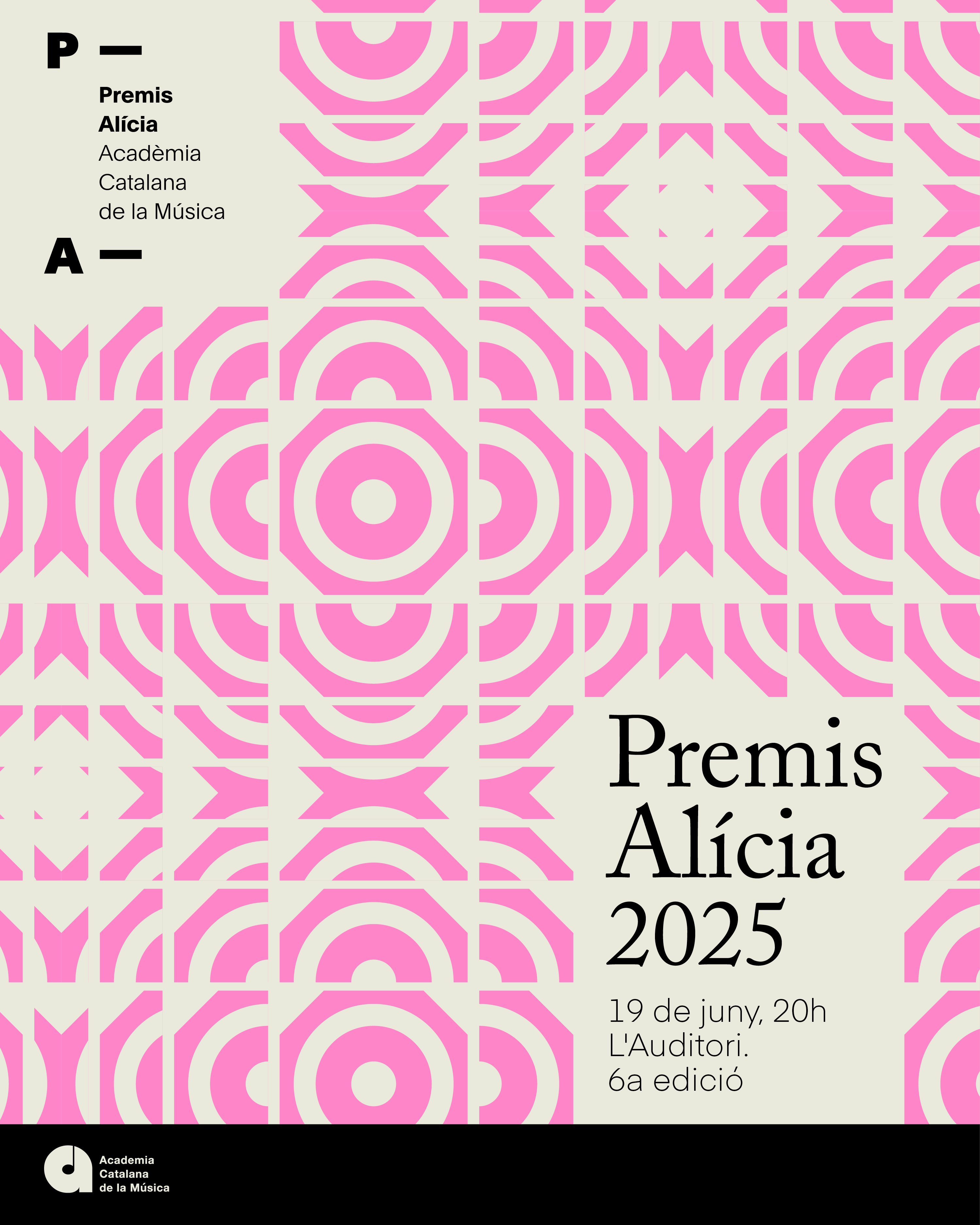
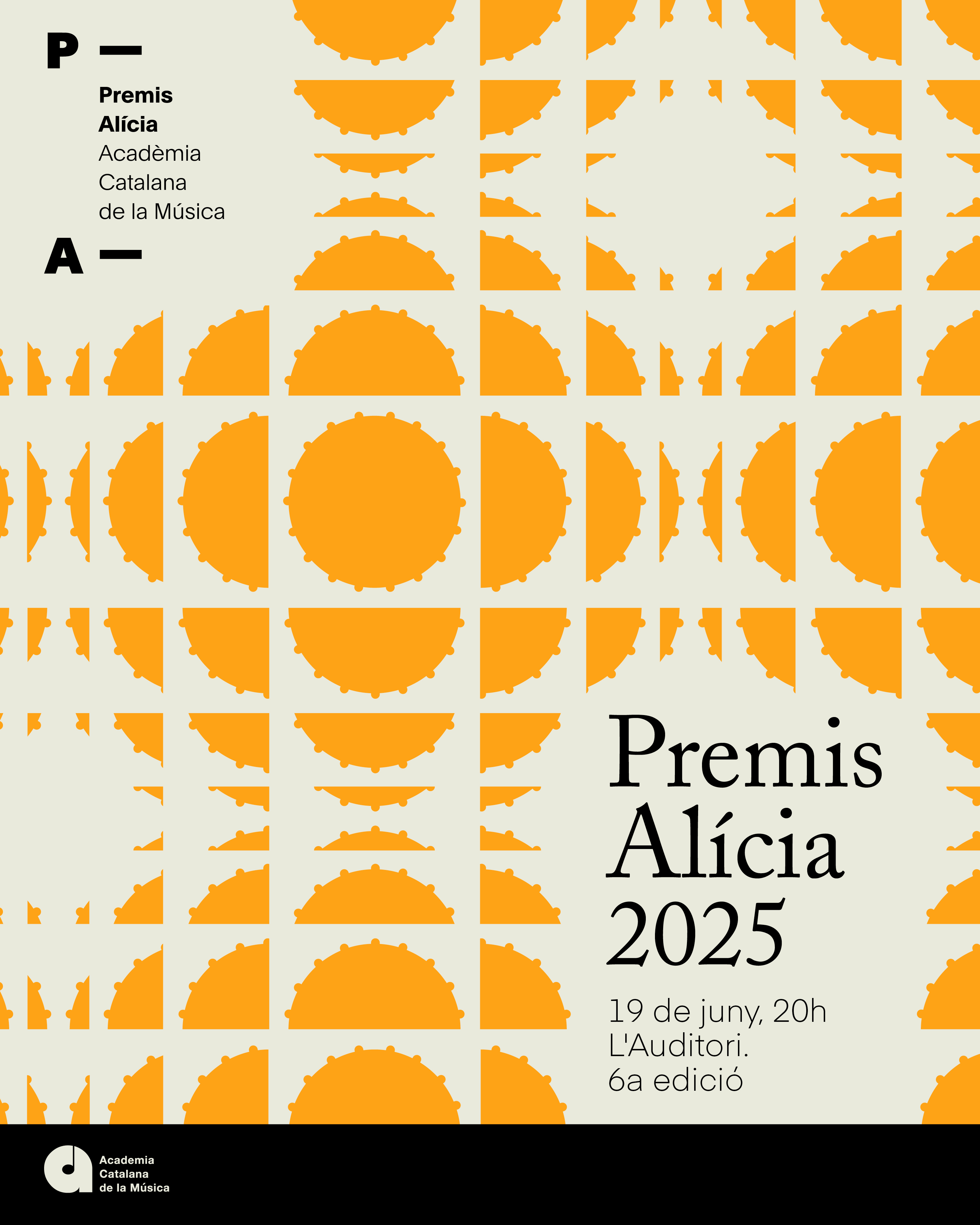
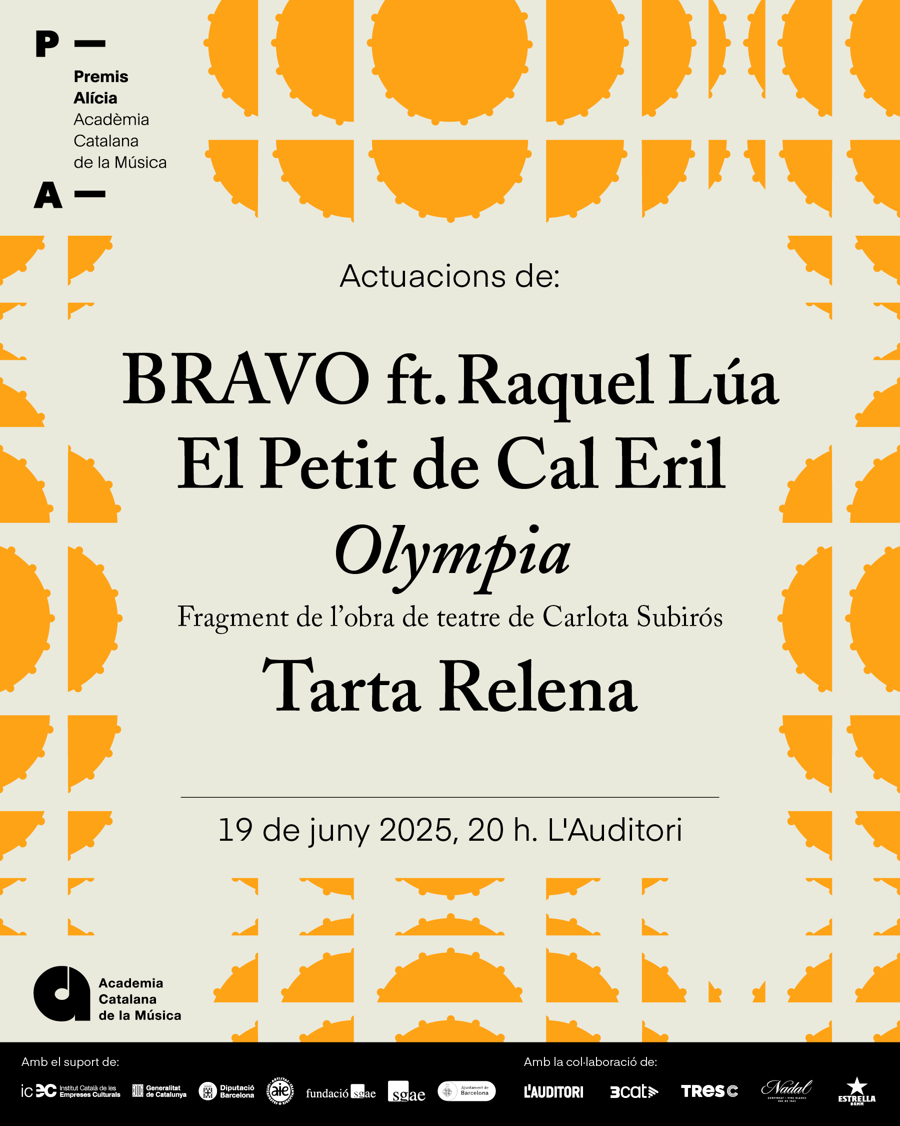
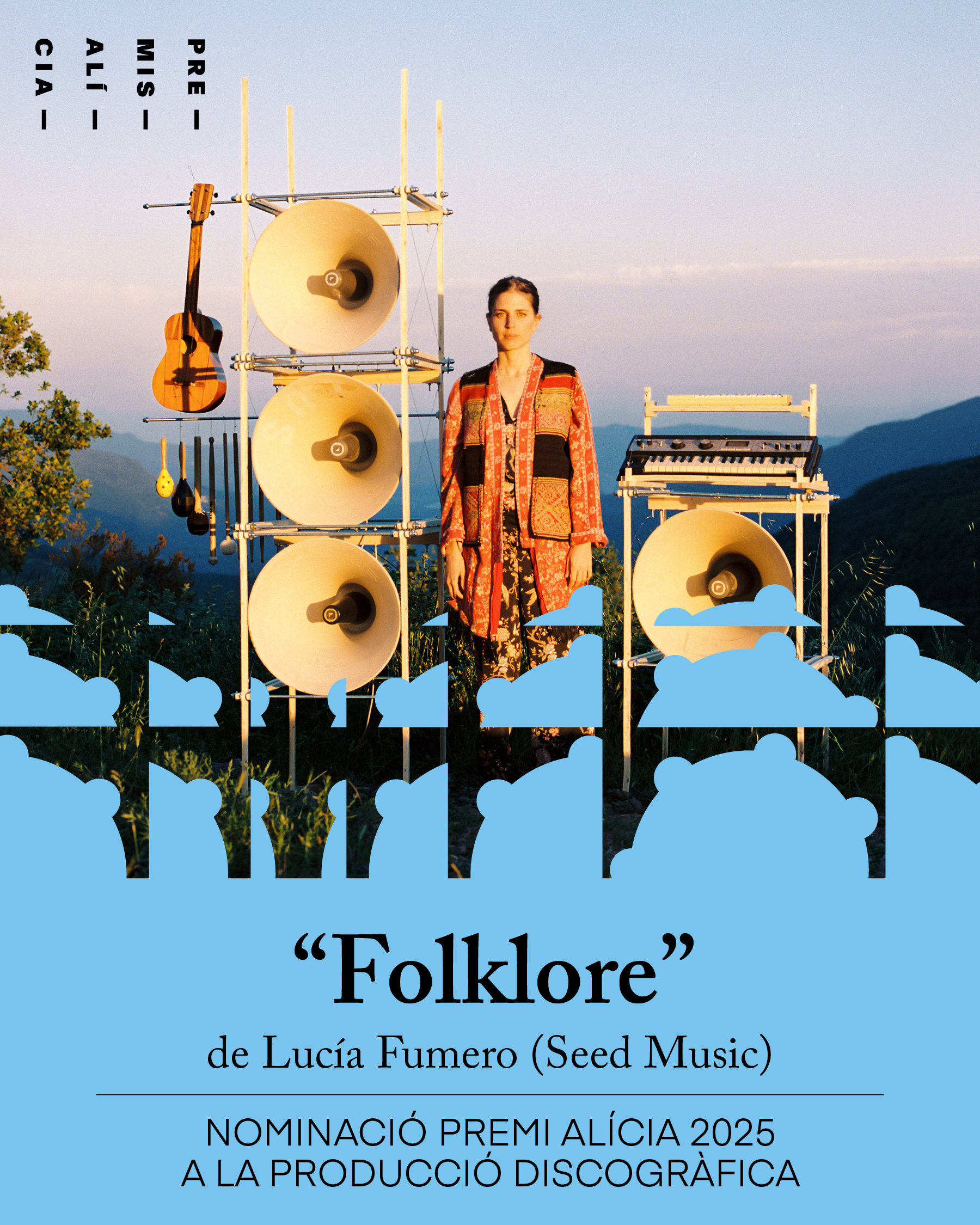
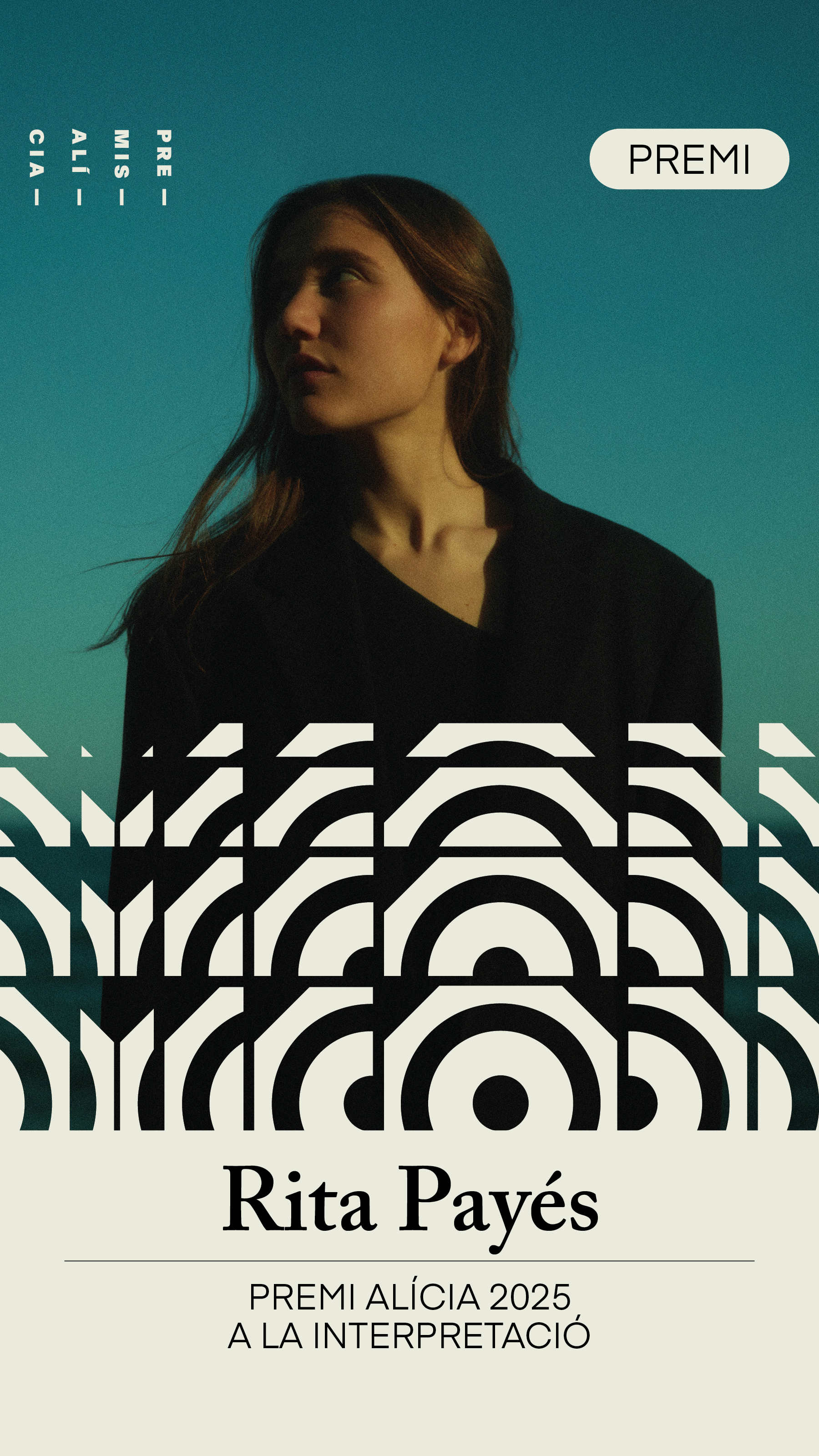
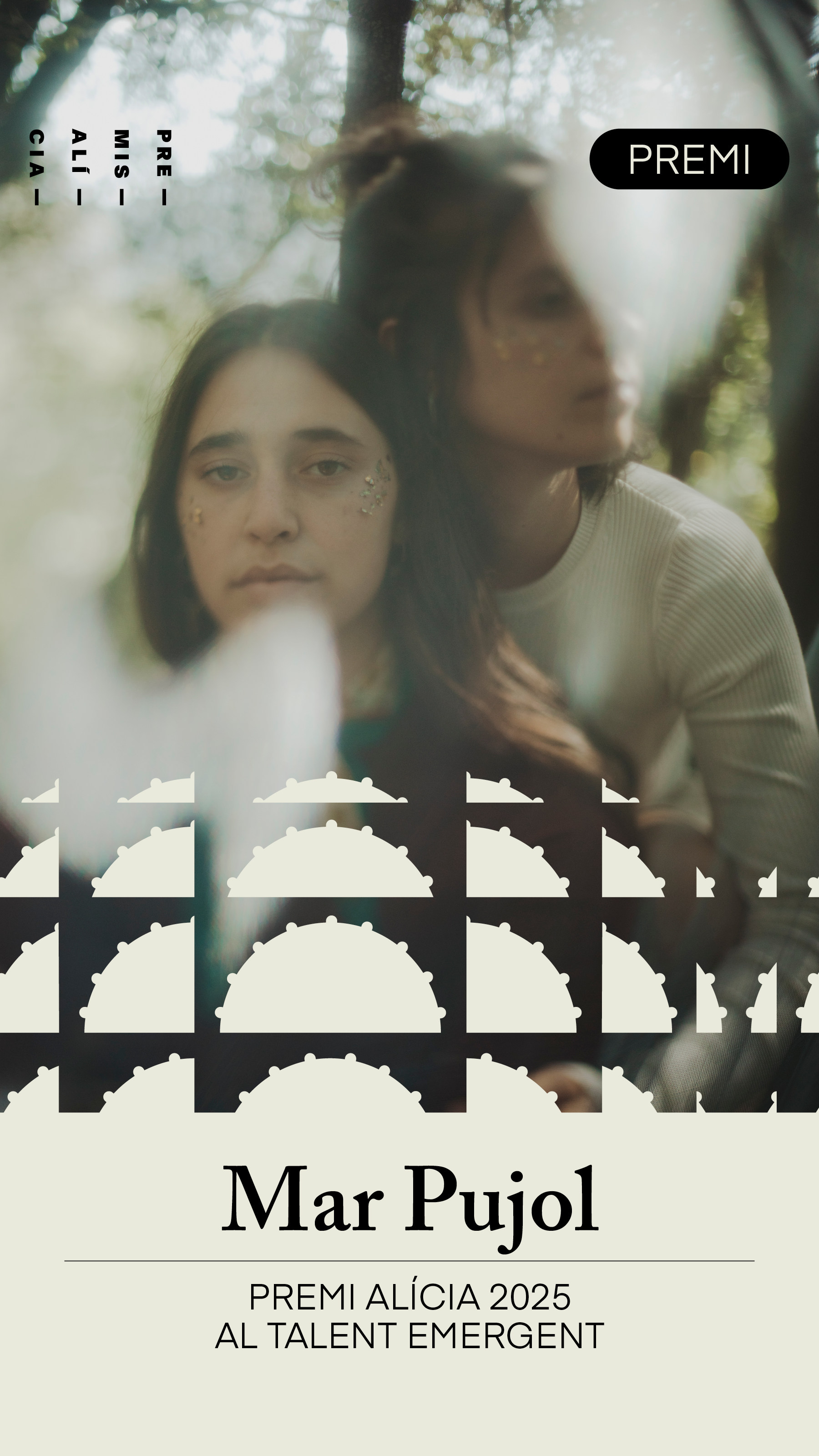
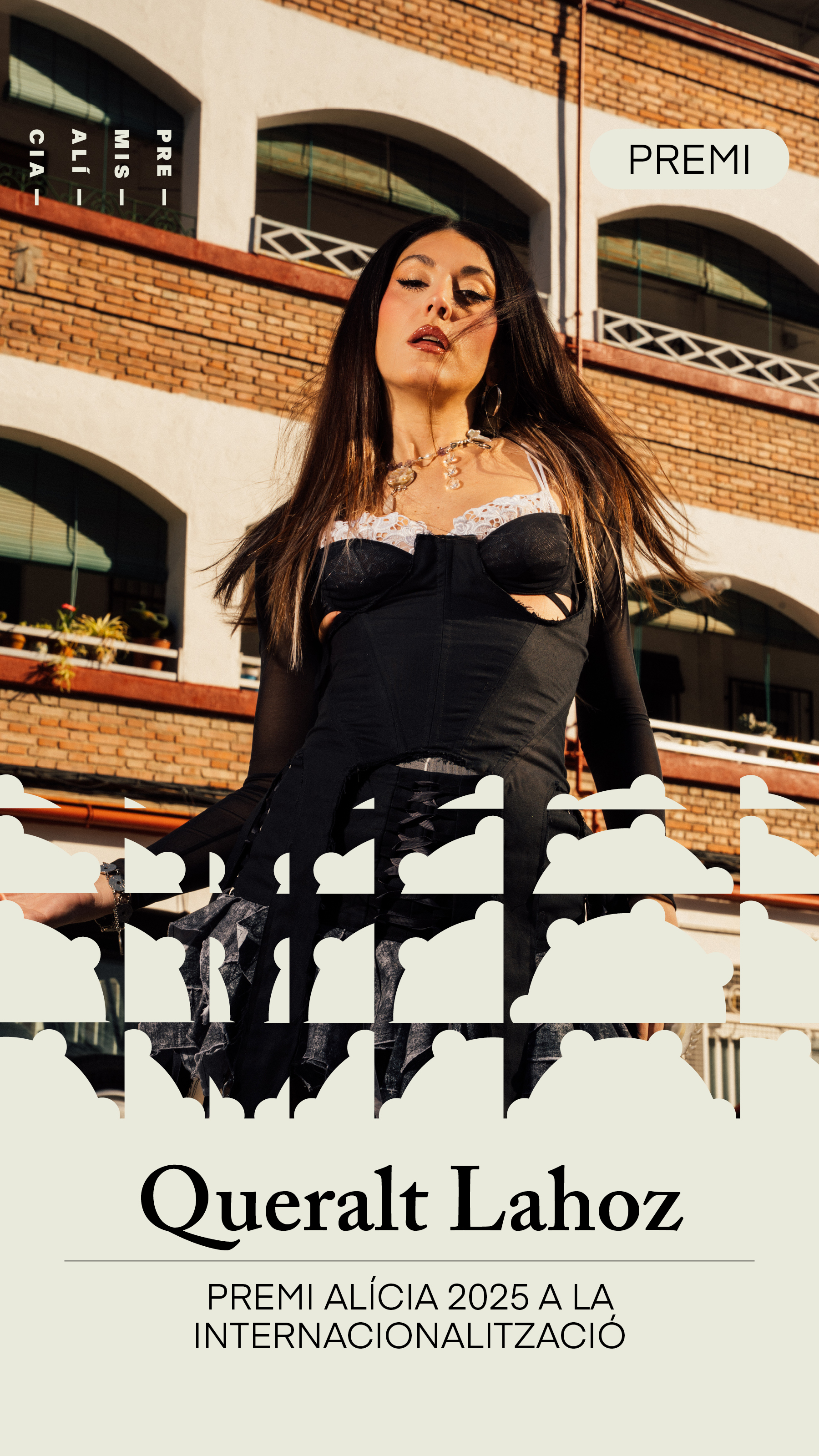
Premis Alícia 2025
Client: Acadèmia Catalana de la Música
Serveis: Branding | Esdeveniment | Identitat visual | Direcció artística | Disseny gràfic | Xarxes socials | Photocall
Serveis: Branding | Esdeveniment | Identitat visual | Direcció artística | Disseny gràfic | Xarxes socials | Photocall
Branding i disseny gràfic per als Premis Alícia 2025 que organitza anualment l’Acadèmia Catalana de la Música.


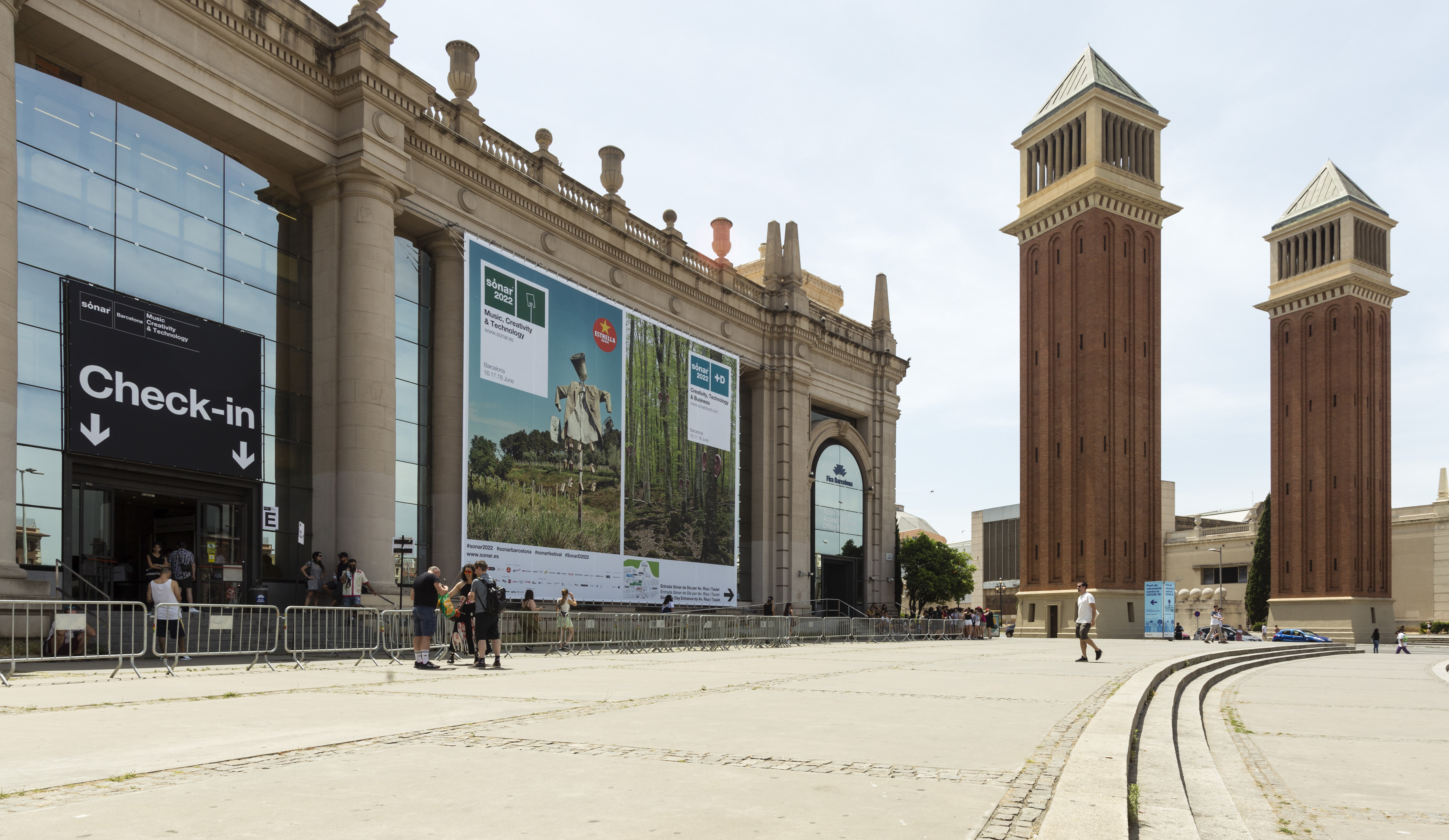
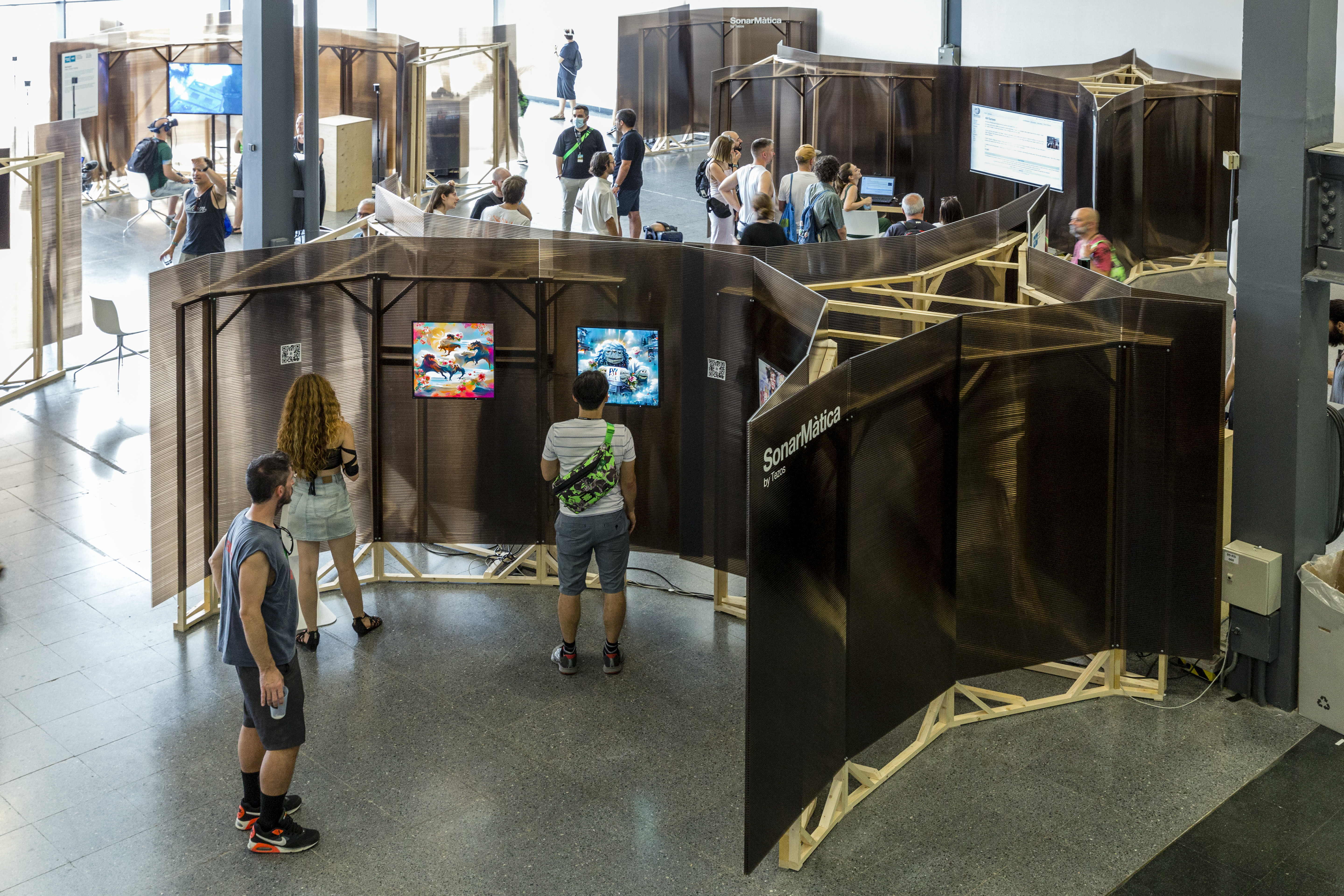
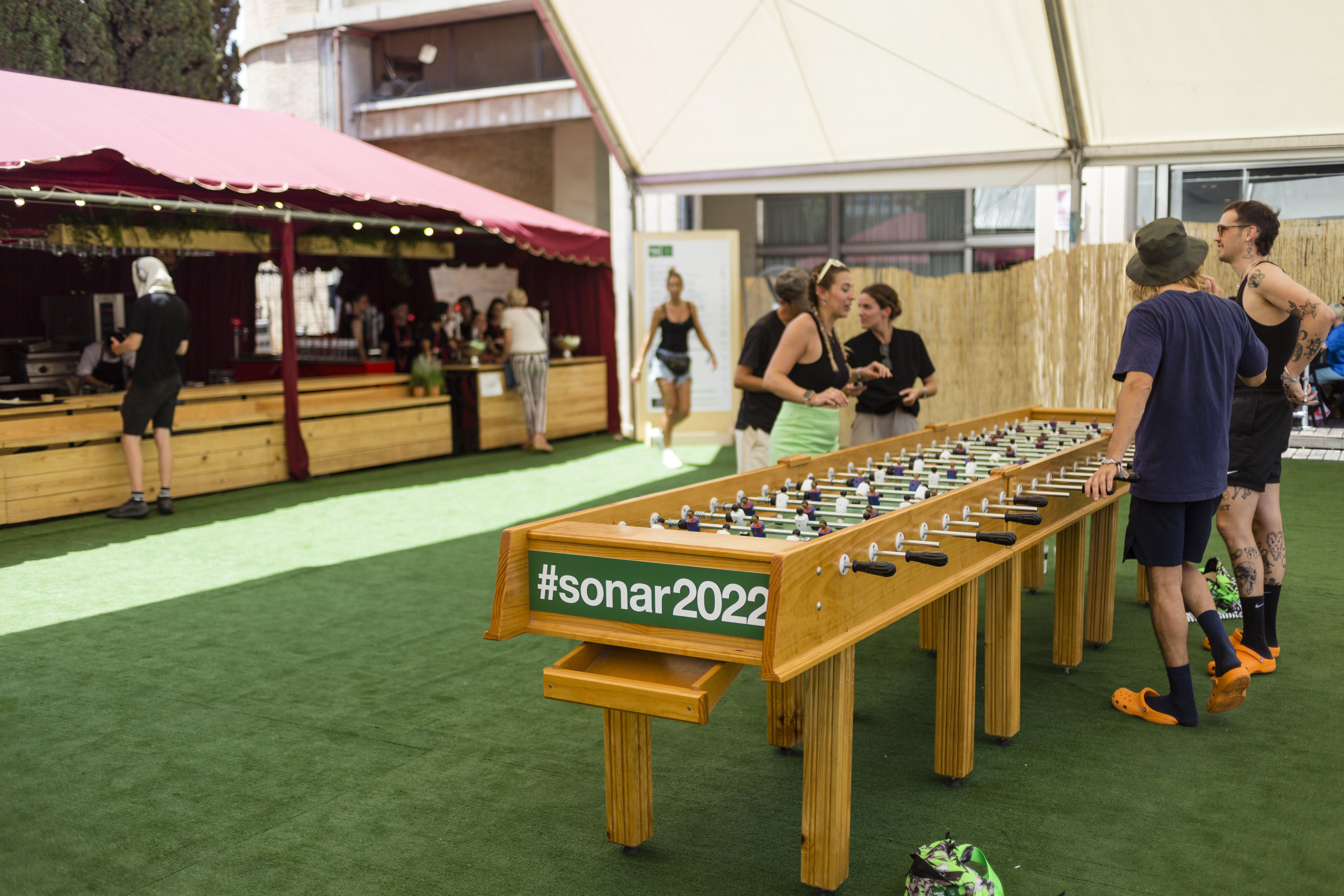
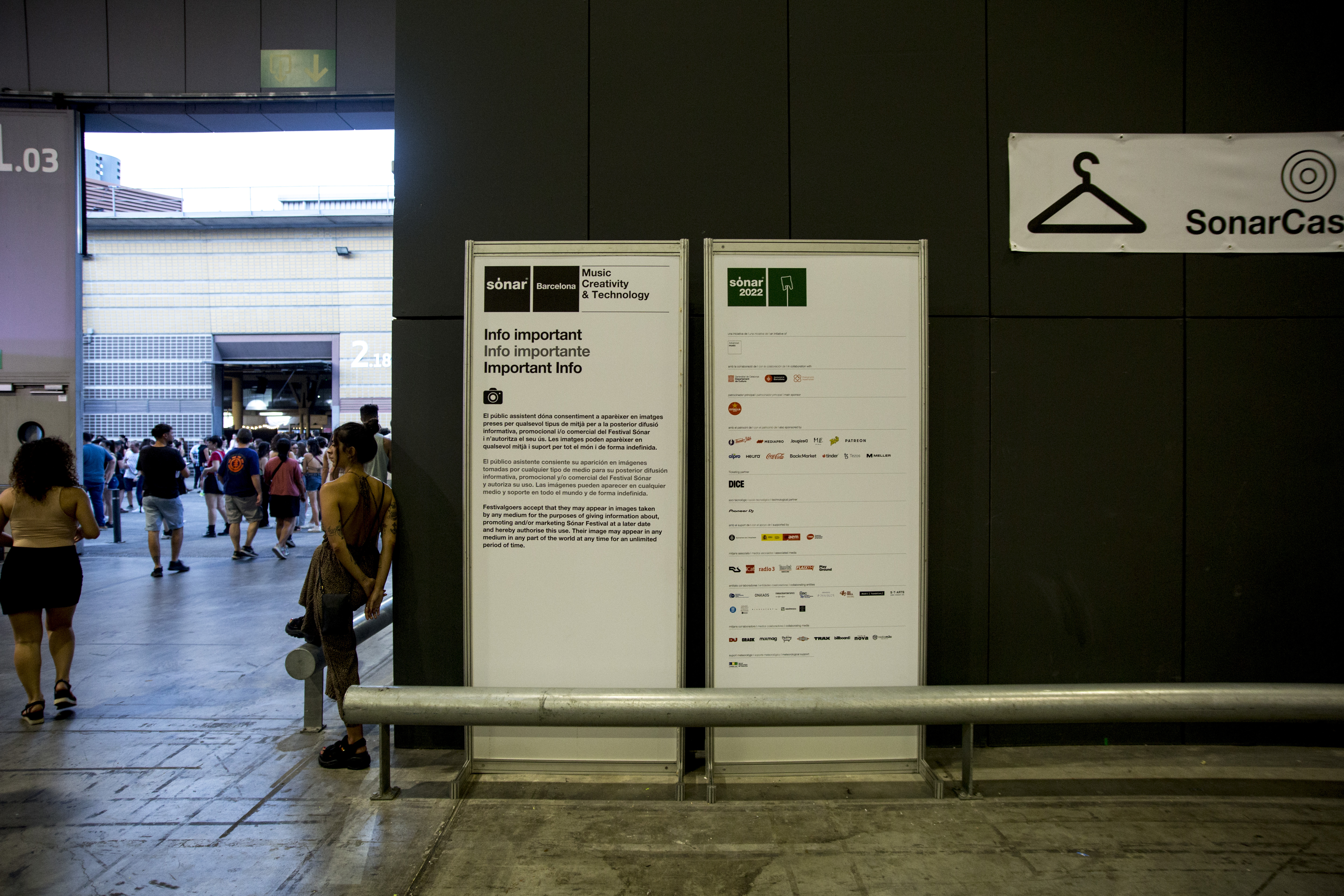
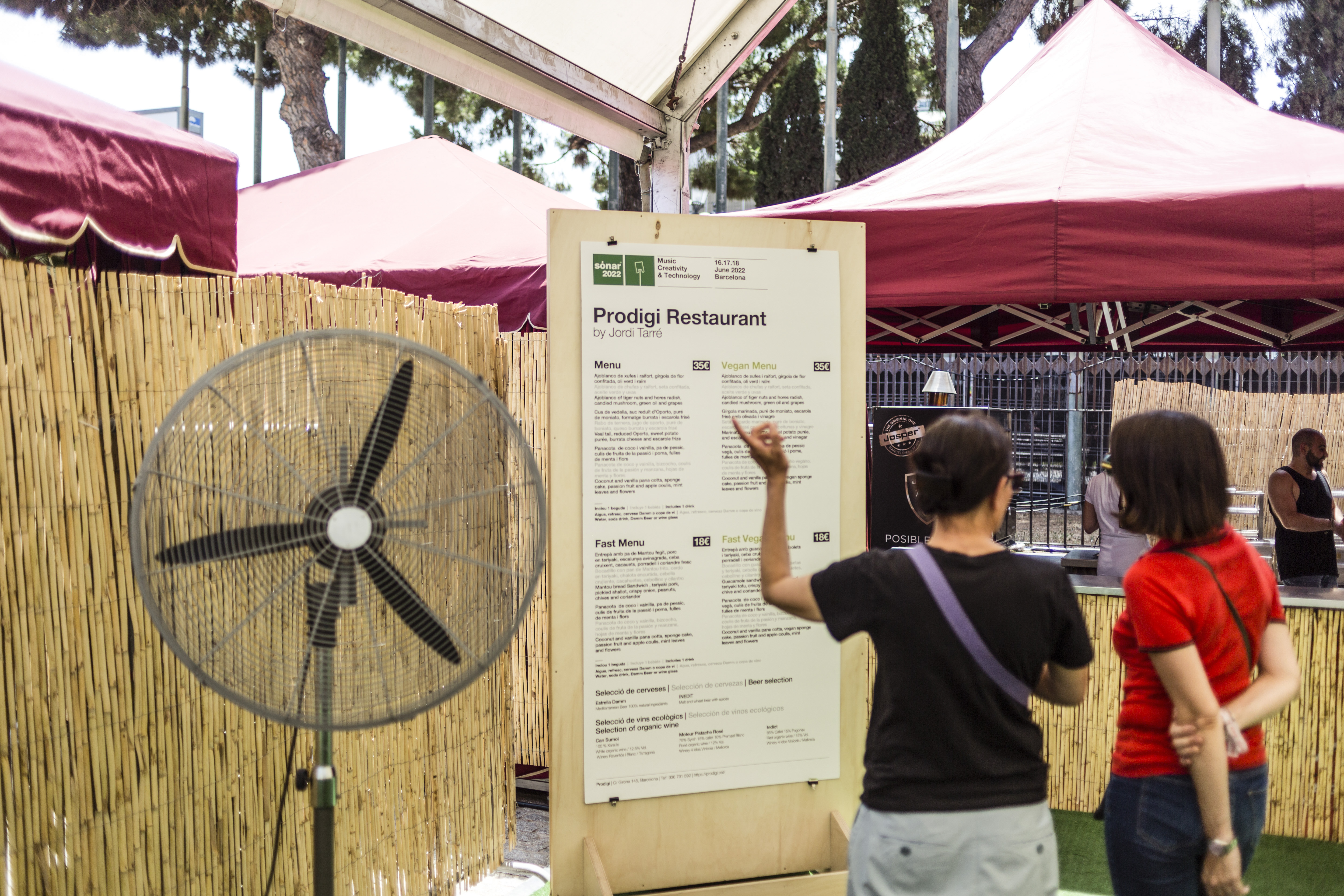
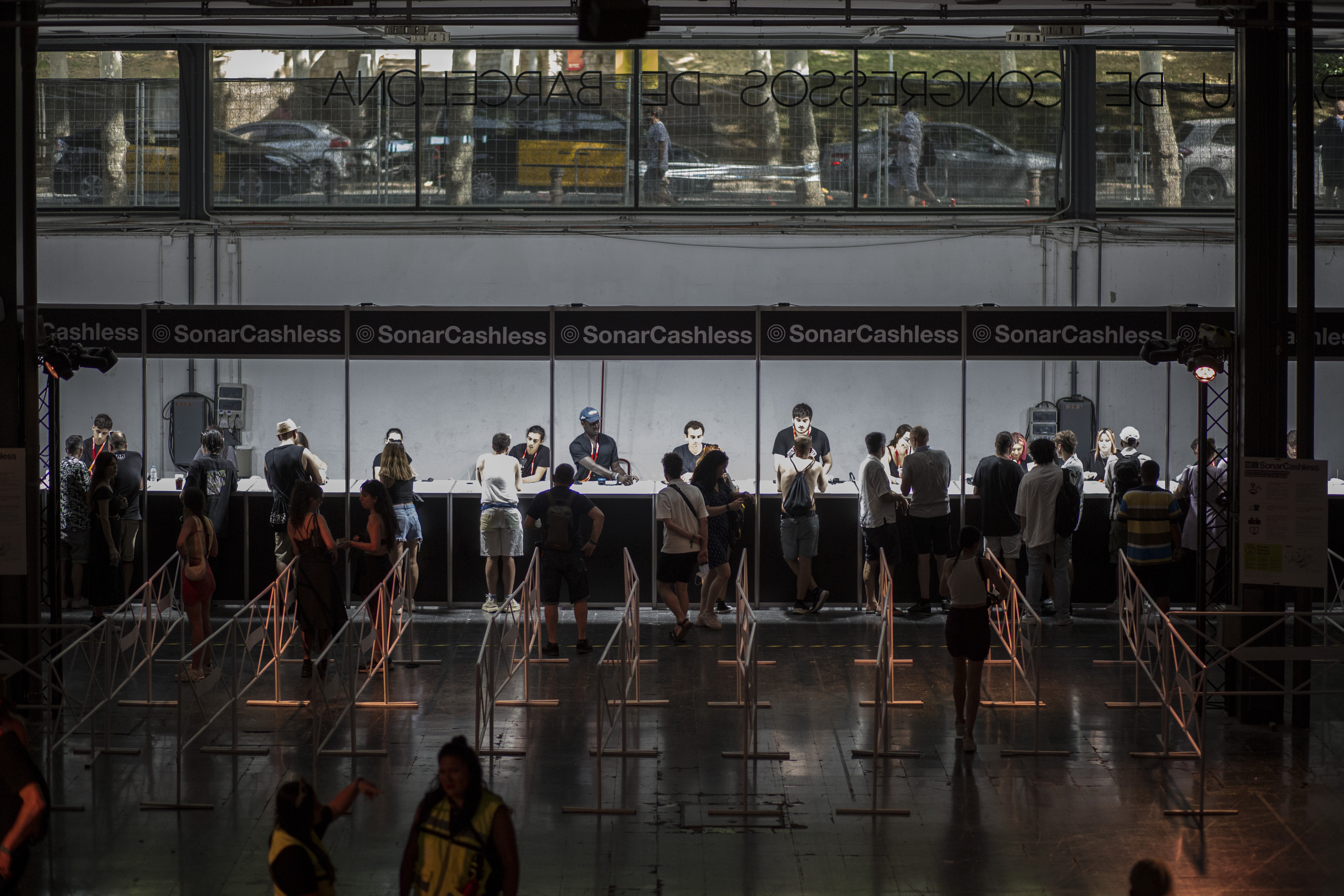
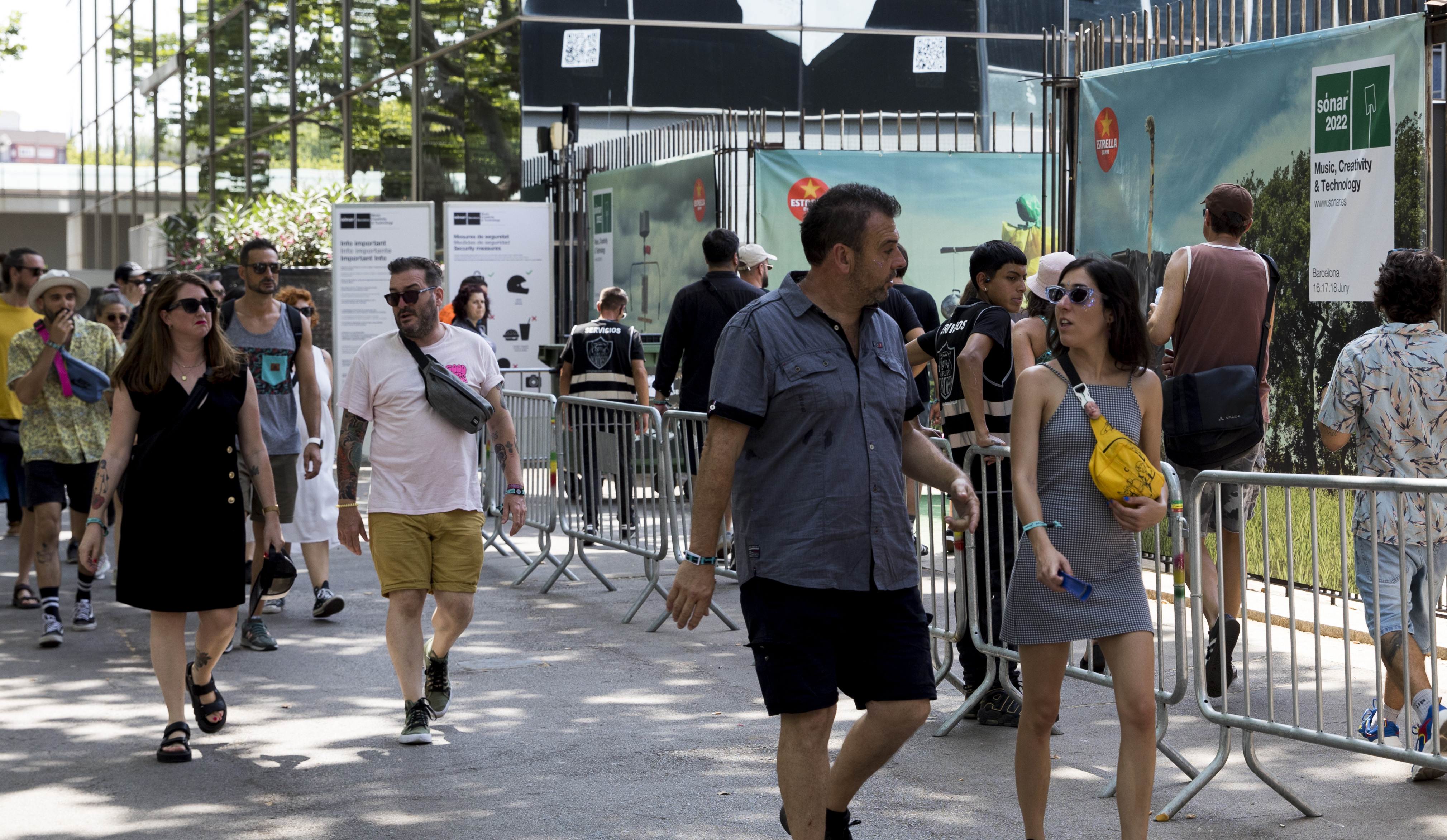
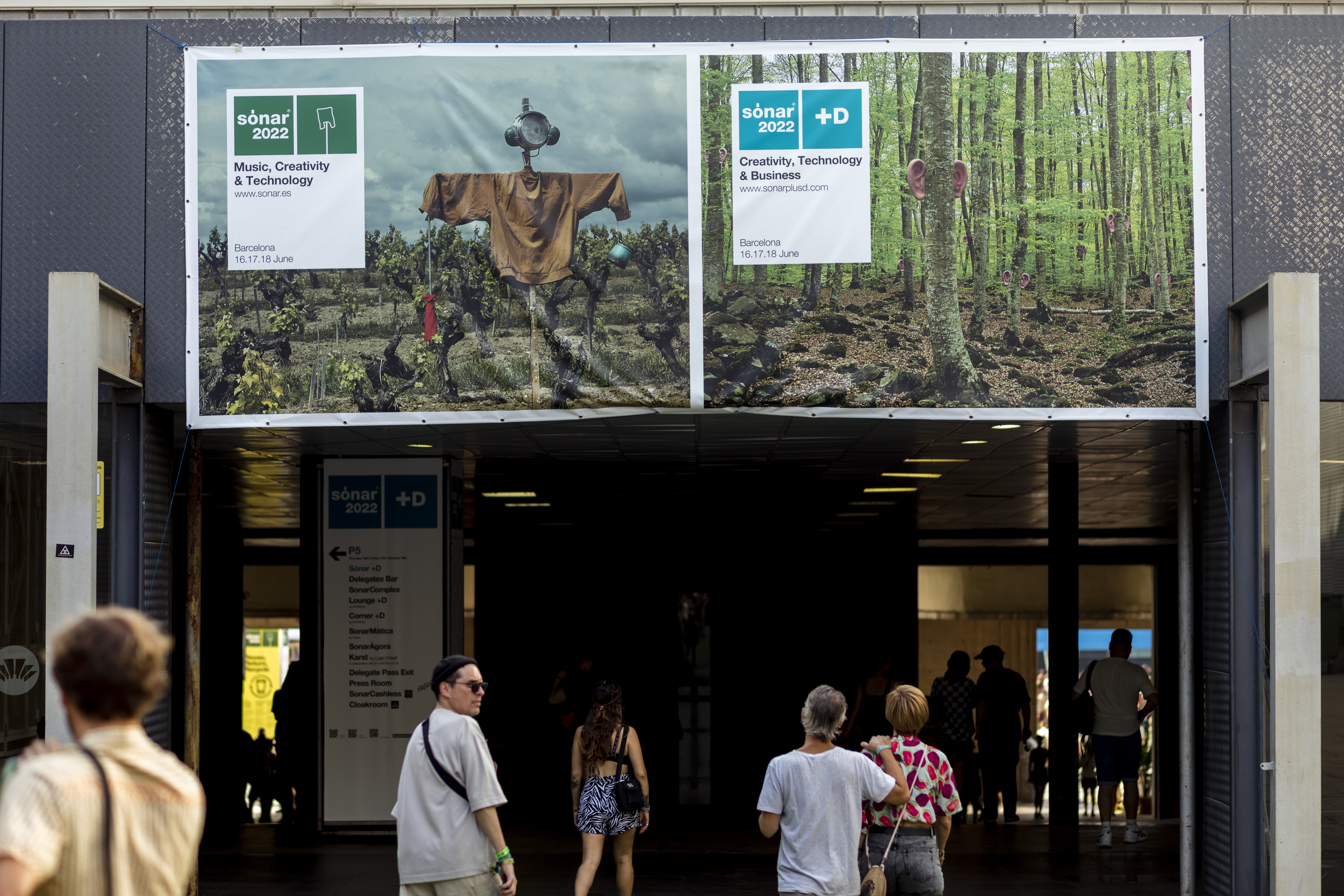
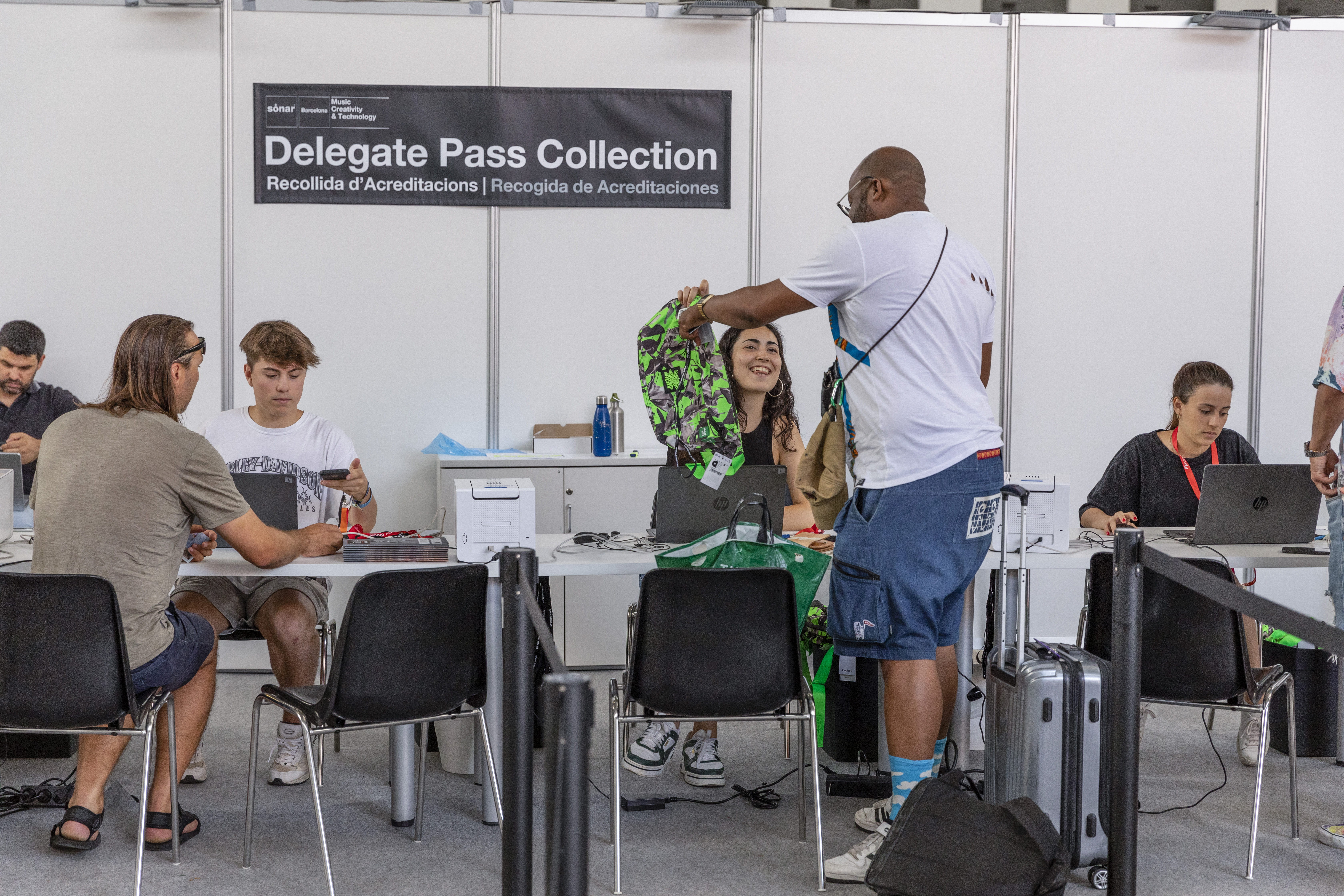
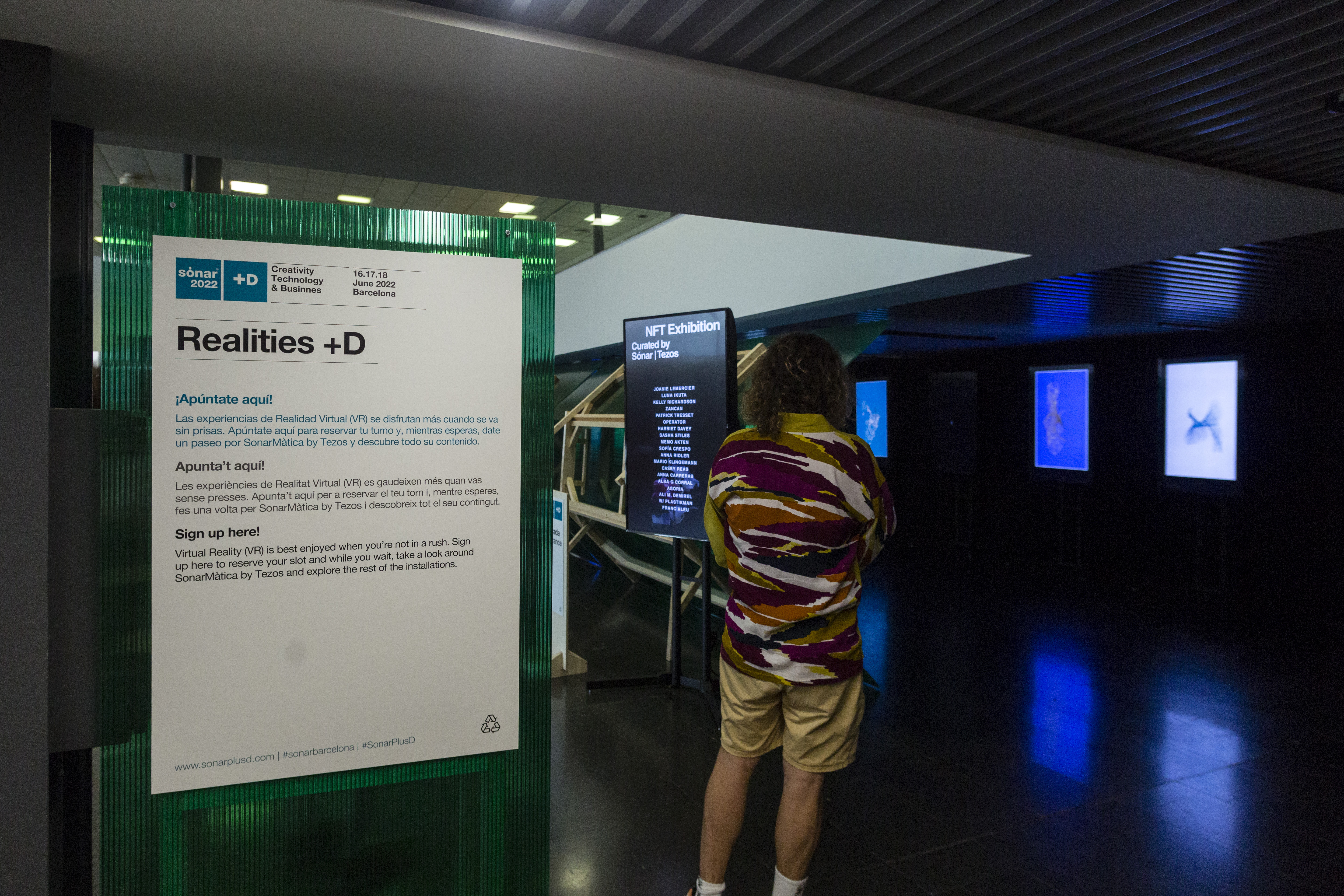
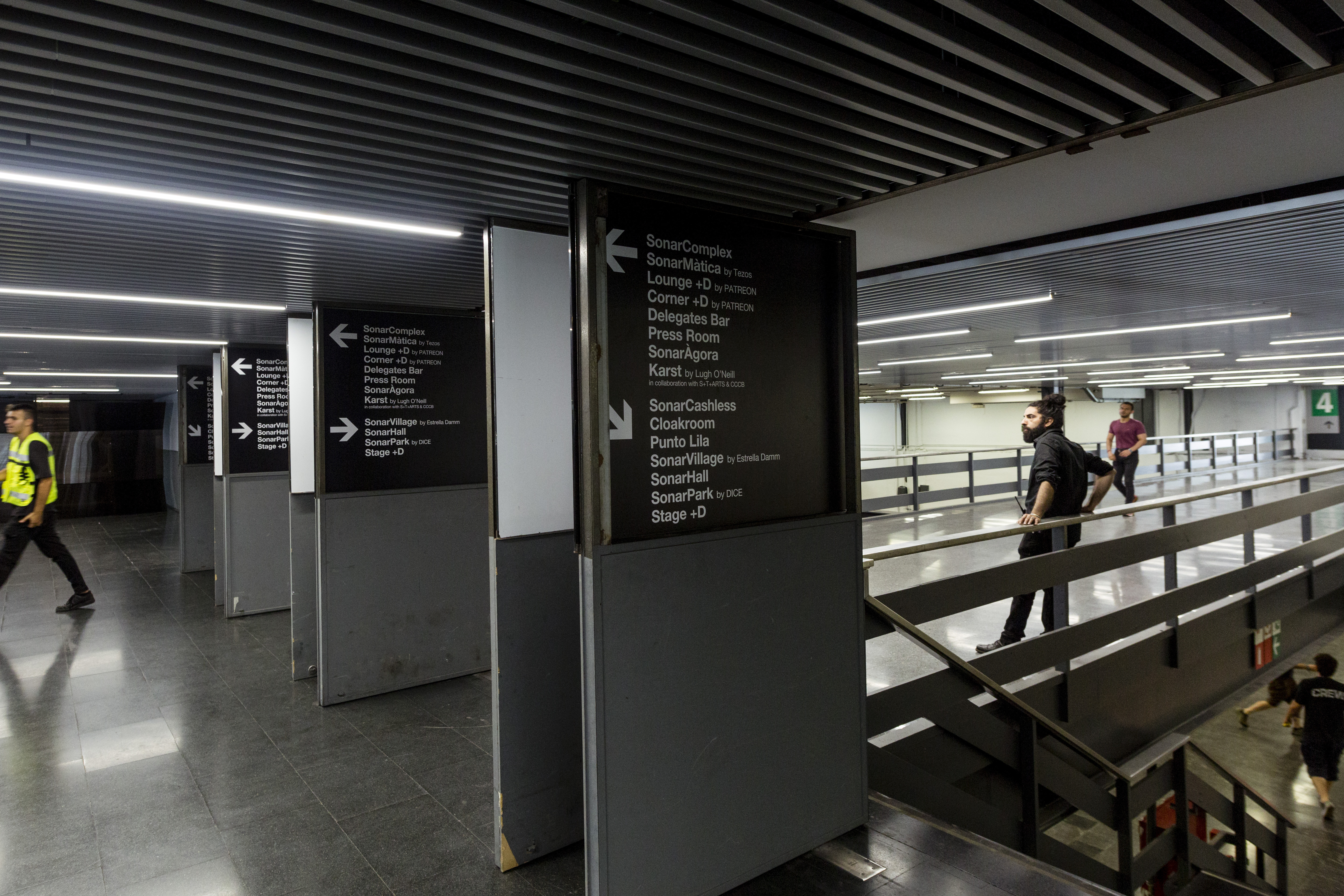
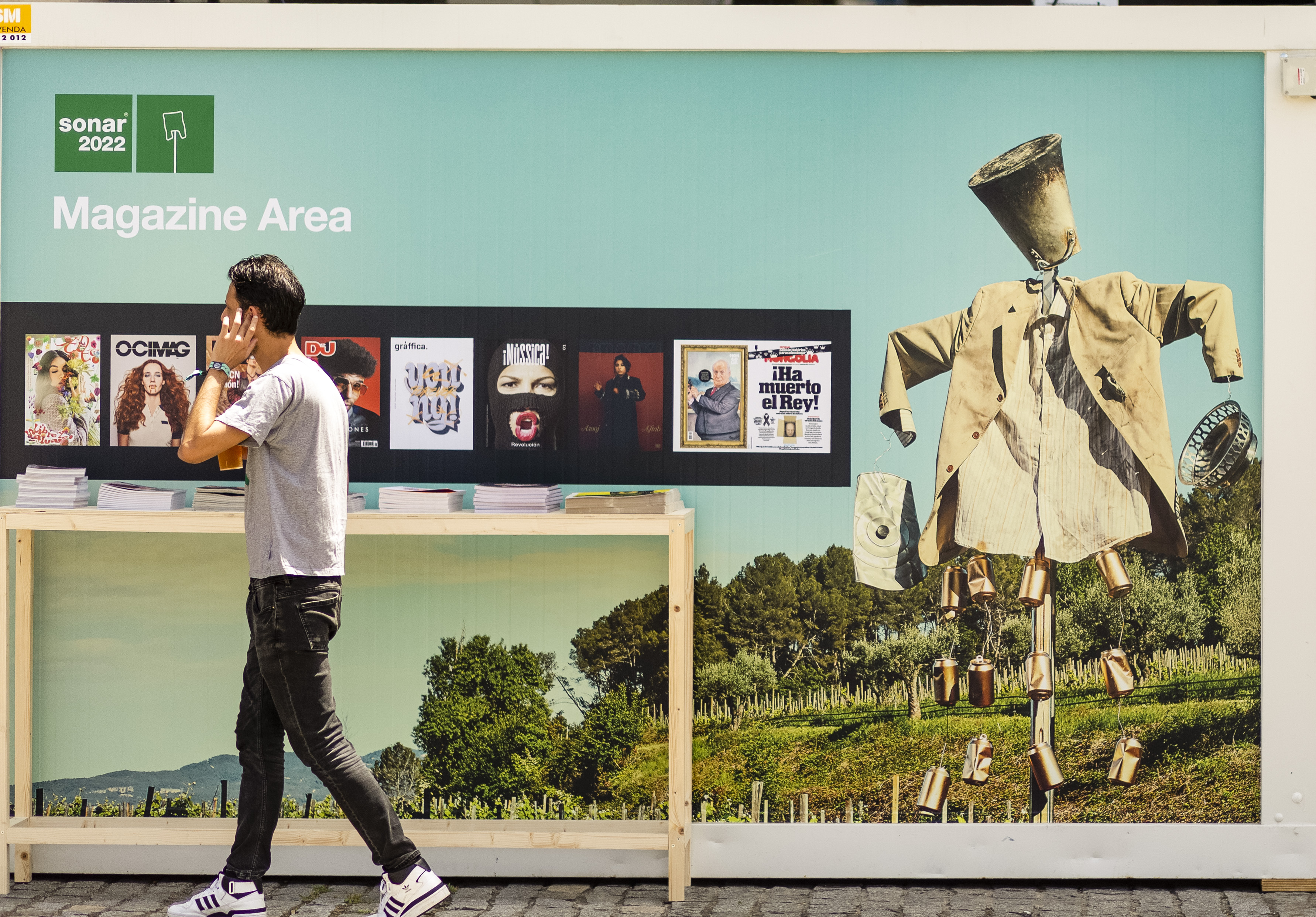
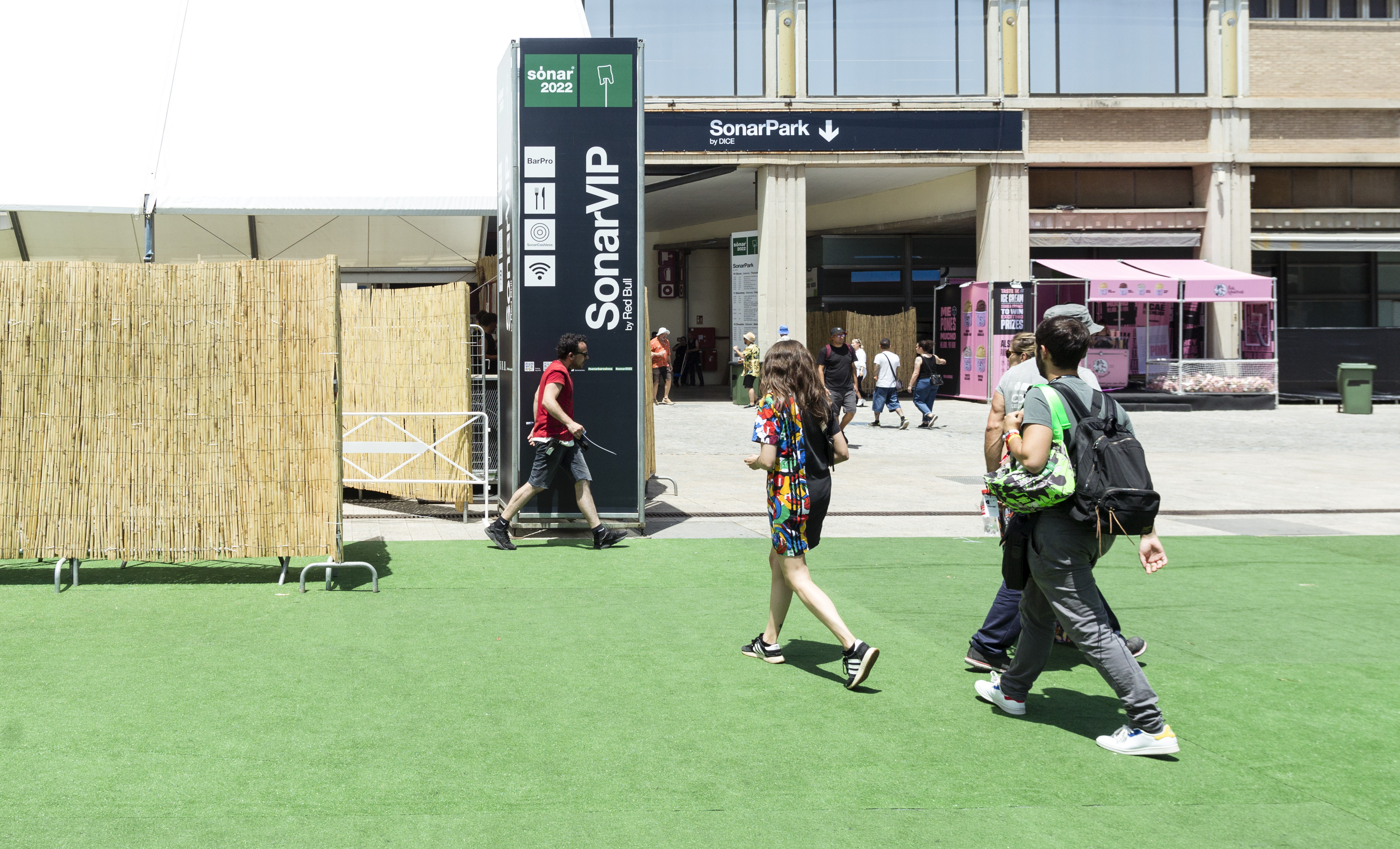
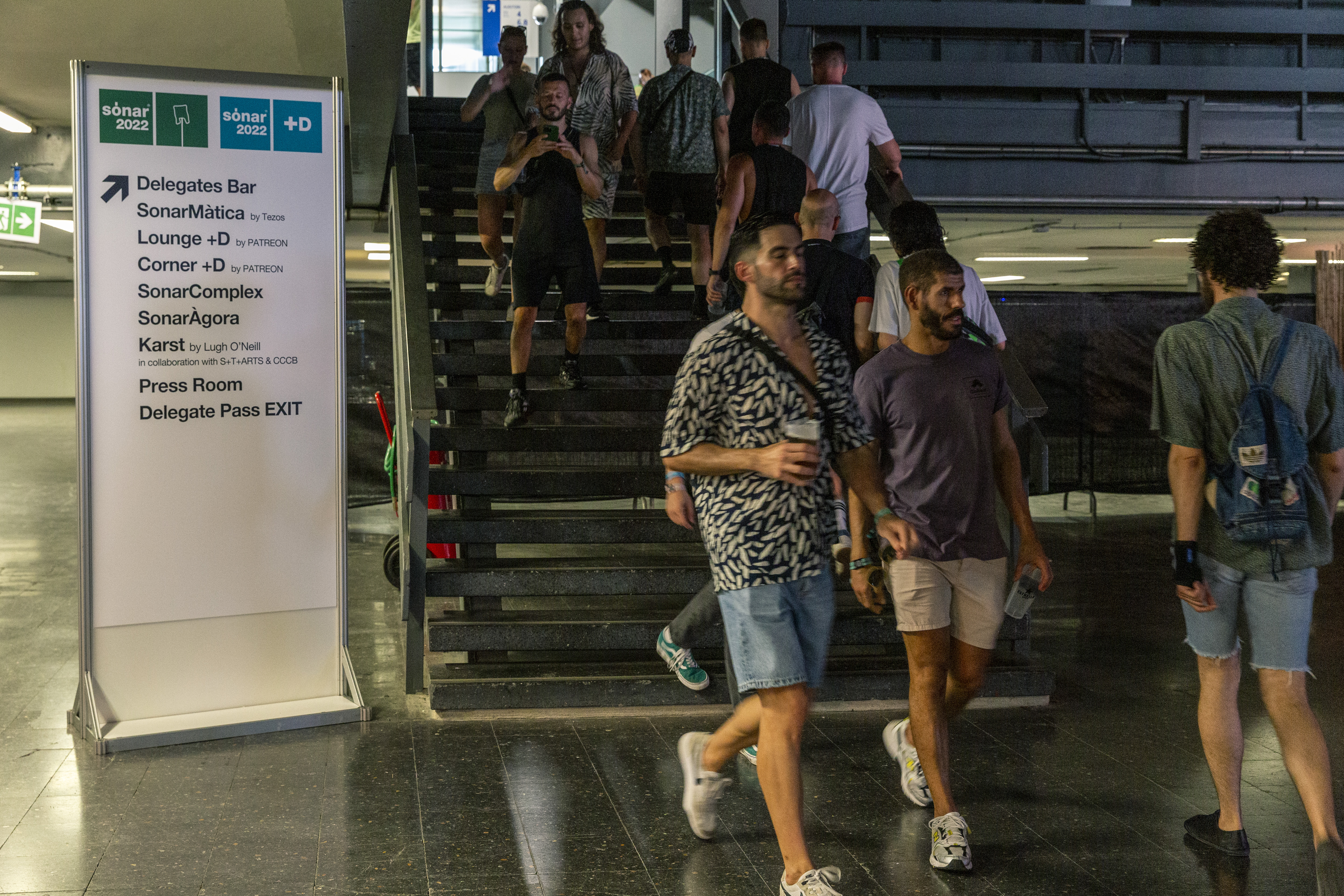
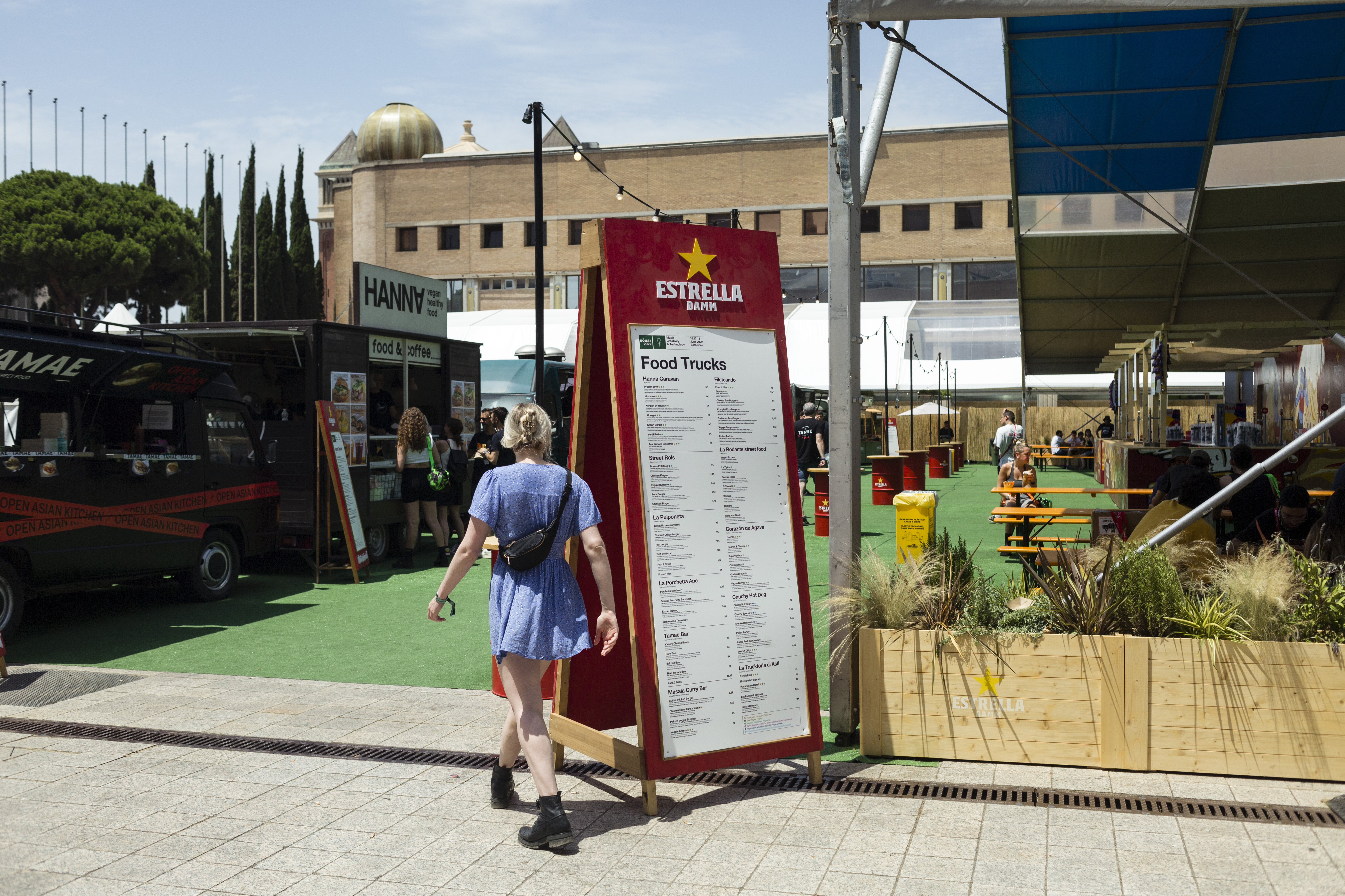
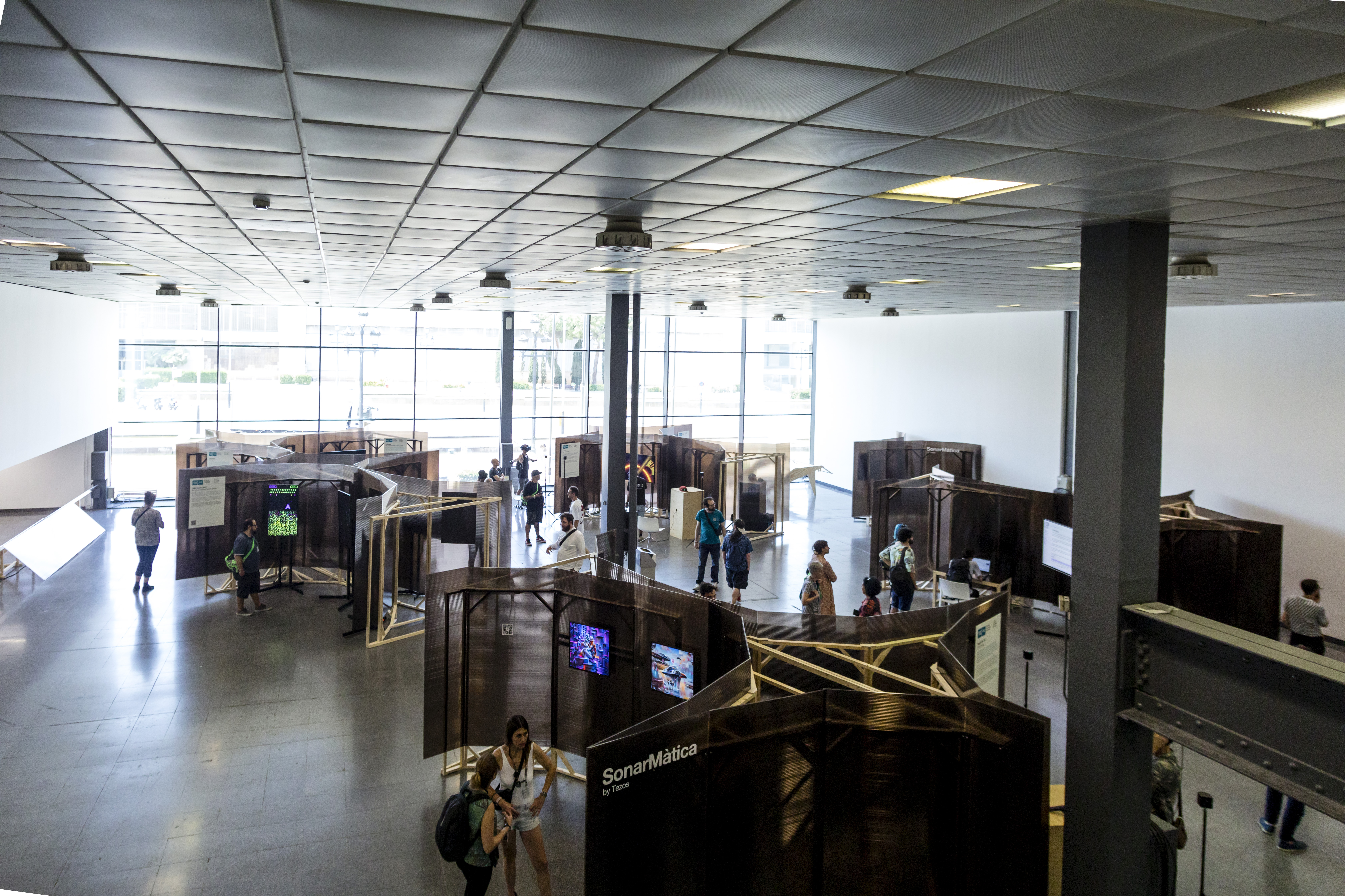
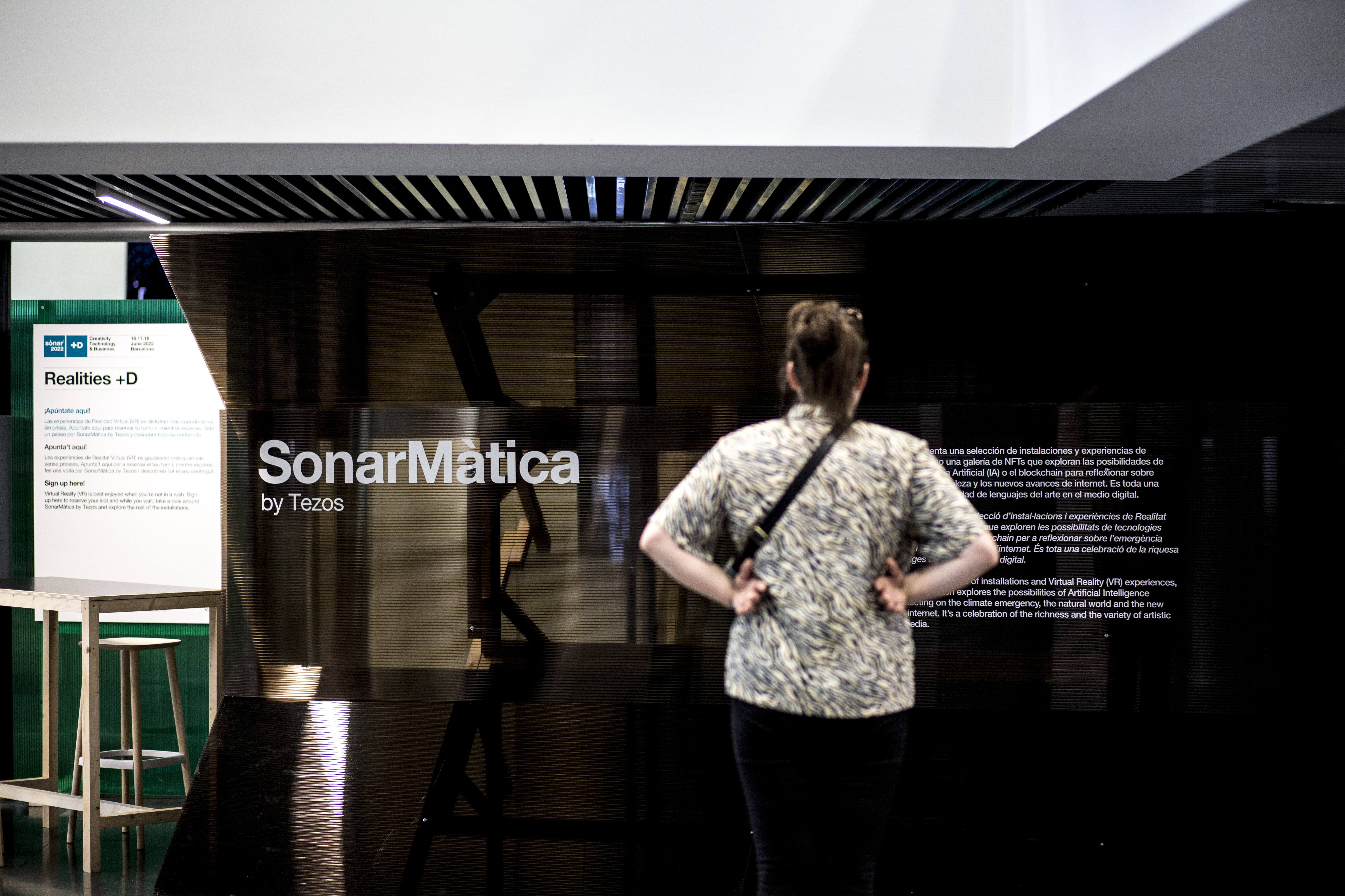
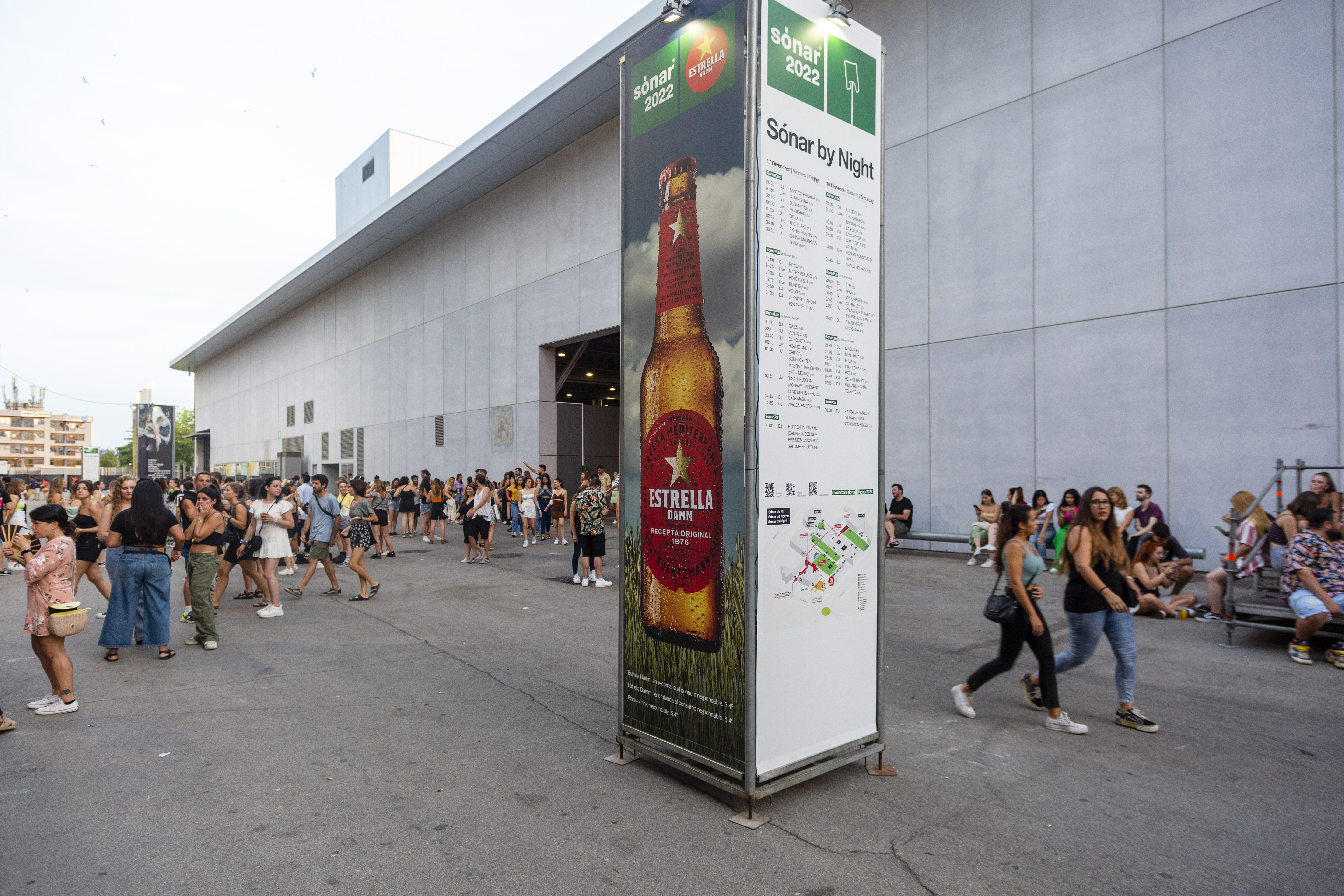
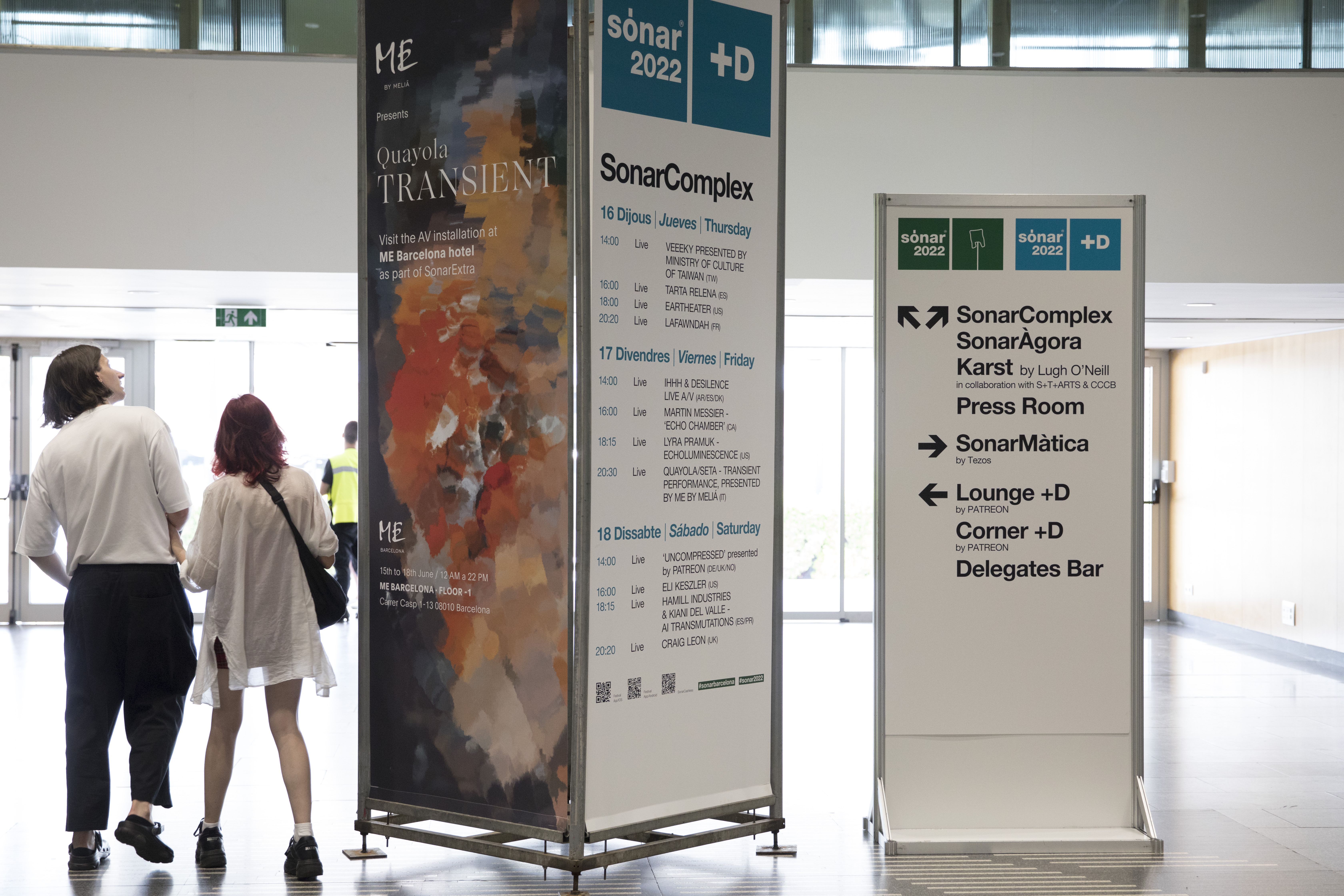
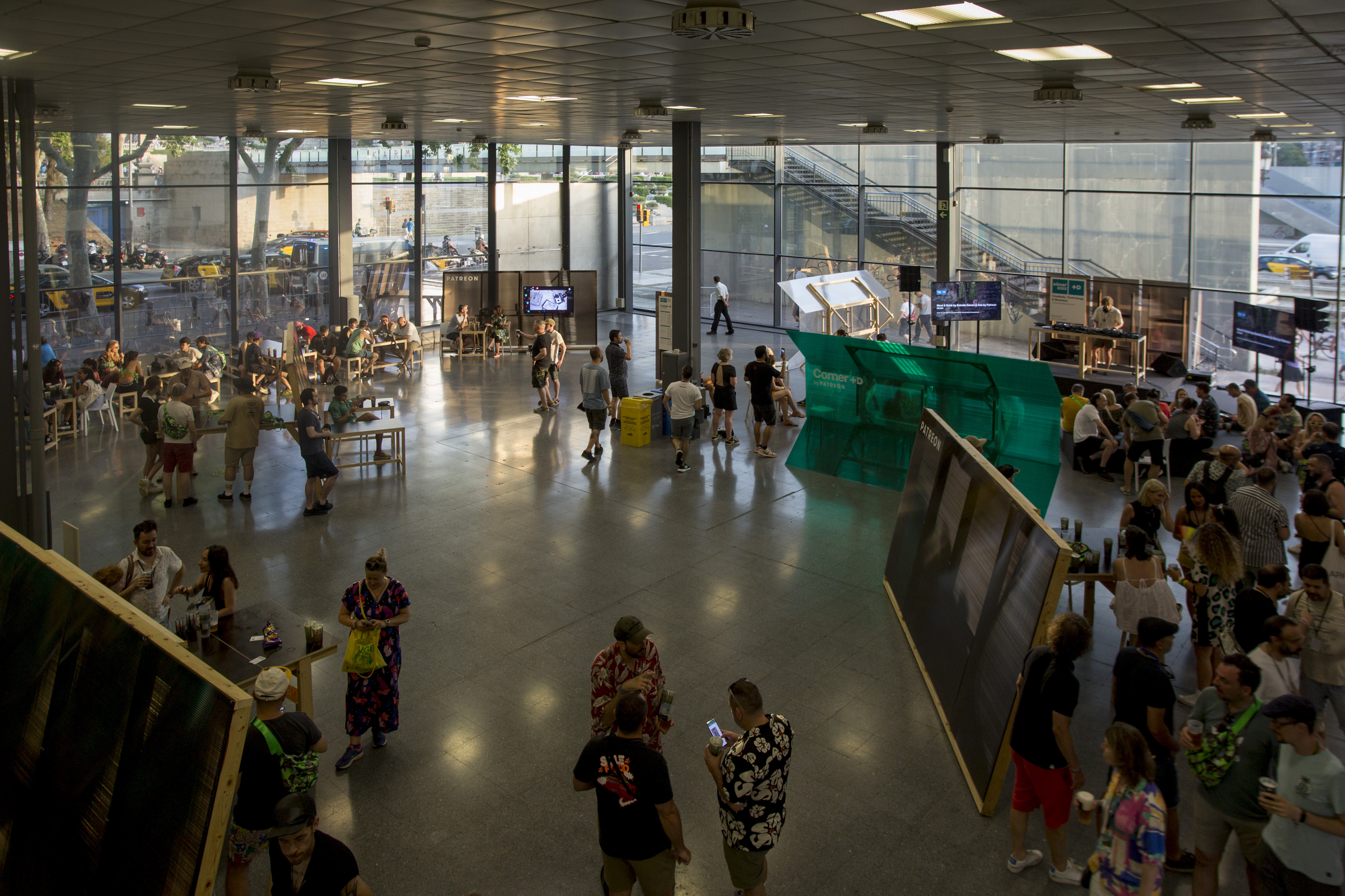
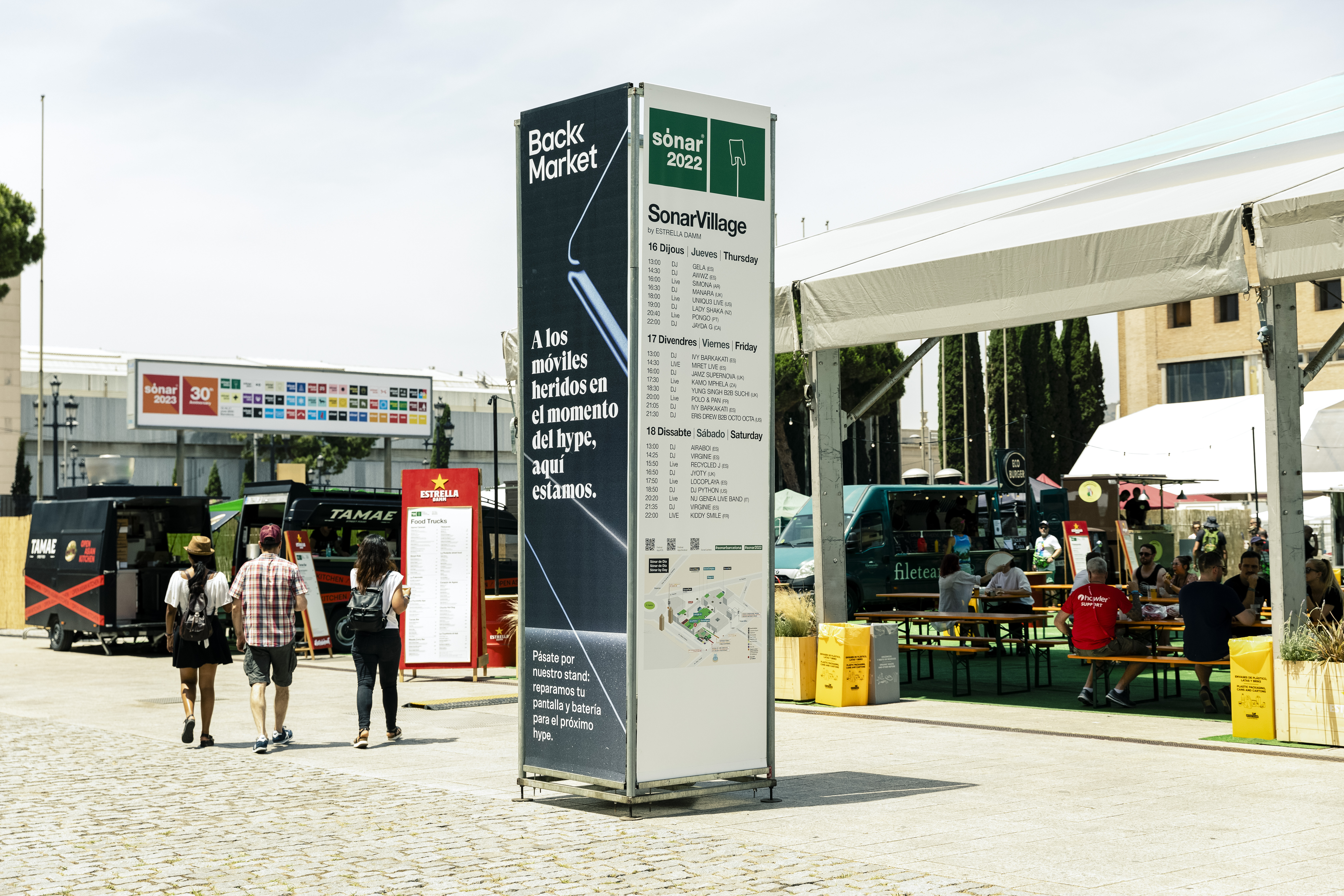
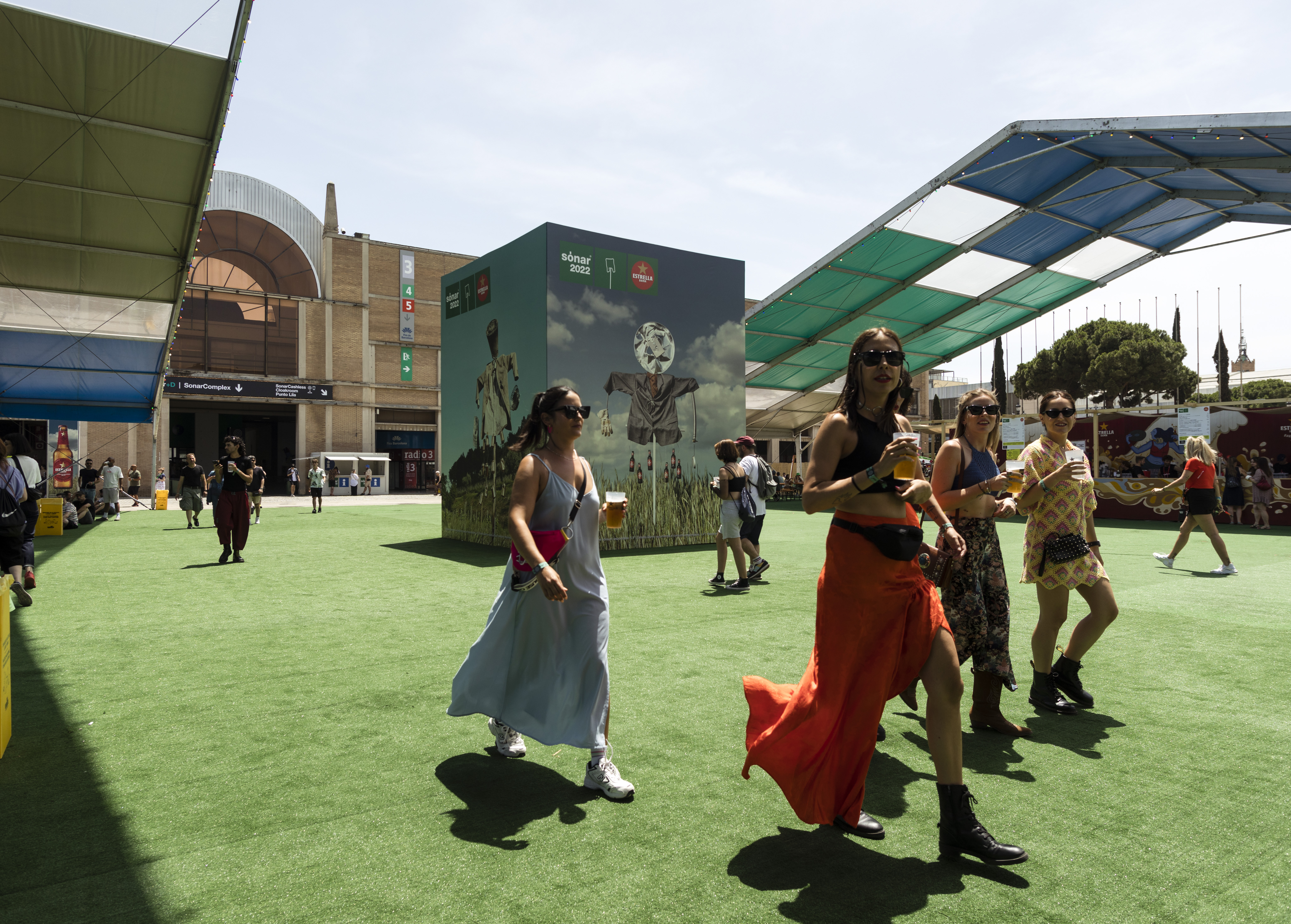
Sónar 2022
Client: Sónar Festival — 2022
Serveis: Senyalètica | Preproducció | Dissenya gràfic | Direcció de muntatge
Fotos de Juan Lafita, Marc González, Advanced Music.
Serveis: Senyalètica | Preproducció | Dissenya gràfic | Direcció de muntatge
Fotos de Juan Lafita, Marc González, Advanced Music.
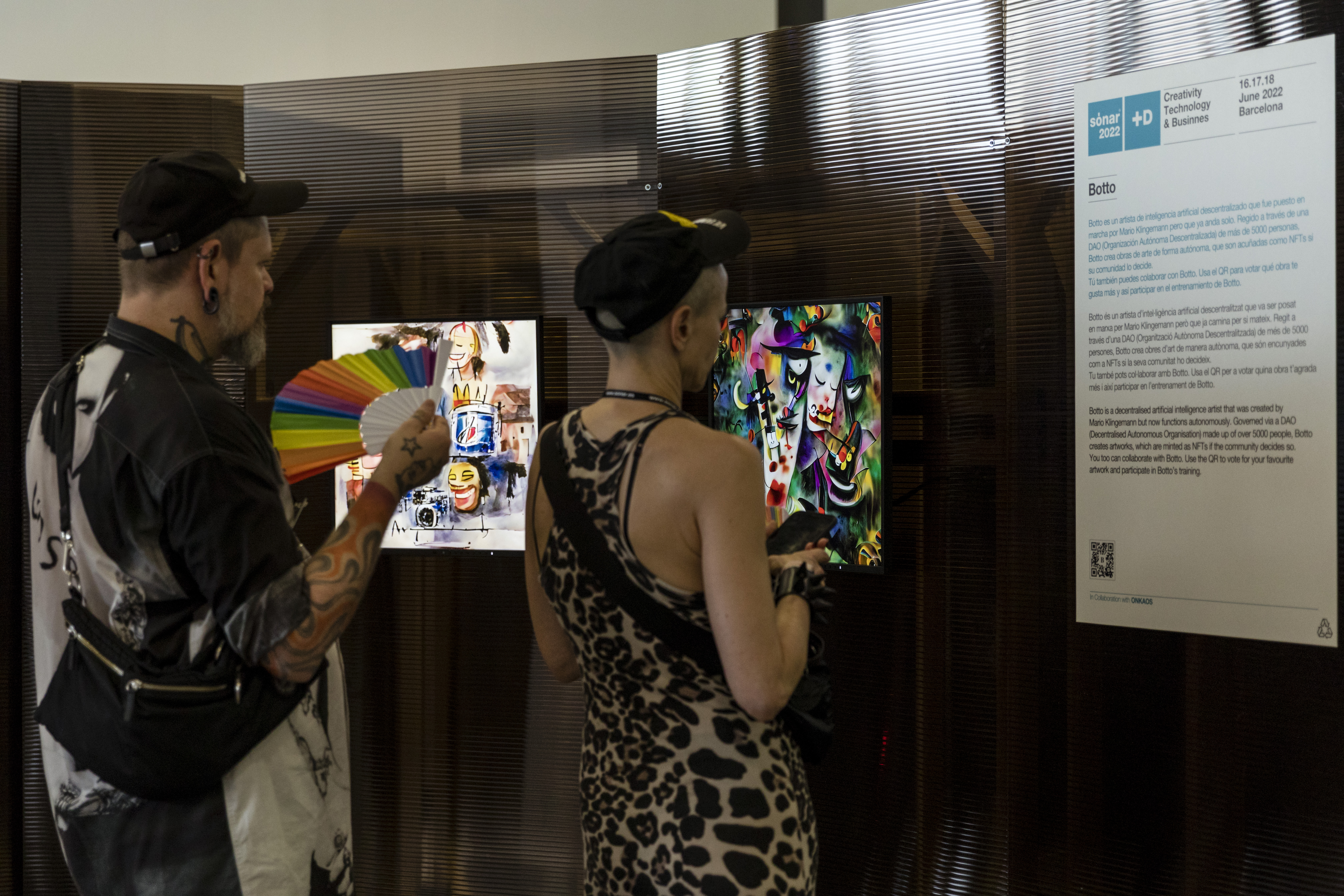
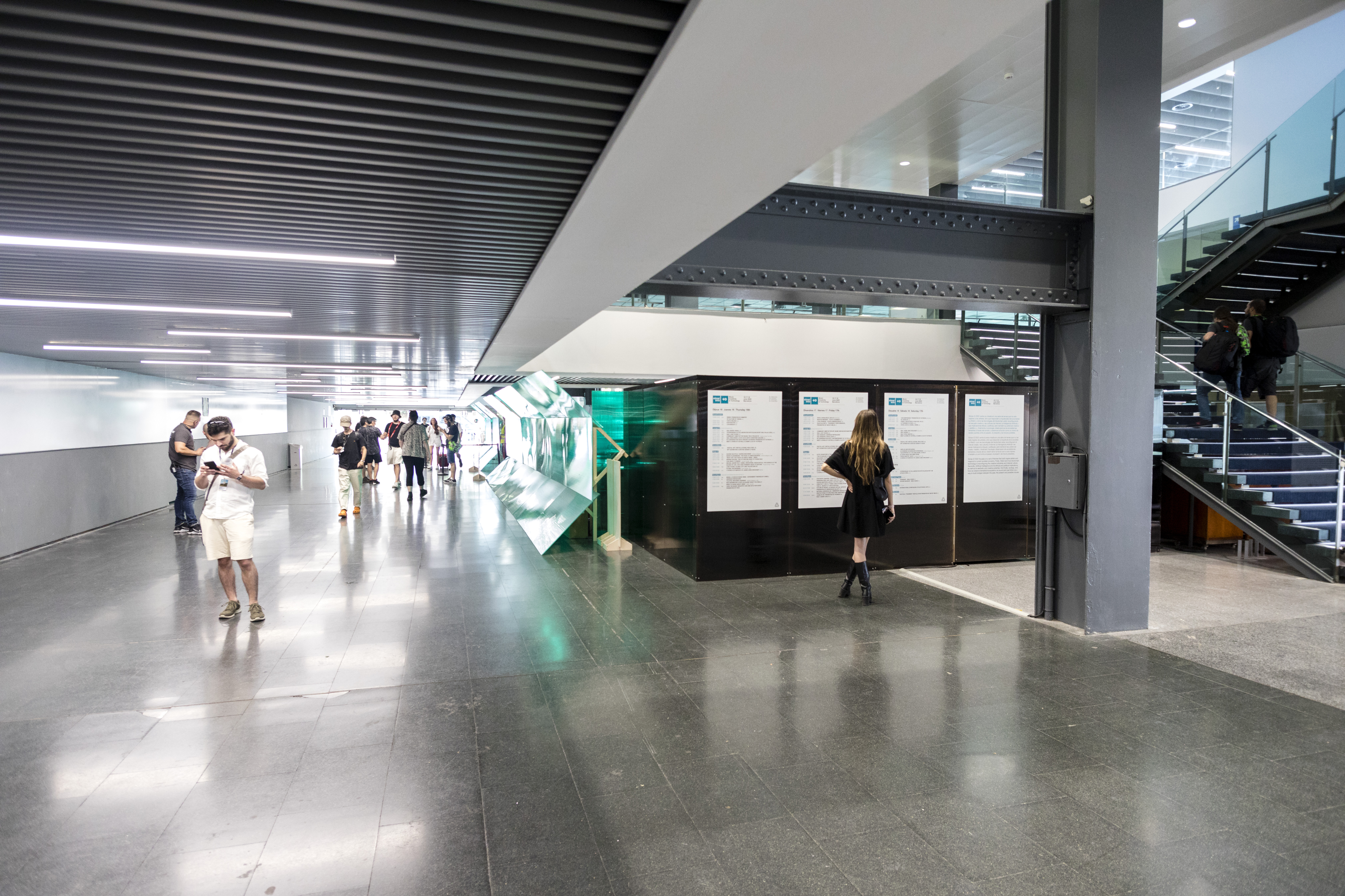
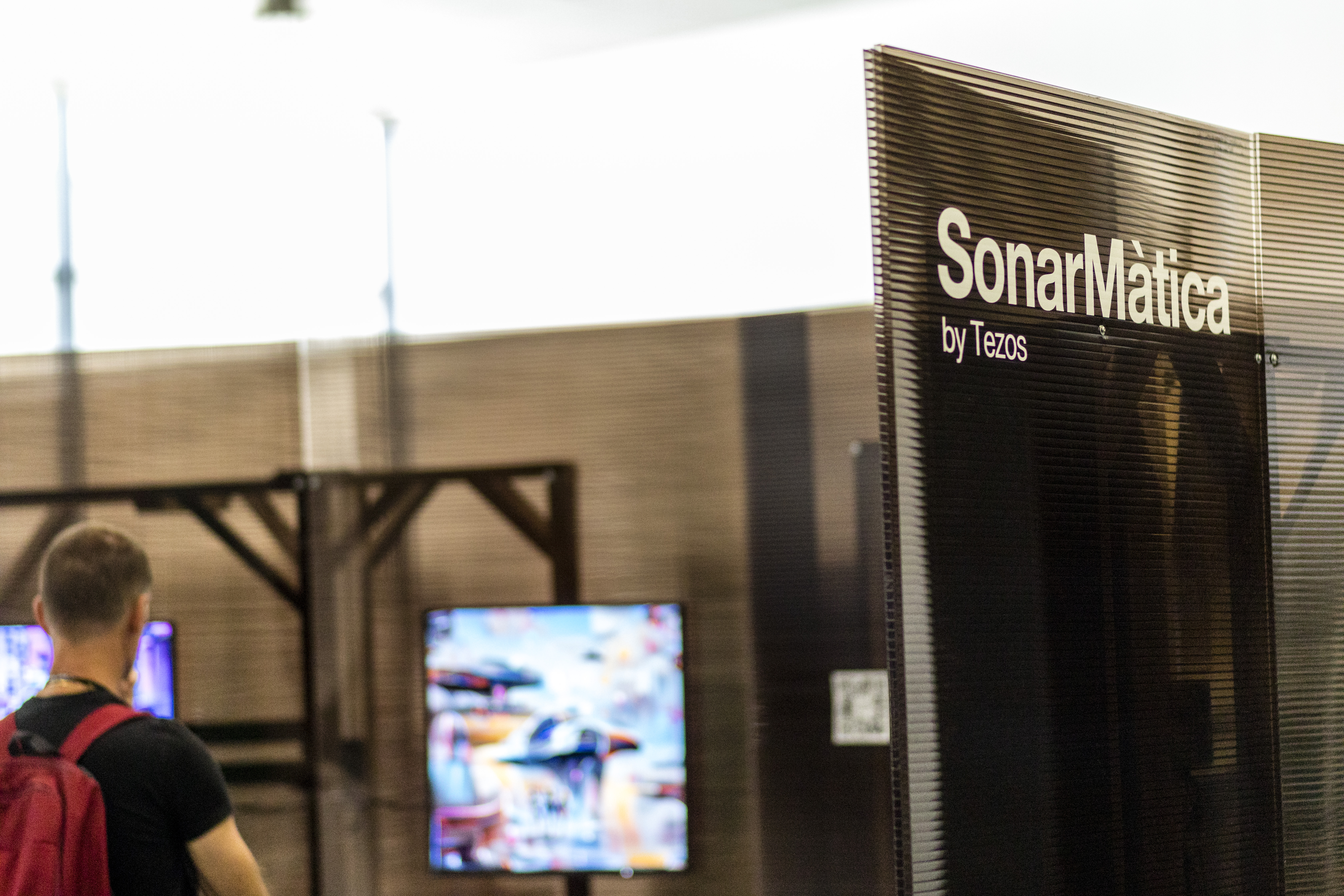
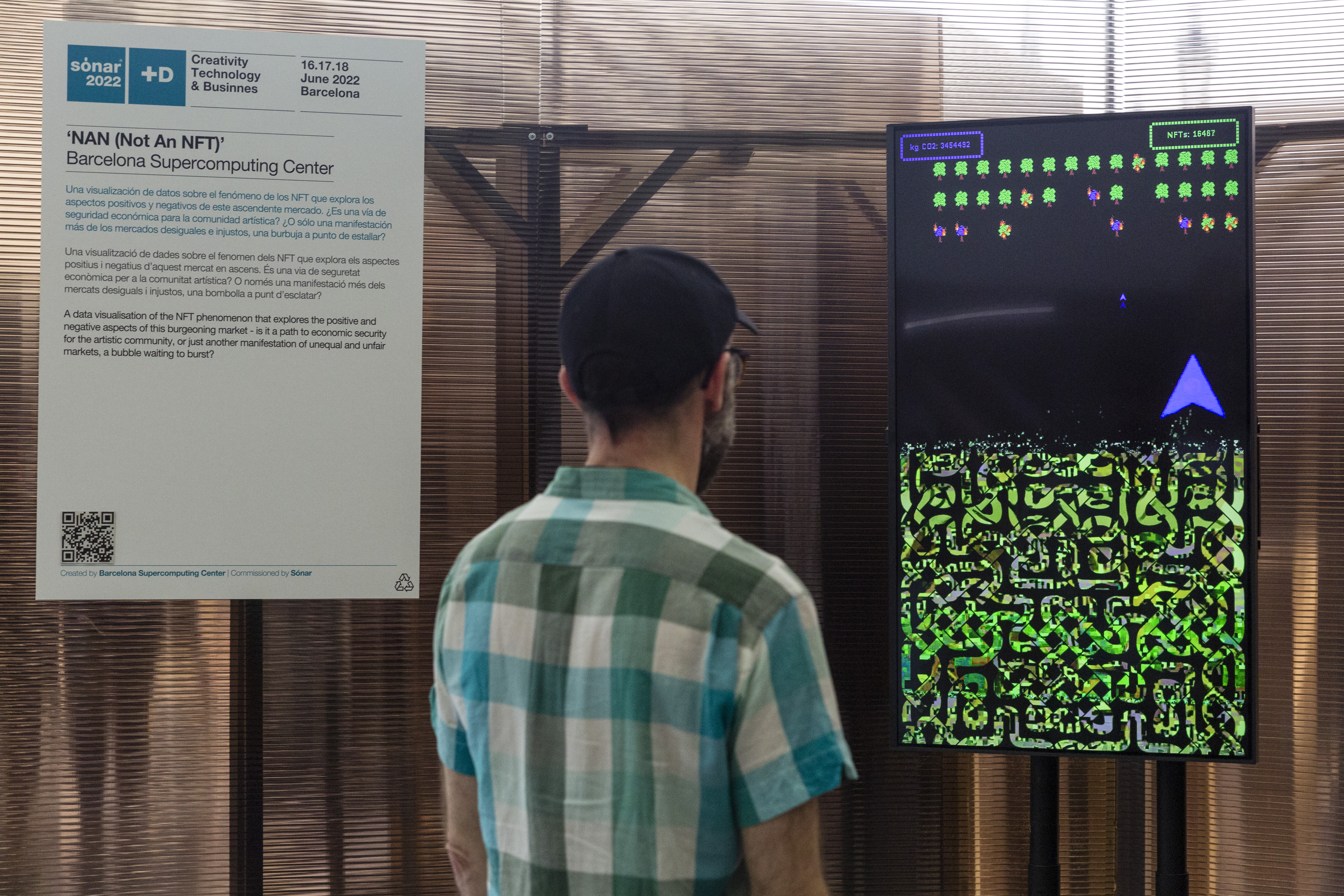
Disseny gràfic i adaptació de la imatge de Sónar 2022 als diferents suports per a la promoció i senyalètica del festival en la seva edició de Dia i de Nit.
Aplicació de la marca i creació dels panells i vinils per a Sónar+D. Realització de dissenys, coordinació i muntatge de les zones de restauració, barres, zones VIP, escenaris, Cashless, zona d'acreditacions, tiquets i tota la senyalètica genèrica.
Aplicació de la marca i creació dels panells i vinils per a Sónar+D. Realització de dissenys, coordinació i muntatge de les zones de restauració, barres, zones VIP, escenaris, Cashless, zona d'acreditacions, tiquets i tota la senyalètica genèrica.


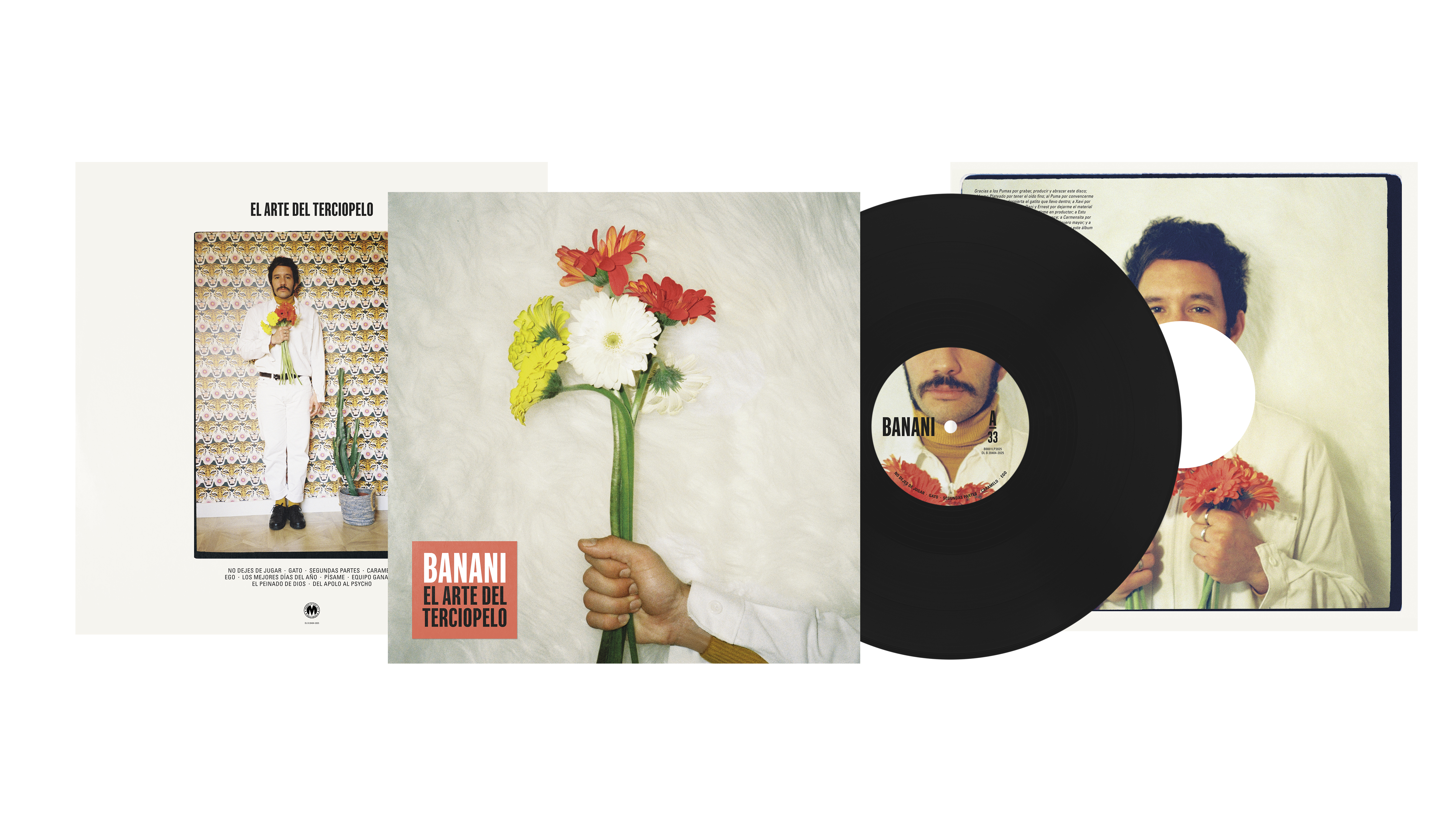
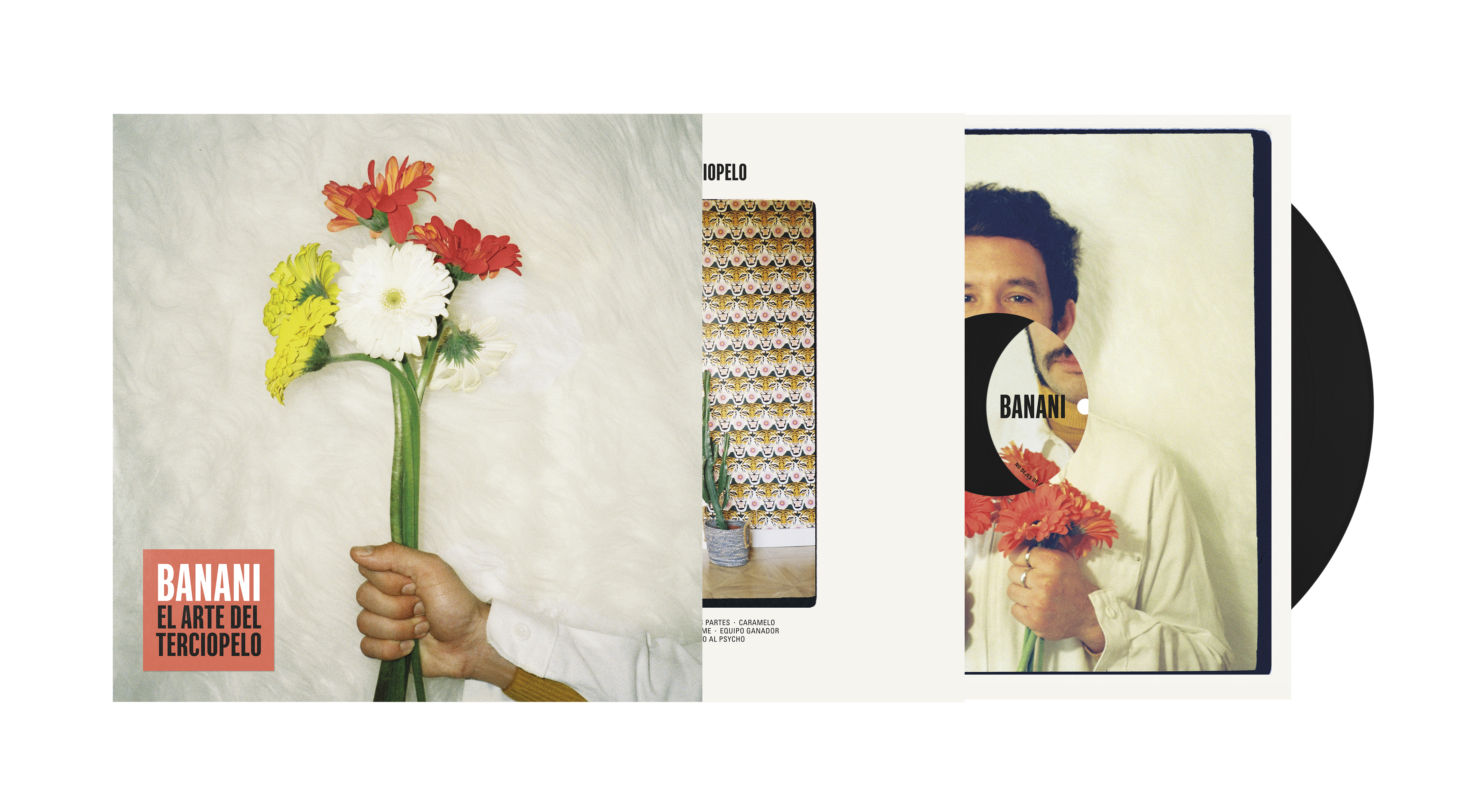
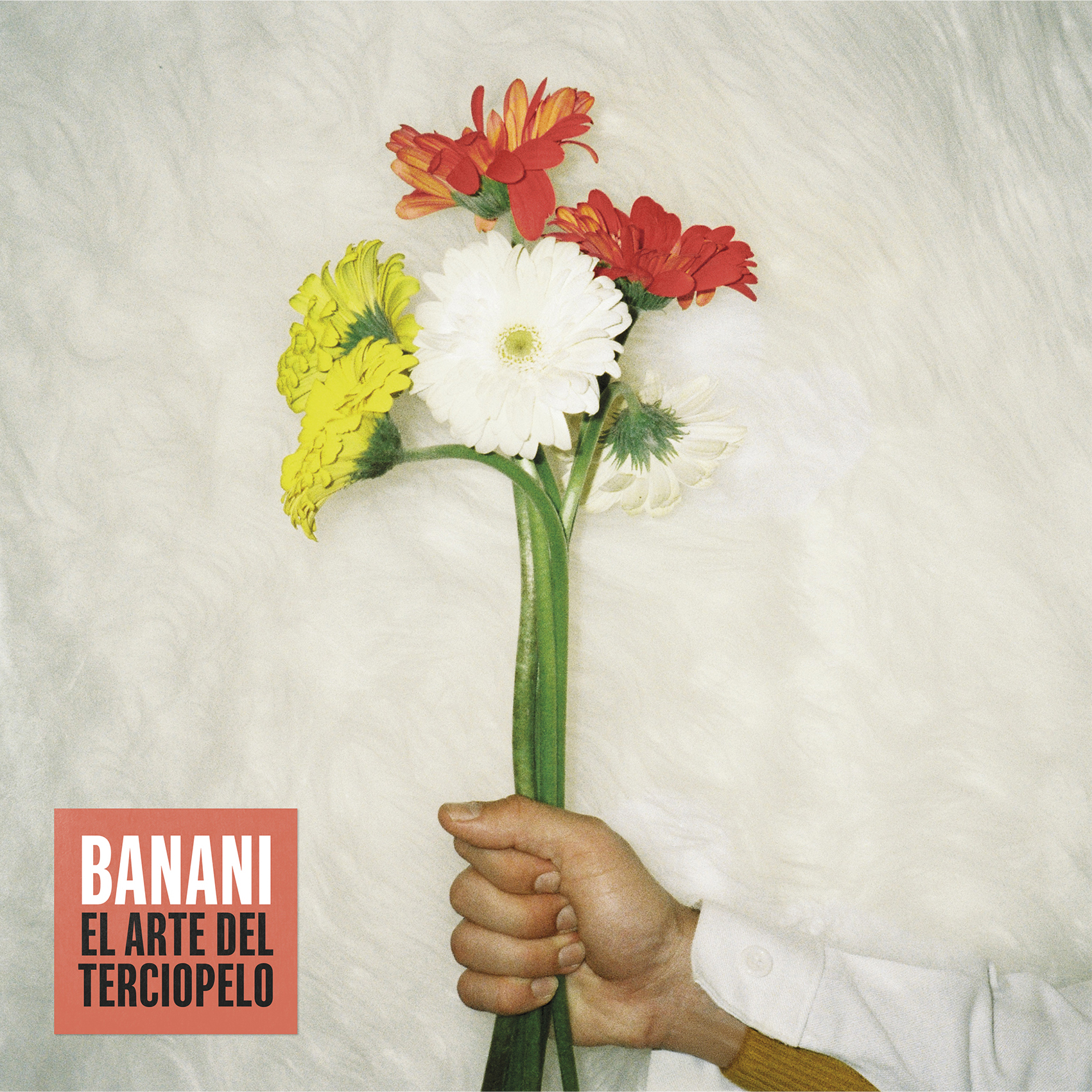
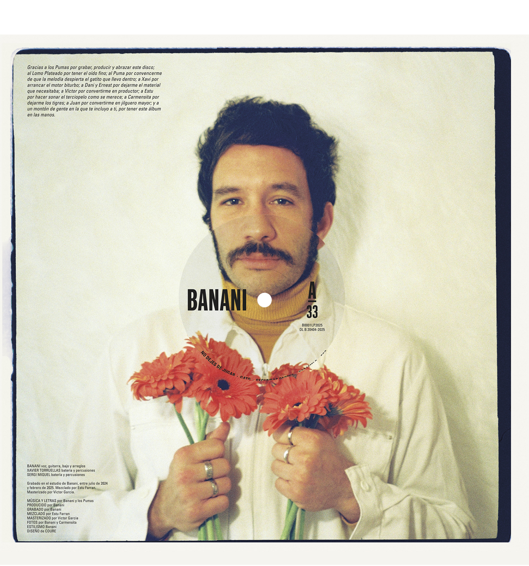
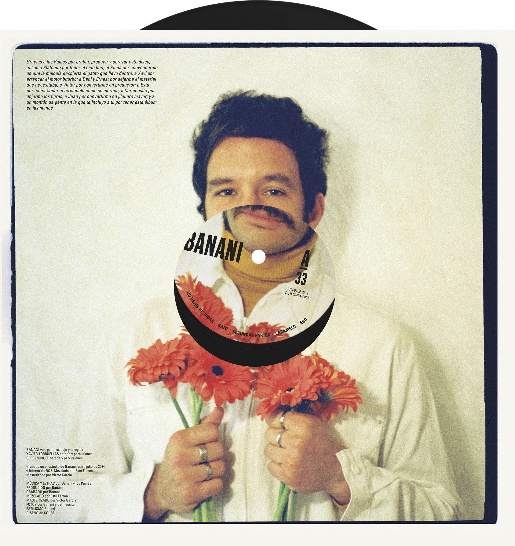
BANANI · El arte del terciopelo
Client: BANANI — 2025
Segell: Magic In The Air Records
Fotos: BANANI & Carmensita
Serveis: Disseny gràfic | Vinil | Stickers | Singles
Segell: Magic In The Air Records
Fotos: BANANI & Carmensita
Serveis: Disseny gràfic | Vinil | Stickers | Singles
BANANI torna a comptar amb nosaltres per al disseny del seu segon LP.
En aquesta ocasió, busquem un aspecte més elegant, amb predomini del blanc, sense perdre l’essència inconformista i rebel de l’artista.
En aquesta ocasió, busquem un aspecte més elegant, amb predomini del blanc, sense perdre l’essència inconformista i rebel de l’artista.
Vinil
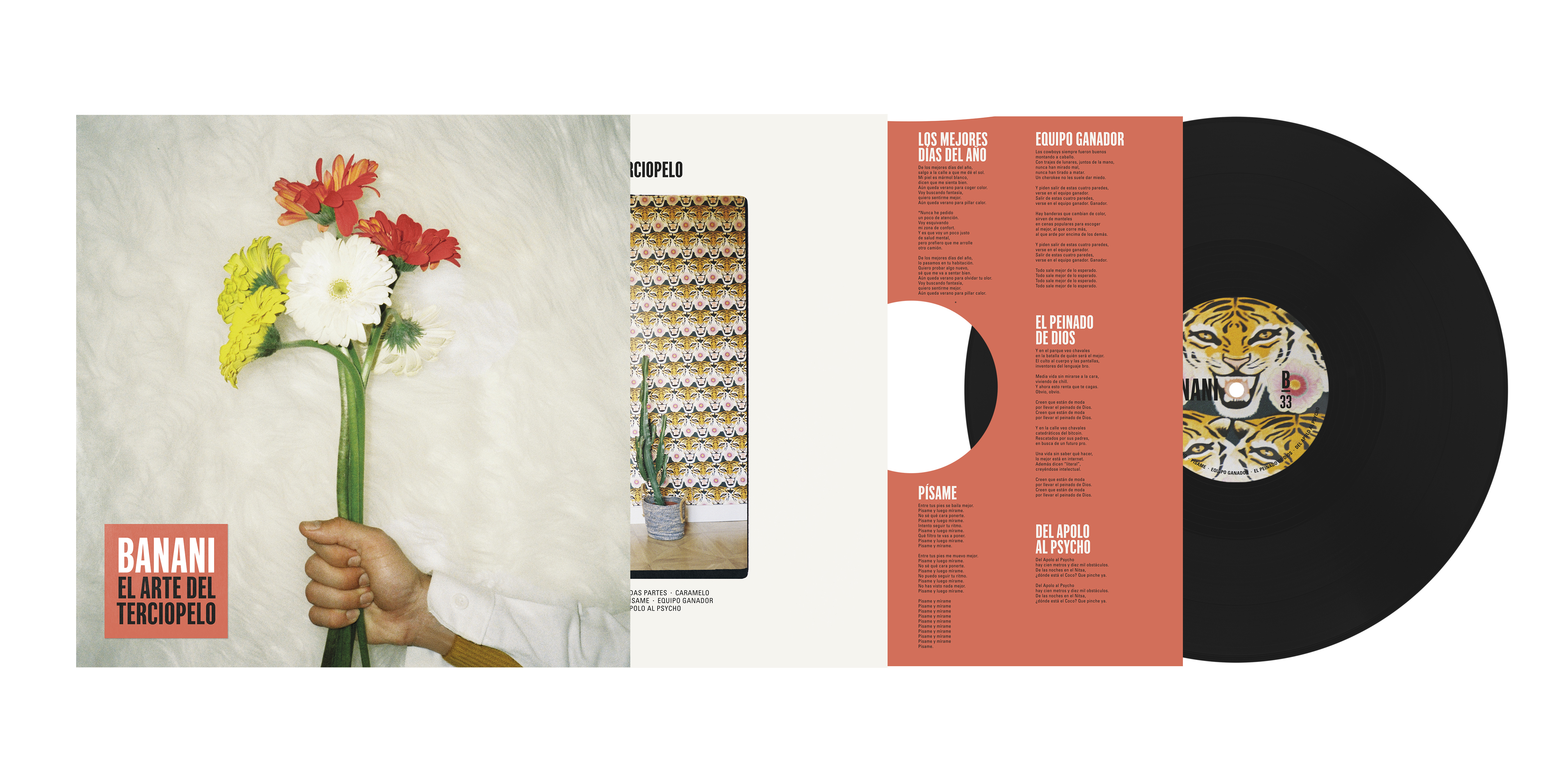

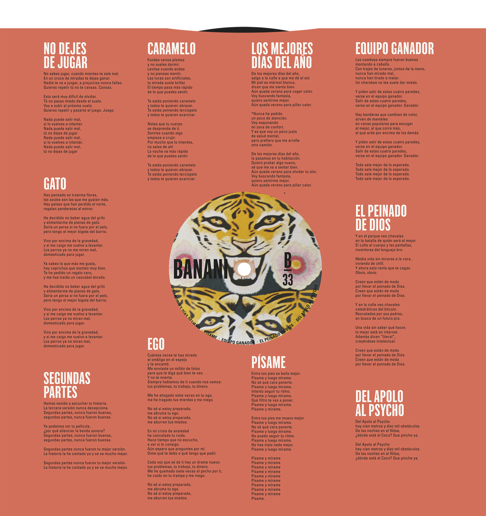
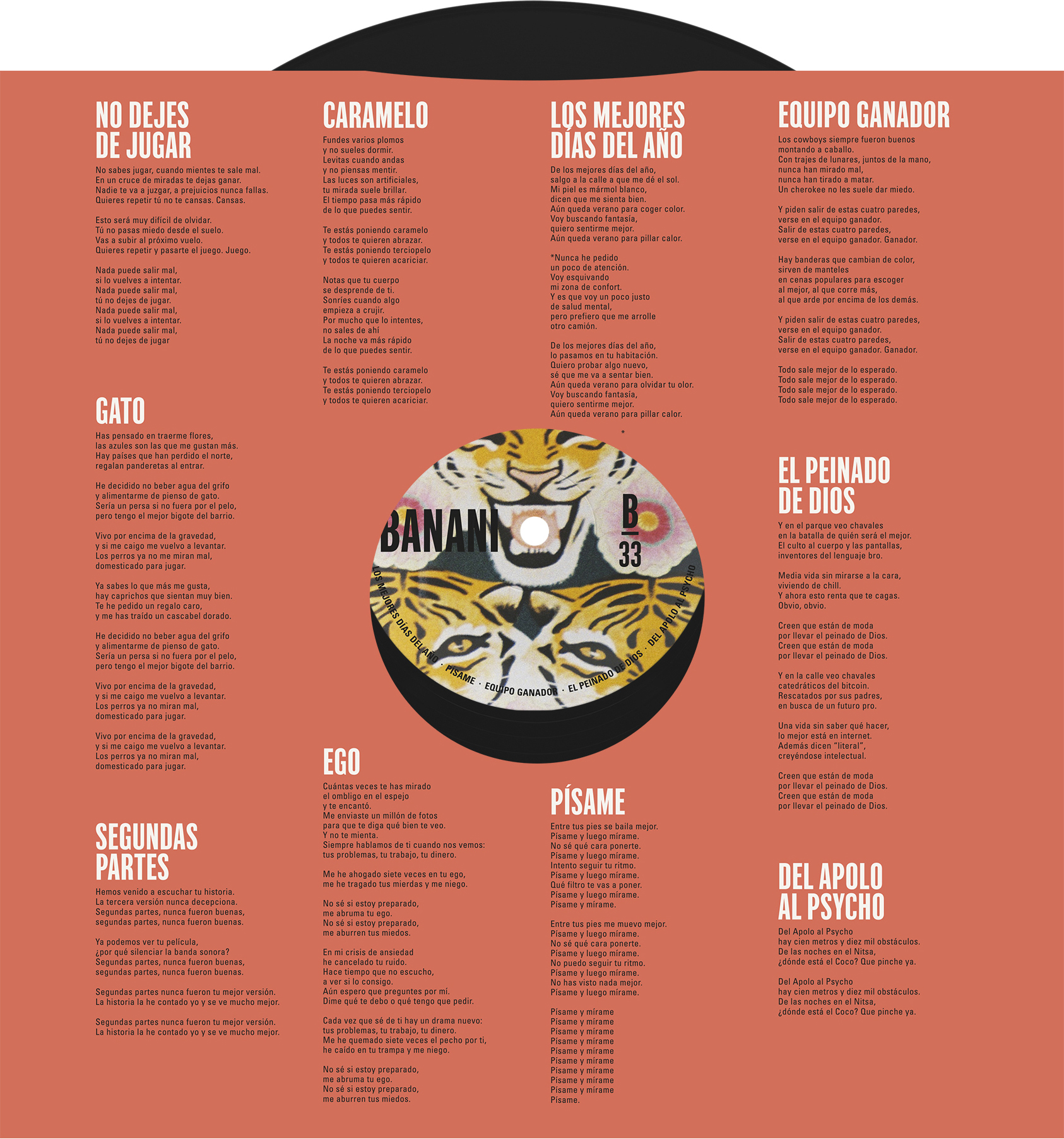
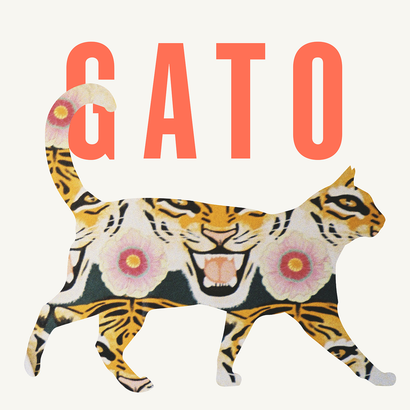
Singles: Los mejores días del año i Gato
![]()
![]()